-
Posts
1,169 -
Joined
-
Last visited
Content Type
News Articles
Tutorials
Forums
Downloads
Everything posted by Noodle
-
Chloe's WIP Thread - Jedi Knight: Reborn
Noodle replied to chloe's topic in WIPs, Teasers & Releases
No way, it looks so much better than the base game. If this is doable it'll definetly become a must have in my mod list. -
I thank everybody who invest their time and energy in keeping this community alive. This place is truly a treasure for anybody who enjoys the Jedi Knight series.
-

wip [W.I.P.] (SP) Star Wars - Republic Intelligence
Noodle replied to Lazarus's topic in WIPs, Teasers & Releases
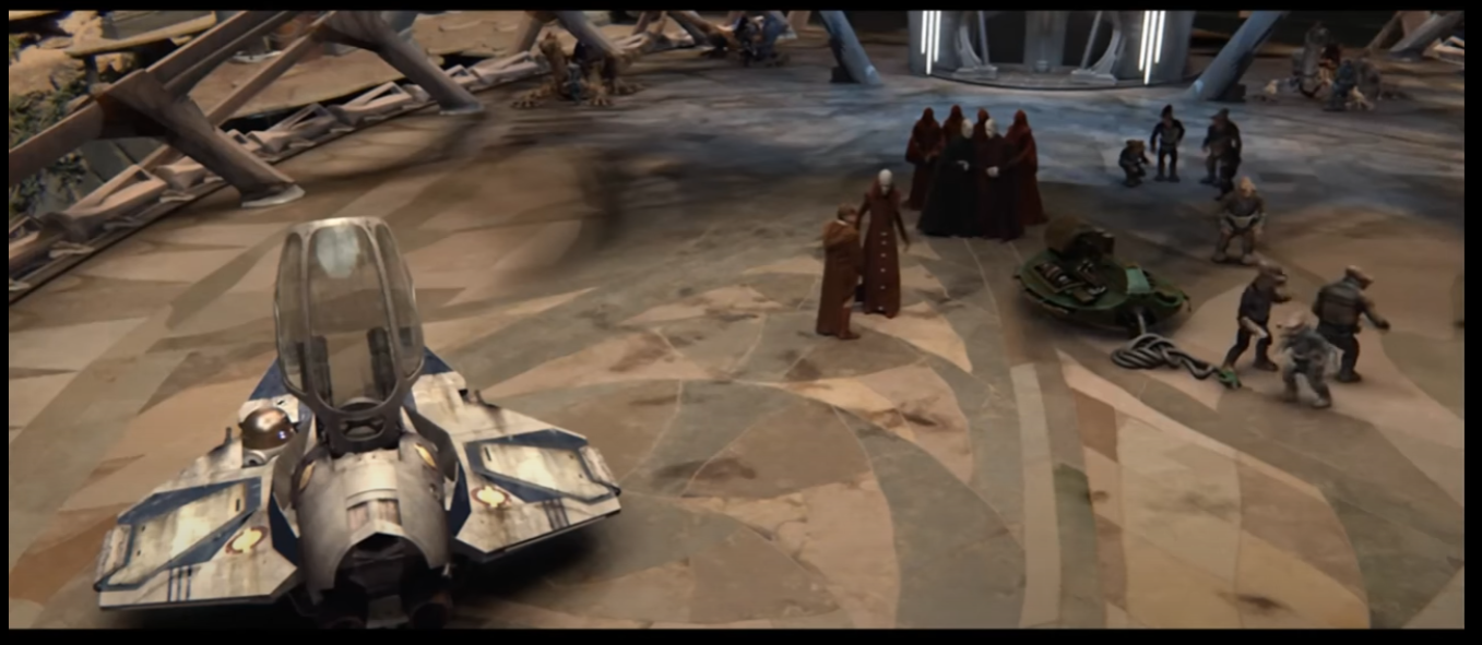
Are ships supposed to land near that area? You could put pipes were cables are meant to go so that the lights there have an actual source and aren't just magically powering themselves up. Also, maybe some sort of pipes that can transport fuel to a small station there, in case a ship needs emergency refueling. Think about how when Obi-wan lands in Utapau those little goblins immediately go to do some maintenance on his ship. -
254 downloads
"Ukti and her master calaetus were both jedi artisans that lived in the old republic era (ukti was born in 3994 BBY, and would end up fighting in the mandalorian wars, her master was born in 4037 BBY and had seen the great sith war, rip both experiences). Ukti was a jawa woman that went contrary to her clans societal expectations for her ,leaving tatooine on a smugglers ship to see the wider galaxy. A few years as a wandering mechanic she got her hands on a device she hadnt seen before. During her failed efforts to pry the curious item open with her tools, she tapped into her sleeping force sensitivity and what turned out to be a jedi holocron activated. " Author : Noodle & Zander_Nao Art source by "Scribbles from Yavin 4" - https://scarila.tumblr.com/post/669859213948928000/jawa-jedi-jawa-jedi-ukti-and-her-master-calaetus File Name : jawa_jedi File Size : 98.4 MB Date Released : June 27th, 2024 Model : Noodle Textures : Noodle Weighting : Noodle Project organized by Zander_Nao A few weeks ago good Zander_Nao contacted me with a request for a model he needed for his excellent series (which you can watch here https://www.youtube.com/@channel80news/). The model is based on an art drawing made by "Scribbles from Yavin 4". This is my first time working with Rend2 support, so I don't expect this to be perfect but its a stepping stone for what will be expected on all of my future projects. The model also includes a lightsaber based on the same referenced artwork. Do let me know if you find any bugs so I can squash them!- 5 comments
- 4 reviews
-
- rend2
- jkhub exclusive
-
(and 4 more)
Tagged with:
-
- 2 comments
-
- non star wars related
- city
-
(and 2 more)
Tagged with:
-
-
Interesting concept, but the references are too low quality for them to be properly used. Do you have better pictures of the costume?
-

Chloe's WIP Thread - Jedi Knight: Reborn
Noodle replied to chloe's topic in WIPs, Teasers & Releases
Looks like a solid idea and very interesting for a HUD. Looking forward to it! -
Cool, I'm super curious about how it looks printed.
-
What kind of modifications do you need to make to be able to 3D print it? Sounds like an awesome idea.
-
Thanks! Its been a while since I uplodaded a new video to my youtube channel. Hopefully I'll have cool stuff to share in the near future!
-
Good thing it looks star wars-y cause I was afraid I couldn't nail the look!
-
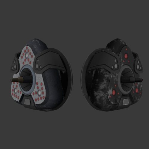
Its been some time since my last post and even though I've been a bit inactive with my board activity that doesn't mean I haven't been doing things lately. I've been doing a lot of modelling and texturing recently but I haven't posted it around here because I don't want to give people false expectations about my future stuff. Some of the things I've done recently include helping Zander_Nao with a bunch of his cool ideas (like rigging the awesome Shadows of the Empire trooper model) and trying to contribute to JKGalaxies, which is my favorite mod by far. I was a bit bummed that I couldn't finish a Nightsister related mod for last halloween so I hope this year I'll be able to upload at least 2 nightsister related things. Maybe an update to one of my already posted mods, who knows! All that aside, here are some of the coolest things I've done in the recent months that I've neglected to share here: JKGalaxies has a bunch of unfinished assets that are quite well done, so one of the things I've done is to try and finish up some of them and get them to work ingame. Here's the texture I did for the "pyro" helmet: This was a headpiece for my male twi'lek model that was based on Hera's in the Ahsoka live action show. Since it wasn't finished in time for the last contest it didn't make the final cut, but here's how it was looking so far: Another thing I was doing for JKGalaxies were new enemy models for a certain map I'm working on. This is one of the concepts I did for the "Desert Biker Bandit" armor set: Part of the idea for this set that I had was that the player could equip different parts of the set to get a more customized look: Now that I feel more confident in my skills as a modeller I started working on an idea I had for a very long time, which was to create a "Cultural Mod Pack" for both JKGalaxies and creative modders that want to use it in their projects. The idea is to pick a star wars culture and create a bunch of assets that can be used for map making or role playing. Right now I'm working on a "Tusken Culture" mod, so far I've worked on the female tusken and child tusken outfits we saw in Attack of the Clones. Here's how they look so far: Female Tusken: Tusken Children: So far this is what I've done, I hope soon I'll be able to update this thread again with cooler stuff!
-
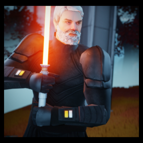
Looks nice, is the model head taken from the sims?
-
You made a beautiful effort to get the community together for this anniversary and it definitely paid off. Congratulations!
-
I've enjoyed playing with his model quite a lot. Its the closest thing we have to Baylan yet even if its not a 1:1 replica of the character from the show. The texture work is solid and its been made with a lot of care, and it shows. I hope to see a future version of the model with custom sounds, since it'd have made the battles with the NPC way more fun. Also, the NPC could be slightly taller than the player character, since Baylan is massive. My main criticisms are that the head topology could be improved a bit. You can see around the ears pieces of the temple of some glasses (probably part of the base of the original model) and there's a gap in the belt area that isn't easily seen due to the dark textures, but it becomes noticeable when you use force powers on him. (pic related) Overall, a great model and I can't wait to see your take on Shin!
-
Was the mapping part done in blender too or did you do it in GTKRadiant and just applied the textures to it?
-
Even though I think Bespin Duel Reborn is mind blowing and an achievement on itself, I have to give my vote to the trip mine replacer because the model is great and it'll certainly be part of my permanent mod collection, giving it a lot of long term value. That said, everything submitted was of high quality!
-
- 4 comments
-
- anniversary contest
- contest entry
-
(and 4 more)
Tagged with:
-
-
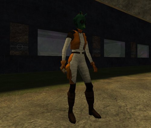
This is a very simple, yet effective, project. Texture wise it looks like it fits seamlessly with the base game and certain details like the choice of clothing and the hair texture make it seem both rodian-like and similar enough to the male counterpart fashion-wise. The couple things I could see changed to improve it is creating a new voice file so that it doesn't sound too maleish, maybe increase the pitch with audacity so that it sounds more feminine. Also, maybe use Jedi Rodian to create more skin variations, since that texture is way more polished. Only garing issue I saw was some messed up normals around the mouth because of the blender export process, but overall its really good, I like it and hope it can be integrated into the game as more enemy variations.
- 3 comments
-
- star wars related
- alien
-
(and 4 more)
Tagged with:
-
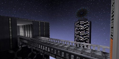
Congratulations on creating your first map, I really like the core concept behind its inspiration and I think the scale of it is pretty epic. The whole idea is super good, specially with stuff like the bridge it has, the size of everything and the fact that the tower in the middle isn't cubic, but has a more distinctive shape. All of this is great and could be further developed into something incredible. Regarding the issue with the music, its not set to the proper path. You set it to music/imperial_hallway when it should be music/imperial_hallway_song/imperial_hallway Here is m constructive criticism: - Ther floor and wall textures are the same, which makes it look monotone and doesn't help give a distinctive presence to the map. Try to make it similar in style but different enough so we can easily differentiate between the walls and the floor. - Concrete pillars lack detail, which makes them look like cylinders that have no proper structure. Try to add details at the base and top of it to make it look more distinctive. - There are no visible light sources in the map, yet its somehow lit. Having objects as light sources make things feel more real. - The doors are painted in the wall without having any distinctive shape and there's a missing texture in the tower's door. Add more brushes to make it look cooler. - Everything that isn't visible to the player should be caulked instead of having a texture, this affects rendering time. - The scale of the tower with the dish is off. People shouldn't be able to live there yet it has many windows. - The base of the map looks like a black square which makes no sense, to fix this you can add a fog effect that makes it blend better with the edges. - Minor thing, but annoying is that you used some light textures that don't have the proper shader on the outside so they aren't glowing. Overall its a great project and I can't wait to see you create a new version of it, keep it up!
- 4 comments
-
- star wars related
- contest entry
-
(and 1 more)
Tagged with:
-
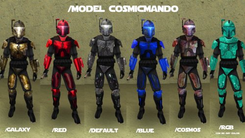
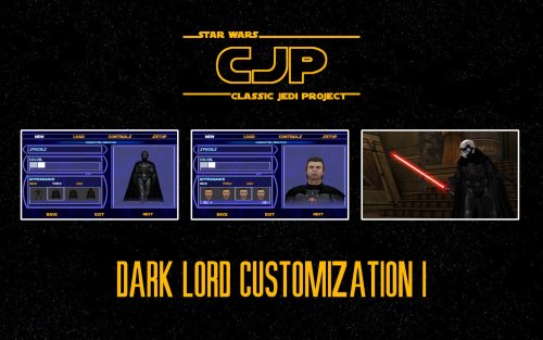
I like the use of the shadowtrooper as a basis for this model. Its a nice customization mod specially for the head pieces, though I wish as much variety could be seen in the torso and leg pieces. The hairstyles are nice, though they might be a bit too samey with just minor differences between each cut. Everything works pretty good, except the cape which has a very stiff rig that makes it look unnatural, this could be solved by rigging the lower part of the cape to the legs (as seen in Hapslash's Count Dooku model). Overall a great concept for sith players.


