-
Posts
48 -
Joined
-
Last visited
Content Type
News Articles
Tutorials
Forums
Downloads
Posts posted by SephFF
-
-
52 minutes ago, Noodle said:
Oh boy, this is a perfect replica of the DF2 level. Were the textures ported from the game or are they recreations of the original ones?
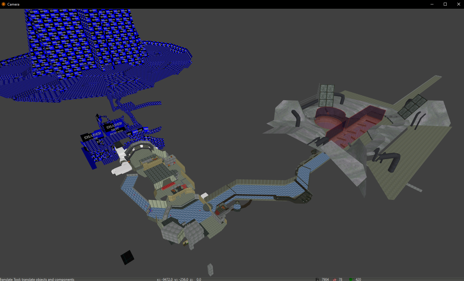
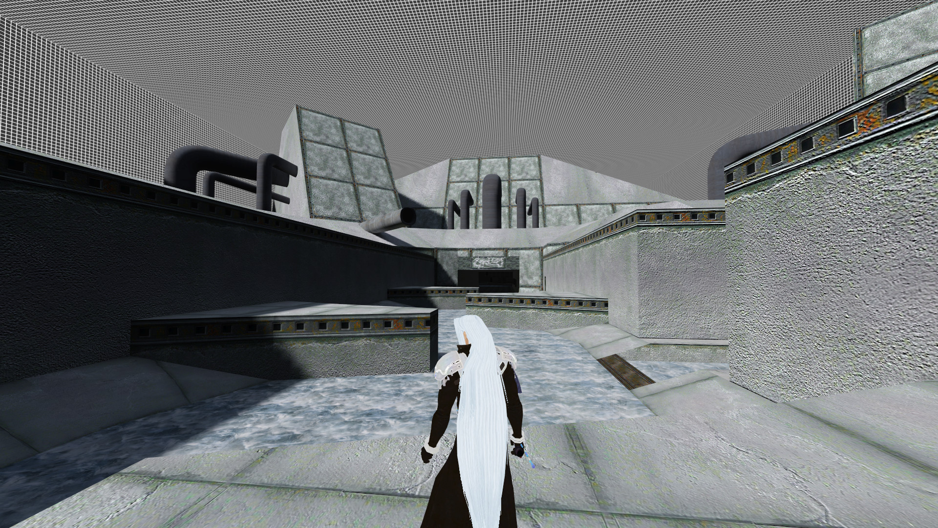
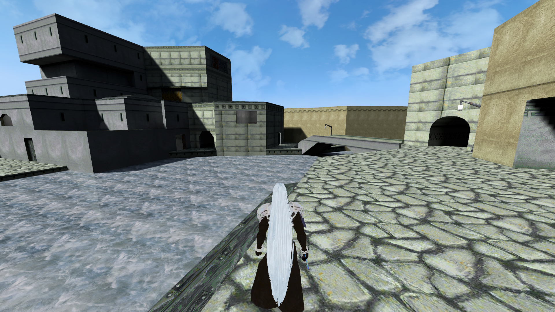
Textures are used from old AI upscale the author used from original game to pass out to other modders. They had a lot of artifacts so i had to go into photoshop and fix all of them. I'd make some larger, remove artifacts, add a highpass overlay and fix where some seamless textures where not doing the whole seamless thing right. was a lot of work, didnt really want to remake all the textures cause I like the feel of the original and wanted that same feeling while in MP JKA. Also how the original game textured things did so cause how the originals where made. Making them all new would break the look of some spots imo.
-
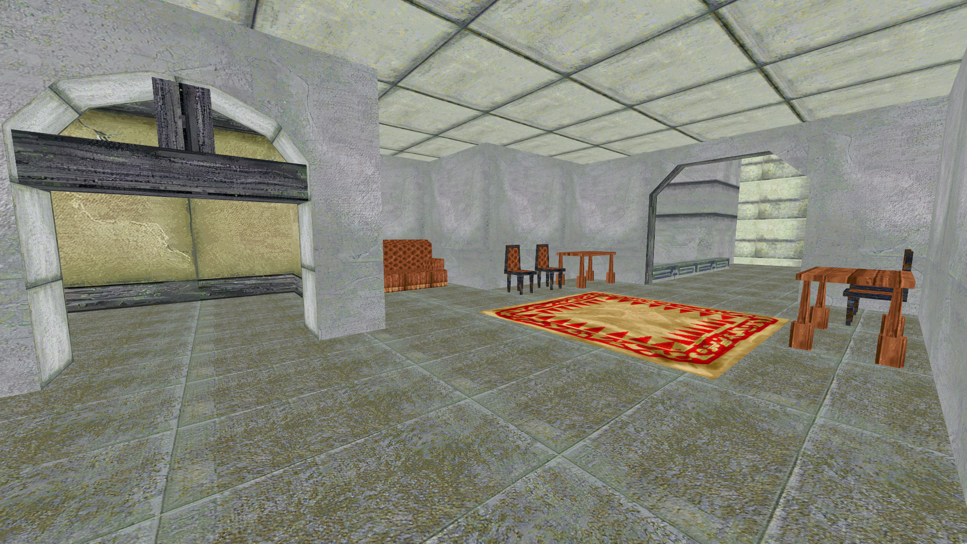
hub area for map... still WIP
DarthValeria, krkarr and Smoo like this -
On 11/11/2022 at 9:30 AM, Acrobat said:
did the mario map get published?
late reply.... super sorry but no, I ran into an issue where I could not find a way for JApro timer to work in main area... but I think I will release it once i finish the DF2 map im working on.
-
I spent a very long time on these maps making a point to really think about who was getting my vote.
My top 3 are
1. TFFA Brutal
2. Ractory
3. Duel Rishi2
Castellaris:
Layout/Construction: Great patch and brush work with what is done so far. Its far too large for a duel map, with 2 hallways and 3 rooms it does not offer a lot of flow for TFFA or FFA as well in my opinion. The door to the tunnels is well hidden I assume by intention both leading to both sides of both rooms. neat idea just more flow to the layout would be needed if you want to turn this into a solid TFFA or FFA map. Personally i would love if you completed the building and removed the clips so I could jump all over the roofs but I am a fan of jumping around lol. some construction elements where the balconey and windows are don't make much sense from the inside of the building. also in that same room you see the sky in the ceiling but outside its covered up by the large building so more of a continuity issue there. There are also 2 models that are in the map that look amazing but seem off since they have such a high poly count in comparison to the rest of the map.
Player Interaction: Water around the map kills the player and 2 doors to uses. lout side the building lots of places to jump around on There are places players using Jump 1 can reach, not a huge deal if person your dueling has some honor lol. again flow would be an issue with such a large space.
Textures/Thematic & Artistic Direction: love the castle and has a magical feel to it. Textures you did well in terms of contrast and visual variety but the scale of the marble seems too large. and the amount of marble work for a fantasy setting just not a practical one. the choice of wood has the grain direction off in some spots and where some of the wood is would be bad for construction, like on the roof and under the balconies. Skybox is nice matches a fantasy setting I just wish you added some moving clouds to it. the sand and grass, then sky, then water room. I def see what you are trying to pull off with all these and all great ideas. I would just play around a bit more with textures to really hash the map out.
Lighting: Lighting seems fine nothing stands out as jarring and easy to see who you are fighting.
Music: Not a fan of the music for a duel map does not match the fantasy vibe i think you are going for.
Performance/Bugs : if using rend 2 sky box in middle room and pond room doors breaks. On my system: i9-14900KF, 64gb ram, 4090 GPU, uncapped FPS I get average of 600 fps lowest spot is 450 while highest spot is 1000.TLDR: this map has a lot of potential and I really like what was put into it so far. Def can tell it was a lot of hard work and I think could be made into a goof TFFA or FFA map. Main think is some texture choices and adding more flow to the map.
TFFA Brutal:
Layout/Construction: One room with with 2 levels of play area. Construction is top notch to where I tried to find spots i should not get to but you where able to stop my antics. also could not find any hidden face that should have been caulked out. Great size for a duel layout and the extra floor ads to the flow with the map. I also appreciate how you have two clear "hero asset" as in the art works you made as a center pieces to the map. Consistent design of all parts around the map
Player Interaction: Nothing to really interact with, could role play sitting in the chairs I guess.
Textures/Thematic & Artistic Direction: Theme is 100% on point to the Brutalist art style with the concrete. Again the hero asset center pieces tie it all together. the simple repeating patterns and shapes are all consistent to your theme. I am now in the mood to play the game Control thanks to this lol. I can't complain about lack of texture variety because it all just works to the theme and is easy on the eyes with I noticed most players want their duel area to be that way.
Lighting: Lighting is on point where everything seems to come from a source and really adds to the theme.
Music: I really with you added some different music, tho very hard to find something that truly matches the theme. some music from the game Control might be a good example.
Performance/Bugs : no bugs, uncapped i get average of 950 fps. lowest is 900 high is maxed out at 1000. Very well optimized mapAll in all I love the artistic stye of this map and how cleanly you constructed it. only nit pick would be music but this is a map I actually want to duel on.
swgl_jt_dojo:
Layout/Construction: Simple layout perfect for duel size, very clean construction only a few spots where I found hidden faces not caulked out properly. wall mounted brackets for cabers can be jumped on. id recommend be clipped off.
Player Interaction: two open when near them, that's about it.
Textures/Thematic & Artistic Direction: Theme is a classic dojo super popular with Jedi academy over the years. Textures super simple but work well only a few spots where texture scaled incorrectly. Not a fan of the rock texture on the ceiling but I like the idea its a hidden dojo in a cave or something. The sabers on the wall are a nice touch but seems unfinished with the empty rack on the wall on the left while the wall on the right is left empty. Still very successful with getting the theme just right.
Lighting: Nice a bright easy to see. matches the dojo aesthetic.
Music: Basic music
Performance/Bugs: no bugs uncapped FPS 1000 that's it... cant get much better than that performance wise.
All in all a solid duel map that I think would work great to play on.
Oasis mesa
Layout/Construction: General layout and design works well for a duel map i think the bridge over water that kills you is a great idea. Since experimental I could write a book on some of the construction issues so I wont do that here. its mostly made out of models which can be done just hard to pull off and be optimized.
Player Interaction: Water kills you, sky big enough where if ya spawned a some ships in you could fly around and have space battles. I wish you were able to walk on the thick cables would add extra height to the map for a duel.
Textures/Thematic & Artistic Direction: Them seems to work for island but the lack of horizon blending, better water shader and contrast from the sand texture to the rock seems jarring. Skybox seems like its stretched in a weird way
Lighting: lighting seems to not have a source in 2 different directions.
Music: I think the music matches well with the theme pretty well just has a harsh cut in it when ending.
Performance/Bugs: Water with current taystjk does not kill you, z fighting in a lot of areas. performance uncapped average is about 300FPS, high is 400FPS low is 240FPS. For the size of this map that's quite a big performance hit but too be expected with how the models are used.
Visually great map if not looking too close to it. I appreciate being experimental with it as I love science and can't have progress with out experimenting. Would be fun for casual play but not competitive.
Hand_of_Thrawn
Layout/Construction: Large open area only a few spots with hidden geometry not caulked properly. its a bit too wide open for a 1v1. Very simple in design I like the computers decorating the edge and tunnels.
Player Interaction: Some force holocrons to collect.
Textures/Thematic & Artistic Direction: Rock texture stretches unnaturally that stands out to me. also the tile texture is covering a lot of area id recommend needs more variety. still the them of an underground facility works well.
Lighting: a bit too dark with the size of the overhead lights in my opinion.
Music: Normal music for JKA.
Performance/Bugs: No bugs, performance takes a hit due to the patch mesh construction average is 800 fps low is 500 looking up and high is 1000 looking down.
All in all its a good map just needs some optimization and maybe add some variety to the open area floor and scale down the size for a duel.
Echani duel
Layout/Construction: Good clean construction, no hidden faces and consistent layout. only weird spots are benches are floating above the ground. Just a simple room for dueling in.
Player Interaction: No interactable stuff in the map.
Textures/Thematic & Artistic Direction: Dark moody Star Wars themed room all blend in well together.
Lighting: A bit too dark to see very well but seems interesting for dueling another person in with.
Music: Normal Star Wars music.
Performance/Bugs: No bugs FPS 1000 so maxed out.
Very simple duel room and a good size for dueling. Just a bit dark for my liking.
Ractory
Layout/Construction: Clean construction with only a few hidden spots that should be caulked. Lots of effort was placed in the with the models. Interesting multi levels to work with but some spot jump 1 can not reach. like tops of pillars and in outside area. Though I do love I can jump over to that area and run around.
Player Interaction: Lava, droid belt, lava scooper, death pit, can break the droid belt if ya try to block it though. Still great to see.
Textures/Thematic & Artistic Direction: Super consistent them with story telling in the map design with excellent texture choices. really can tell a lot of effort was done to get this done right with a lot of attention to detail. I like all the light up textures that really highlight the area and also the neon signs outside.
Lighting: Great lighting matches theme perfectly.
Music: Normal Star Wars music.
Performance/Bugs: Droid belt can be stopped that's about it average FPS is 300FPS Low is 145FPS High is 800FPS.
Amazing map, just some performance issues I think could be fixed by reducing the amount of droid parts being rendered. Since with r_showtris you can see them in the brushwork being rendered. This was my number 2 choice of a map, would have been 1 if better performance since hard to get people to wanna duel ya on it if their comp cant handle it.
Duel rishi
Layout/Construction: Very clean construction, only thing that stands out would be the three boxes in the center that don't seem to match imp design. the stairs are also impressive and I like the window showing the landing platform outside. I like the dip in the floor that adds extra to dueling a person in this type of area.
Player Interaction: Lots of buttons but noting to interact with.
Textures/Thematic & Artistic Direction: Amazing clean texture work with clear them. the consoles I think could use more screen graphics or lights but still otherwise great in detail. Def feels like a imp station. very clean modern style.
Lighting: Great lighting nothing out of place.
Music: Normal star Wars Music.
Performance/Bugs: No bugs Fps average is 700, Lowest is 600 while high is 800. well optimized map.
Amazing map this would be my number 3 choice out of the bunch. Makes me wish it was a much bigger map to explore.
Took me like 5 hours to write this.... eyes hurt now lol
FYI all the maps are good, so dont take what I said bashing ya, just pointing out what I personally noticed.
Artemis, Noodle, DarthValeria and 6 others like this -
2 hours ago, NumberWan said:
There is no big secret, but it was probably the hardest thing to pull off in Radiant. In this regards NetRadiant works far better than the original level editor, as I used meshes and Brush triangles. The brushes were used for pillars, several triangle ones were placed together to form a wall under certain angle. The method you show either an ase or md3 model is actually a nice method! This was used for the mountains of Tatooine in JA, but we use it too for a more complex architecture, when using meshes and brushes aren't enough.
We also thought of making the city 1:1 like in Dark Forces, but it was difficult back when we started. Besides our map shows the city almost 10+ years after the events of the original game. We assumed, that the Empire is gone and the city is slowly restoring it, so the general layout is probably the same, but the materials and details look differently this time. We didn't recreate the Canal area, which you've recreated most remarkably.
yeah the canal was stupid hard....
For mine I have the original model from DF2 as an obj. I scaled it till It was the same size from either kyles POV in DF2/JKA. When i first started this I tried to do it from image reference.(it was waaaay off) Then I tried importing the entire obj into NRC and rebuild the brush work that way. (also not a great idea but kinda worked) Now I do one of 3 things... using blender plugin to export brushwork I invert the normals, export into NRC and extrude flat side of the face, use the faces as a reference and use CSG merg tricks to get things right or for normal rooms i build like I normally do for any other map.
The canal was stupid hard to build and that bridge was also not easy. I actually hade to build the bridge in blender with basic shapes and export as brushwork, not faces to get it right. took me like 4 tries to get it right. that model is a placed holder so when I build the sky box you can see the tower in the right spot.
Spoiler
FYI.... when i do make this....ill release the source files.... feel free to use whatever ya want....or if want something now i can give it to ya. I also plan an making Max into an NPC.... gatta model him and all still.
NumberWan likes this -
On 11/29/2023 at 4:46 PM, NumberWan said:
We've updated the city – its streets, markets and of course – the cantina

I'm happy to see this looks like I got some competition. I also been working on Barons hed.... Tho i'm making 2 versions... one mostly original everything... the other updated... Also a WIP.
So far I really like what ya did.
Spoiler


The question i got for ya.... is how did you build this part?...... the angles for the pillars in the market place?
Spoiler
Mine is a bit different than yours as its close to 1 to 1 in how it was in OG game. But i'm struggling to get it built clean with brushwork. Was wondering how you tackled it. It looks built in the image but its not clean brushwork so I have to rebuild it completely.
hit me up on discord can VC about it if ya want.
-
TTT = Trouble in Terrorist Town
I want to build this map for JAWA to run this event for others to enjoy. I figured asking community for ideas could be useful. I am not super knowledgeable about TTT, only played rough version of it on JKA. I think a map designed specifically for it would be fun. This wont be a clan map just a map others can enjoy. Also would like to make the map useful for other event ideas not just TTT.
The idea:
Most of this should be similar to what they did in Half-Life 2 mods, trying to make it work for JKA. The event is run by a host who picks who the terrorist are in secret.Win conditions:
- Innocents win if kill all terrorist or unlock escape room and enter it.
- Terrorist win if Kill all innocents.
Concept idea: Innocents need to figure out who are terrorist and kill them, or open locks that let everyone escape. Lock buttons are placed around the map in different rooms, traps can be placed leading to the rooms or also in the rooms as well. "vents" are only used by terrorist so they can quickly get around the map. The vents will shoot the player to different parts of the map. The locks are on a three min or so timer where no one can hit that button after it’s been unlocked. Once timer runs out, a terrorist can in turn relock the escape route. This also acts as a check to see who a terrorist is, if caught relocking buttons. The idea is to incentivize entering dangerous rooms and player movement/interaction around the environment. Most rooms will have two or three ways to enter or exit, with a few dead ends. The map flows equivalent to three figure eights overlapping each other. Visual hierarchy, points of interest, and landmarks are key so players can easily navigate to their intended destination without feeling lost. Lastly some spots on the map will randomly become dangerous, for example a tie-fighter flying through a tunnel players need to jump across to get to the other side of lava/abyss. Maps designed for terrorist but balanced to feel fair.
Map theme/ layout:
Lobby starting room leading to three separate play areas. (May reduce to one or two due to entity limits)- No traps / no escape room, small play area. (Not sure yet)
- Traps / no escape room, medium play area. (Not sure yet)
- Traps / escape room, large play area. (Abandoned Imperial underground facility.)
Debating on using mainly JKA assets over custom assets to save on file size. Any thoughts about this concept would be greatly appreciated.
Might post some concept drawings in future.... currently have artist block thinking of a good map layout.
Smoo likes this -
Been working on the Mario map still.
Thanks to college classes im taking my work has slowed down on it but ATM the map is mostly down. I want to get some JApro features working for it and have to where you can race for times on the slide and a race for times on the outside part. The outside part has proven to be a challenge since it is so open and easy bypass a lot of places on the map I am not sure how to set it up where it will feel fun to race on. So I think I will make 2 bsp files, one for the race and one for FFA... FFA being open and free to roam around and the race more restrictive. Not sure how long this will take me to complete so a lot of testing from other users and myself would be needed.
I might go ahead and upload it to here sometime this week so I can get more people to test it. Then update it with fixes as needed.
-
added skybox
Smoo, OCD2, scp_chaos1 and 4 others like this -
DarthValeria and Smoo like this
-
Testing some things.
SpoilerDarthValeria, Circa and ZelZel like this -
15 hours ago, Szico VII said:
Ball would be nice as an NPC but I don't know how to do this myself as never used any character modelling stuff and not really keen to worry about that side of things unless it's very straightforward and has a clear easy tutorial.
@mjt And I were gonna have a barrel NPC similar to your Moon base Labs Map. Where people could throw it or make it explode like a tie-fighter killing everyone near by lol. Unfortunately we ran out of time before the contest and could not get it working right in time. I really like the idea of making the ball an NPC! where you could use force push and play volleyball with it on the beach! Or slap it with a hockey stick that uses "saberdmgvelocityscale". I could see some fun events we could run on JAWA server with that. One flaw in it would be making it float in water lol. I have no idea how to pull that off.
You really are making me want to update my Costa Del Sol map with all these amazing details. ( I got 2 maps to finish before I can start tho ;_; ) Some things I wanted to do but just didn't have the time was build interiors for all the building, true to Final Fantasy 7 reference images of Costa Del Sol. The hardest part is the maps size where so much is being rendered it is hard to optimize and really make it look amazing, not killing everyone's FPS. (we tried adding grass to it.. it killed most ppl's computers to include my own lol).
I'm also one of those mappers where I loth invisible walls... Only clip things that absolutely need it. I love the idea that if its looks like you can reach it... you can! Though with the way jump 3 works and some of the movement glitches I can normally find like 50 ways to break a mappers intentions lol. it makes designing maps a million times harder.
That water tho.... *Chefs Kiss*
-
I gatta say this is looking pretty darn good.
PreFXDesigns likes this -
Since you’re asking for thoughts, I tend to tread softly on just how much constructive critique I give since it can sometimes be taken in a negative manner. For example, level design logic where the doors are too small for boxes, yet the added boxes improve the play, so the designer just does not care. Each case/designer is different or accepts things differently. I’m assuming your goal is to push the limits of JKA and make an esthetically pleasing looking map while looking for real constructive critique. What you currently have is outstanding and forms a cohesive look to a nice sunny day on the beach. The darkened sand looks a lot more natural to the eye I think you did a great job on that. The only item that stands out to me is the grass sprite/grass texture. One thing my level design professor use to preach is that “your design is successful if nothing is noticeable unless you intend it to be noticed.” So out of all of it so far, it’s the only item that stands out to me.
As for ways to correct it, would be avoid stand-alone straight lines of grass sprites with the high contrasting color planted in the sand. Also play with different lengths/density of grass with complementing grass texture/color.
If not looking for this kind of critique, I can just go back to…. “looks good!! XD” *keep walking*
TLDR: Grass stands out a bit, looks good tho.
ZanderNao likes this -
top 2 looks better to me... The bottom 2 I tho would be better if made for at a farther distance away from the island.
"Do people think its better more isolated or I can pop more islands in the skybox to make it seem more of an archipelago chain"
I would say archipelago as long as it does not kill performance. Adds more life to the environment. Also recommend adding fishes/coral... i would be curious to see how you would tackle it lol
-
@Szico VII Ah thanks for letting me know. I ended up sorta making mine by hand... using 2k textures. Got it close to how it should look then compiled the map and made minor edits in photoshop using vid_restart over and over lol. I tried to find a program that could automatically do the appropiate distortion but all the ones I found were out of my price range. Also tried using blender and texturing the inside of a cube but that didn't translate well into JKA. Its just a painful slow process to make it look right. Or if ya know any good plugins for photoshop I'm all ears. Making the animated skyboxes is nice but sometimes not worth the performance cost. I want to eventually learn how to use rend2. I just have to make sure it works for both base JKA and Rend2 users since its hard to get people to download anything for multiplayer.
That grass also looks really good. I tried using a grass shader but FPS DROPPED fast with the size of the map.
Like the progress so far!! feel free to use any assets I used in my Costa Del Sol map... your tutorials and .map files ya shared are half the reason I was able to make it. for example alpha shaders and decals are some things I learned from ya. The other half was due to @mjtbeing a mapping senpai lol. regardless can't thank ya enough.
-
On 10/7/2021 at 6:41 AM, Annubis1991 said:
Maybe silly question but will you release the first map someday?
Yes lol....(Sorry for super late reply) IRL can get in the way as well as skill with this type of stuff... IRL I'm retired jarhead now college student who does graphic design. Also got a wife and three kids + 2 dogs so its hard to manage all that sometimes. 3 main reasons i didnt release the first map YET... was -vis was bad causing major FPS drops and I want this to run smooth for most people. The second reasons is I suck at scripting and i'll need to find help with that for the elevator in main building. Three... This map is the first map I tried to make so its been a lot of learning involved. I'm slowly getting confidence I need to finish it tho.
In the mean time... before I work on that I wanna make a fun simple not too pretty Co-op map... and probly update it over time. ATM I 2 rooms made for it and wanna make a third before uploading it.
The big main room is just a playground of sorts... mainly to teach movement mechanics in game like what can walk on what angle of slope... Glitch tricks...strafe jumps... rolling/crouching and a room to test max saber range. The Co-op part will have 3 difficulties... Hardest can be done solo... just requires to know expert jump mechanics. Next is kinda hard with 2 people but fastest way though the challenges. and last an easy route for people not good with strafing. Its just hard designing rooms with 3 difficulty levels but its nice to have options imo for solving something.
Spoiler


 DarthValeria and mjt like this
 -
-
I mainly use Net-radiant custom for all my mapping needs. I feel like I understand it enough to make half way decent maps, but at the same time it feels extremely limited. I also searched through the forums looking for tutorials or guides but there is so much scattered, its hard to figure out what workflow I would need to do. With mapping its fairly easy to spend 20 hours on a minor detail only to realize you can't make it work and have to try a new approach. So what I am looking for are any guides or tutorials for a workflow that mainly uses blender for the level creation aspect. I guess I can try to explain a few things I don't know, I should know...but also there is the aspect of what I just don't know that I should be asking. So I hoping someone can point me in the right direction.
- Can full levels be made in blender?
- How to make JKA shaders work in blender to include system shaders?
- Advanced Alpha blending in blender
- Terrain optimization
- Importing from blender to Net-Radiant Custom, import small parts little by little or full blown levels
- Baking light maps from blender into the game
- Known limitations such as polycount or conflicts.
- how to ensure -vis works (I'm assuming block out with caulk but not sure if that works inside of models.)
- There might be a million other questions I don't know to ask lol
What I do know mainly amounts to RichDiesal's JK2Radiant Mapping University, Szico VII's tutorials, and what @mjt has taught me under his wing lol. I can use Blender, photoshop, illustrator. I use to have access to substance painter but I cant afford to subscribe to it lol. I am a IRL graphic designer so that helps with making my own textures. I also have a minor degree in game design I just do this as a hobby though. I guess the goal for me is to figure out a workflow that mainly uses blender. ATM I feel fully comfortable using only Net Radiant Custom but would like the maps I make to be higher quality. Another aspect is speed, where I can make something in a few weeks, not a few months. (Wife, three kids, 2 dogs, working keeps ya busy)
Personally I would love to make guide about all this stuff someday... Just with so much information scattered its hard to really nail down a solid tutorial with all the new tools we can use today vs back in 2003. Also I do have ADHD so I'm already a scatter brain lol.
-
6 minutes ago, Mandalorian said:
Beautiful. Not sure about the static clouds that are brighter. I'd make them not as bright maybe? This map is looking amazing.
felly agree will have to adjust them....main reason i have them is so if flying a ship...you can kinda tell if ur about to hit the skybox lol
-
testing skybox
SpoilerooeJack, OCD2 and Mandalorian like this -
small update:
poor quality stream but it was my first time trying youtube streaming.
the main thing i like how tauntauns can go where a player cant.
Smoo and DarthValeria like this -
On 8/8/2021 at 9:07 PM, SebTheAlchemist said:
I'm itching to ask. Is this Costa del Sol?? Because it is looking super cool.
......UUUH lol here is a video showing some updates...may answer your question lol
Video:
SpoilerCirca, krkarr, TheWhitePhoenix and 5 others like this -
caustics are great
SpoilerDarthValeria, Futuza, Circa and 1 other like this




SephFF's WIP
in WIPs, Teasers & Releases
Posted
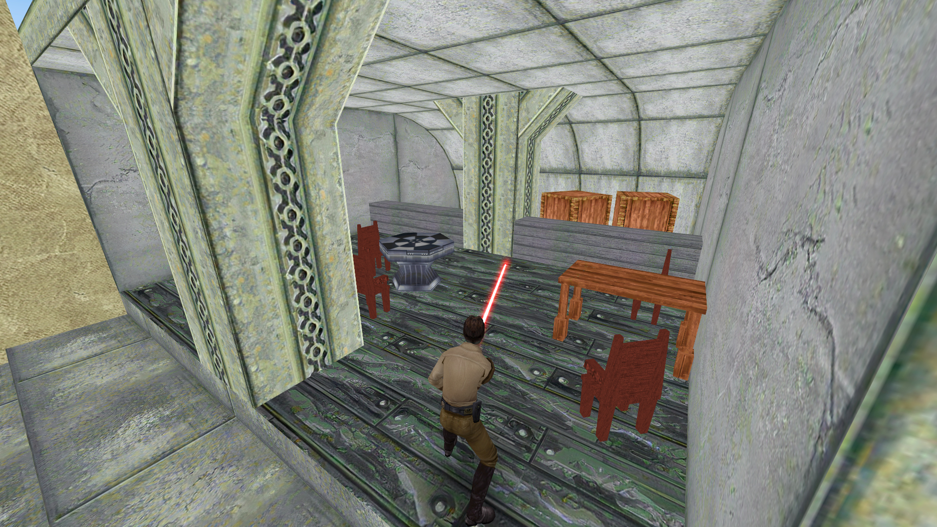
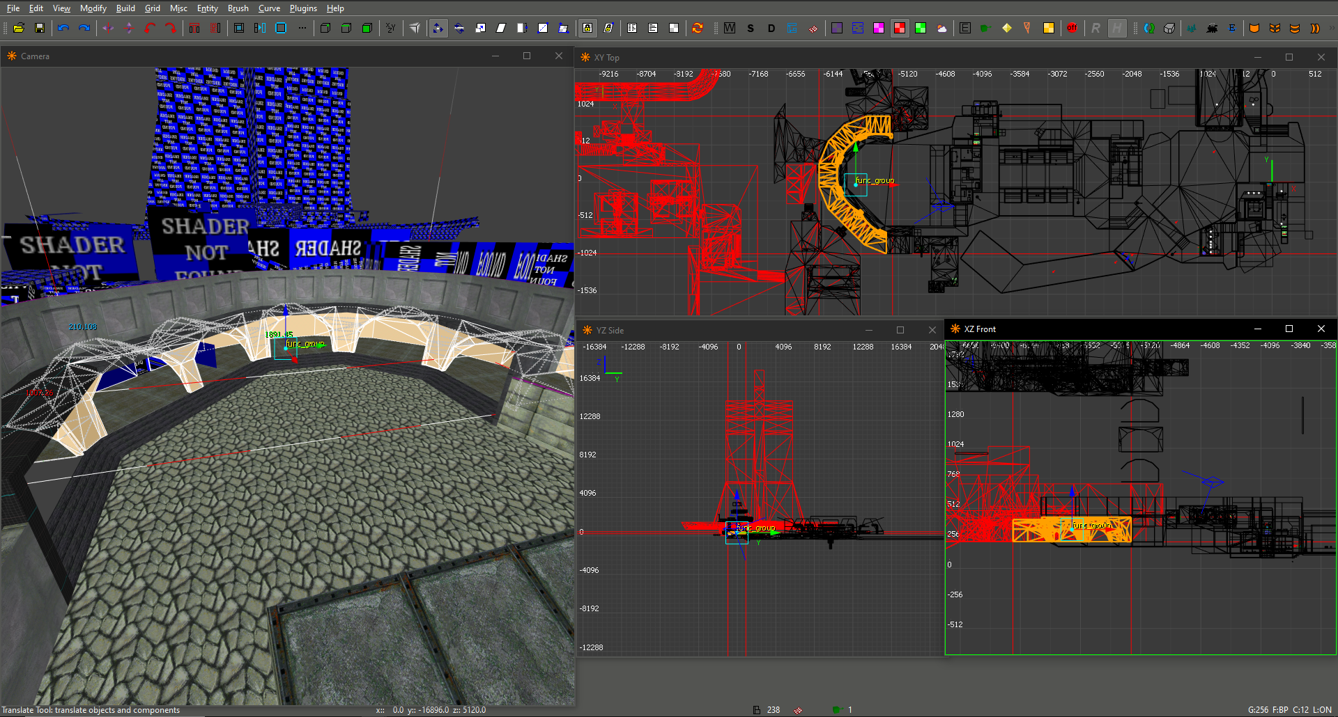
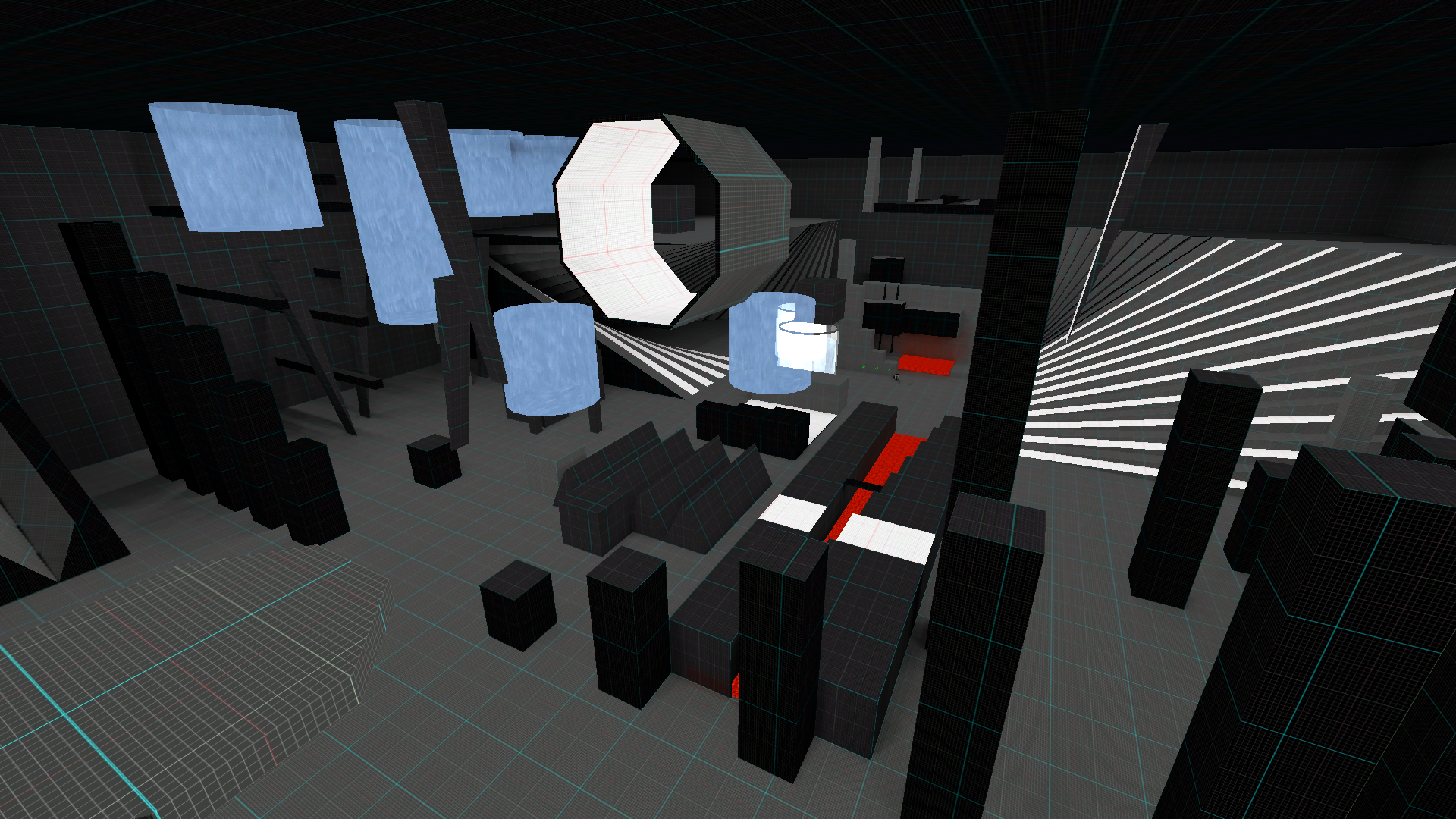
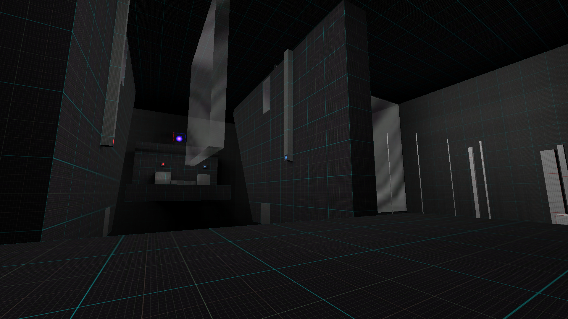
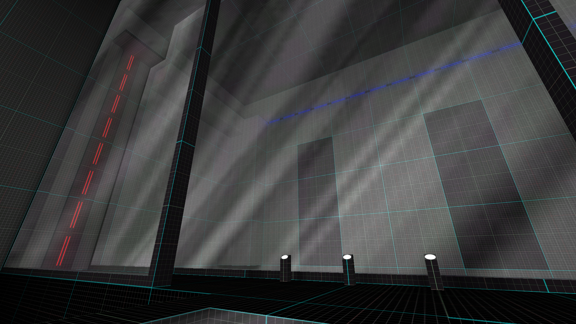
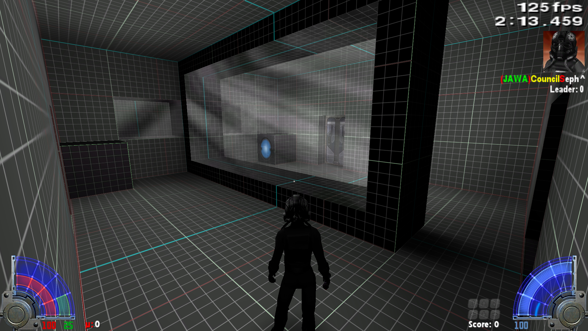
will be adding this to DF2 map im working on for funsies. i gatt work out how im gonna do the interior.