-
Posts
1,439 -
Joined
-
Last visited
Content Type
News Articles
Tutorials
Forums
Downloads
Everything posted by the_raven
-
Tommy Vercetti for Grand Theft Auto: Vice City
the_raven commented on SlavicPickle's file in Player Models
-
- 2 comments
-
- bot support
- npc support
-
(and 3 more)
Tagged with:
-
- 4 comments
-
- droid
- npc support
-
(and 1 more)
Tagged with:
-
-

Raisin's Model-Shots (and maybe a few WIPs)
the_raven replied to Raisinbrand's topic in Art, Media & Technology
Now, if you could release some of these models, that'd be great. -
Maybe. But the jetpack scene felt kinda Looney Tunes-y to me. Also, like I've said, the new episodes jump from one (cool or not) action scene to the next a lot quicker than the previous season's episodes did. I'm guessing it's because many morons people complained about how the show had very slow pacing. As to Boba/ Morrison, I don't really follow his career or life, so it's understandable that I wouldn't recognize him. The only non-AotC movie I've seen him in was an Australian sci-fi film about an alien invasion, and he still looked more-or-less the same as in AotC (granted, he did look older and I didn't recognize him right away). That being said, he's also bald here, which is another factor.
-
In a nutshell and in plain words please. When I first learned of it (saw a youtube video), I've gathered that it was a collaboration between writers with the purpose of expanding the lore of Star Wars. If that is correct then this is a glorified team-writing project? Then all of the content on here that's been inspired by THR, or recreates it, is based on text descriptions and artwork, is that it?
-

Who most likely to fit in force lightning?
the_raven replied to syainkn's topic in Star Wars Franchise Discussions
I think it's one of the lesser reasons that the old canon was ultimately canned, the force powers becoming more and more outrageous. I mean, in the OT, what force powers are there? Telekinesis, telepathy, mind trick, and lightning (choke and jumping fit into the telekinesis category). In the prequels, it's largely the same, with the only exception being Yoda, who absorbed Palaptine's lightning and then shot it back at him, that and maybe absorbing/ reflecting the same lightning with one's lightsaber (as Obi-Wan and Windu did in a couple of scenes). But the expanded universe introduced more and more exotic powers for both light and dark side, stuff like healing, Sith Magic, draining of life and one's Force energy, reviving, poisoning, stunning, invisibility, and many more. What I'm saying is that in the original movies, which were inspired by the classic story of a farm boy (Luke) saving a princess (Leia) and defeating an evil wizard (Palpatine), and the wizard's bodyguard-warrior (Vader), lightning was shown as the ultimate magic power that made the evil wizard such a big deal. The 'dark knight' could also use magic, but his powers were relatively simple by comparison - jumping, choking, pushing, pulling - stuff that just about anyone studying magic could use. For this same reason these basic powers are already available to the player in JO and JA right off the bat, whereas the more exotic stuff (lightning, choke, absorb, shield, rage) needs to be obtained through levelling. So as a conclusion, there's a reason why lightning is primarily (sometimes exclusively) associated with Palpatine and not with other characters, and why so many people like TFO over TFU despite the two being very similar. -
What about Beskar and Cortosis? What about energy shields? What about the Zillo Beast's scales? (alright, the last one really is bullshit) As to whether I like them or not, when I first got a vibrosword/ vibroblade in KOTOR, I thought it was outrageous - in fact, my best friend and I thought it was stupid to have actual swords (technically they're sabres) in a universe where there are lightsabers - but then we figured that people still most likely had need for melee weapons (in a universe where everyone's armed with a ranged weapon? How many people seriously run around with swords nowadays? Outside of sporting and roleplay events, and traditionalist societies, I mean. And we don't even have blasters! Ah, but I digress), and since not everyone can wield or even own a lightsaber, it made sense. As to them being actually resistant to lightsabers, I just stopped caring since it's a game (KOTOR) and all weapons in it could be used to fight lightsaber-wielders, regardless of whether or not they were described as being resistant to lightsaber damage - just a game mechanic basically. Don't know about other mediums, since I haven't read many SW books or comics, but the whole "melee weapon resists lightsaber" isn't as common as one would expect, as not all melee weapons are resistant to lightsabers. I also never understood why the vibroblade, which is a full-lenght sabre in KOTOR was turned into a dagger in other mediums (comics, TCW, The Mandalorian, SWC (MnB mod)). I mean, sure, a vibroblade can technically be any edged weapon with a vibrating blade, but it just stroke me as a bit odd, given how there's little such deviation in most fictional universes. I don't get the OP's excitement though. Yeah, sure, a weapon that's resistant to lightsabers, okay, but having a lightsaber-resistant sabre, even one with a vibrating blade would hardly be enough to actually successfully parry a lightsaber. I mean, those things are supposed to pack a serious punch, which is why people have to actually train a lot to be able to wield them, more so than with regular melee weapons. So like the OP said, a weapon like this can... ... which will still be practically useless. Also, how practical would a sword/ sabre/ axe with a vibrating blade be in the first place? Not against lightsabers, I mean. I imagine it would still require some training to successfully wield one, and even then, how good would they actually be at cutting into someone or something? The vibration would either make the edge go deeper, or would make the cut very uneven, and thus rather weak, no? It's not like the saw-blade from the 40K or from the Fallout universes, that's basically just a one-handed chainsaw, and the vibration there works differently from what we've seen of the vibroswords/ vibroblades.
-
While I love the show, I have to say, I've noticed that the second season feels different. It's less gritty, less moody, feels more family-friendly and the pacing is a bit messy. If in the first season there were many shots that would drag on setting the mood, showing off the surroundings, now it feels like we're just jumping from one action scene to the next. Maybe it's just because of the pandemic that the production is a bit sloppy, or maybe it's just me. I don't know. Wait, what? That was him?? I may be a bit thick in the head, but how could anyone recognize him? ? Agreed. To wait for a whole week just to get... I suppose it's decent in terms of expanding the universe's lore, but other than that, just meh. But what's the big deal about baby-Yoda...
-

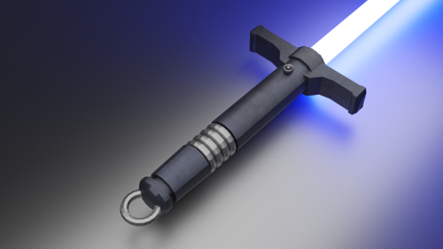
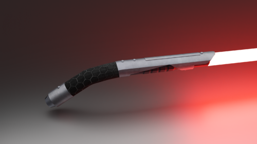
The High Republic Inspired Lightsaber Hilt
the_raven reviewed donajello's file in Lightsabers & Melee
-
-
-
-
- lava
- star wars related
-
(and 1 more)
Tagged with:
-
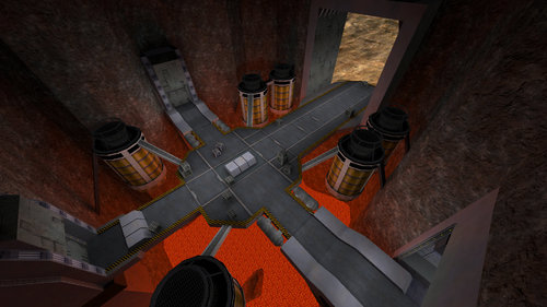
Woah! What's going on here? And in the next two pics?
-
Check it out!
-
So, I'm somewhat involved with the reddit Mount and Blade community, and the guys there have a monthly (or bi-monthly) online event called Calradic Campaign. The gist of it is that each month or two, the event's moderators launch a series of online battles that are supposed to emulate the conquest of a region in the game-world. The event is story driven, which is arguably it's biggest appeal. I figured the community here could do something similar, since we've actually got a ton of maps and models and skins. It might attract new members if advertised properly, or at least make the current members more engaged. I mean, many people on here already play JAMP, so it kinda makes sense. We just need to set up the ground rules, stuff like what period the campaign will taking place in, what sides will be involved, what the rules of engagement are (in Calradic Campaing, each battle follows a 'best out of 3' principle). For example, in MnB there are 'field' battles, and 'castle' battles. Field battles are pretty much like team deathmatch whereas castle battles are sieges. For a similar event in JAMP we could go with space battles then ground battles, or several ground battles in a row, since flying vehicles kinda suck in the engine. Maybe even sieges could work, since 'siege' is literally a game mode in multiplayer (though we could emulate a siege in TFFA). Discuss.
-
Yay! Another contest!
-
Thanks!
-
Hello, world! ? I'm Bach! ? I wanted to download the Kotor pack, but couldn't find it among all those other packs on Jeff's dropbox whereas the dedicated link to the file doesn't work. Can anyone help?
-
-

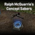
Ralph McQuarrie's concept sabers (Luke and Vader)
the_raven reviewed Rooxon's file in Lightsabers & Melee
- 8 comments
-
- Lightsaber Based Weapon
- Star Wars Related
-
(and 1 more)
Tagged with:


