-
Posts
44 -
Joined
-
Last visited
Content Type
News Articles
Tutorials
Forums
Downloads
Everything posted by Spaghetti
-
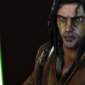
I really like the quantity of interesting alternate skins here. Impressive work. Some minor critiques: The specular shader on the hair doesn't work very well with the transparency (tinges the transparent parts gray, looks really weird).The baked shadows look a bit overdone on the cloth, especially the default skin.
- 23 comments
-
- NPC Support
- Menu Support
-
(and 5 more)
Tagged with:
-
Who can say?
-
This is very true. A wonky lightmap will result in some very odd looking entity lighting.
-
This got attention. Do the jetpack/rocket effects work properly with this? If they do I can lend assistance with the shaders (it's not difficult to do a basic spec for the metallic parts of the armor).
-
Func_walls seem to be buggy like that. I recommend using a func_static instead for this kind of system.
-
Pretty much what Boot and Ping said. You can't go wrong using jaMME and its features are all documented. As for editing, that's really up to your taste. Windows Movie Maker is a good beginner's tool, but you'll soon find it frustratingly limited. Sony Vegas is popular with many, though I prefer Adobe Premiere (pretty advanced but it can be used simplisitcally).
-
- 51 comments
-
-
- 22 comments
-
- jkhub exclusive
- lightsaber based weapon
- (and 5 more)
-
Thanks Pande, I kind of sort of worked my way to that conclusion when I took a second look at the new version yesterday (for some reason I missed the cantina on my first check). The original author of that Cantina seems to be Chalmun (found while searching Google for the old assets). I'll probably try to get in contact with him now that I know who did it (the Cantina part anyway). Though I assume whoever started work on the MBII map already had permission, it's changed hands enough that I wouldn't even know who to ask. May as well check with the source. NECRO EDIT FROM 2019: Apparently I confused the name of the fictional cantina owner with the map author. Actual author was Krattle (thanks mrwonko for preserving filefront).
-
Just some of the map assets for Mos Eisley - textures and shaders (I think everything else is present).
-
It would save many, many hours of work duplicating the same thing. I'd call this a very strong want.
-
The .map (or at least a version of it) is present in: JKG/Map development files + Extras/Maps/Tatooine/OLD_Mos_Eisley.map. That said, many of the texture assets seem to be absent. The associated shader too. We have a version of Mos Eisley developed for MBII with a very incomplete Cantina that seems to be a doppleganger of this layout/design. I'm guessing the same mapper was involved. Either way, releasing the assets would be a huge boon to the development of our version.
-
-
Thanks for the help EZ, simple enough to remember.
-
I am very curious about this too, there are many applications where LODs are vital for performance.
-
Catwalk removal is definitely good, as is the cover change at main. Meshing your take on the old layout would be hard to do with this though. The balcony isn't really authentic, but it works quite well for gameplay as throne camping was a common balance complaint. Given the other changes, I would need to rework it quite a bit to fit your version (probably by dropping the balcony aesthetic and using an indoor corridor instead). As to performance, I'd probably have to sacrifice some complexity here and there. At least in spots like hangar it should be possible to combine some of the brushwork into composite textures for the floor segments. Also I must ask about the lighting. Your screenshots look a bit brighter than in-game in general so I'm guessing your gamma is higher than default, or maybe the compile I tried is old. The areas around main and throne seem particularly dark even in your screens though.
-
Well that's certainly something. Recent work on a layout change for MBII's DotF was just released, and I was planning on continuing with improvements by integrating and finishing the V2 Mace was working on. Now I have to think about this version which is much more complete (and pretty), but incompatible with the current layout and might pose performance issues in MBII (yay code inefficiencies). Not sure whether to thank or curse you Pande.
-
That really looks a lot better than I'd imagine it could in this old engine. Kudos.
-
-
-
A proper Savage would be cool, though I still can't get over the silliness of his name.


