-
Posts
205 -
Joined
-
Last visited
Artemis's Achievements
-
Artemis liked an article: Winners of the Duel Map Mod Contest
-
Trotyl liked a file: TFFA Brutal
-
bigphil2695 liked a file: TFFA Brutal
-
Artemis liked a post in a topic: Duel Map Contest Poll
-
Artemis liked a post in a topic: Duel Map Contest Poll
-
Artemis liked a post in a topic: Duel Map Contest Poll
-
Reepray liked a file: TFFA Brutal
-
Merek liked a file: TFFA Brutal
-
NumberWan liked a file: TFFA Brutal
-
Pandora liked a file: TFFA Brutal
-
Artemis liked a review on a file: TFFA Brutal
-
Circa liked a file: TFFA Brutal
-
Sithani liked a file: TFFA Brutal
-
DarthValeria liked a file: TFFA Brutal
-
Artemis liked a review on a file: TFFA Brutal
-
Artemis liked a review on a file: TFFA Brutal
-
cNightshade liked a file: TFFA Brutal
-
Artemis started following TFFA Brutal
-
151 downloads
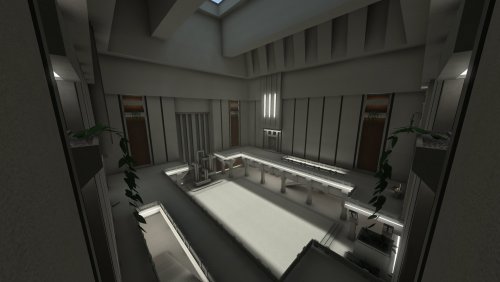
This is a small(ish) duel/TFFA/FFA map intended for 1v1 to 3v3 gameplay, although there is enough space for more players if this is used in FFA. It's inspired by brutalist architecture. It uses a limited number of textures and assets (both base and custom, with the furniture and vines made in NetRadiant as .ase models). It does include botroutes, but I did notice that bots tend to get stuck around the stairs. There are no item pickups on this map. This took about 2 hours to compile.- 1 comment
- 4 reviews
-
- contest entry
- duel map contest
-
(and 1 more)
Tagged with:
-
Artemis liked a post in a topic: Jedi Knight: Jedi Academy 20th Anniversary Event!
-
Artemis liked a post in a topic: The Raven's Nest (thread for my WIP)
-
Artemis liked a post in a topic: School of War: Tron Legacy Edition
-

Anybody home (unlocked basejka servers?)
Artemis replied to iwillmakeitlegal's topic in Introductions
Oh, that's not the issue at all, lol. It's to keep new players who have no idea about what's going on from joining, jumping ingame during a pug, and causing chaos. -
Aaaaand I'm back for another post. I'm going to be adding the Duel1 replacement to the list of downloads at the beginning of this thread. The only difference (that I remember) from the screenshots of it before is that I've added a Jedi Knight League banner to the back wall. It should be fully playable on base servers, provided that you use Eternaljk or have another way of bypassing sv_pure. It will possibly break on FFA servers that have it entity modded into another map, though, so beware. And now for something new, I've spent the past month working with someone else as a partial art director to make an FFA3 replacement that will work the same way as the Duel1 replacement. I'll also be adding it to the links at the beginning of the thread. The final compile took almost 14 hours total (to think I was getting antsy about 2 hour compiles before!), so I don't plan on making any changes to it in the near future. Maybe in August if there are things that need to be changed. Several screenshots ahead:
-
Quick update on the instagib map, I added bases for either side so CTF can be played. I don't think the layout is ideal for CTF because there are only 2 ways in/out of the bases and one of them is a teleport (I ran out of patience with trying to connect hallways together). Hopefully I'll be seeing the map in action soon, so I'll know what all to fix so I can call it done. I did forget about changing the sky, but the map's taking about 2 hours to compile now, so I won't be messing with it just yet.
-
I swear I'll get back to the temple map eventually, but in the meantime, I've got a couple of other projects I've worked on. The first is more technical than artistic. I've used a lot of flat colored pngs in some of my maps, and I decided to simplify them all. For the flat colored textures specifically, I didn't even need a png to start with, I could just specify the color of $whiteimage with rgbGen const. So with that, I've got the black/grays/white colors that I need, along with most of the rainbow of other colors, and a variety of glowing textures. I also wanted to simplify a texture that was mostly gray with a colored border that I use for boxes and jump pads. I had a separate base texture and glow texture for each color, but I've got it cut down to one gray png with a transparent border and a single glow texture. The map I tested this stuff in only has 4 custom textures, and a pretty lengthy shader file. Test map: Some of the shaders, if anyone is curious. The one for the squares is probably not the most efficient, and I'll take suggestions to further fix it if anyone has any. Also I just realized I'm rgbGen const'ing $whiteimage to white in all of the white shaders, which is probably super unnecessary. Shaders are not my strong suit. I also revisited my ysal arena map and redid the texturing on it so it's not cheddar cheese orange anymore. If you want to compare, there are a couple of screenshots of it on the previous page. Then I made a functional? instagib map over the weekend. It hasn't been tested yet, beyond me making sure the team spawns, teleports, and jump pads work properly. It could still use some tweaks as far as map geometry goes because there's a lot of empty space. It's also a little bit small, so I might try adding on a room and maybe some CTF aspects. This map and the ysal map do not have light entities, invisible light brushes, or any worldspawn lighting currently. They're both taking about 30 mins to compile with -fastbounce, so I'll probably have to do final compiles when I'm actually out of the house for a decent length of time (not right now). Also, the base sky shader is probably a placeholder until I find a better one.
-
Taking a tiny break from working on the temple map to do something else. I don't spend a lot of time on duel1 because it's very dark (and also a duel map), but I do spend a ton of time on ffa3, so... I decided to see if I could just make duel1 look more like ffa3, and it appears that I can. I hopped onto a server to test it and noticed some weirdness, not sure if it was the server or my map, though. It could use some more work, I just put the map models back where they were on the original duel1 since I didn't know what else to do that would fit within the clip brushes. Also, there are a couple of buggy places where there's brushwork in my map and not in the original that I should make nonsolid.
-

EternalJk And finding servers
Artemis replied to LSD_Polyphony's topic in Jedi Knight General Discussions
@LSD_Polyphony Make sure you have the latest release from here. If you're running Windows, that's going to be the eternaljk-win32-portable.zip. Make sure you extract the contents to the Gamedata folder, then you should be able to just run the eternaljk.exe that's included. -
@AshuraDX I'm going to attempt that with python and Blender, sounds like a fun learning experience. I've tweaked my compile settings and did end up replacing -dark with -dirty because the other weird spots were apparently coming from -dark, but that still didn't fix the jagged lines on the terrain. I also tried q3map_lightmapMergable, different q3map_shadeAngles, q3map_lightSampleOffset, and even just raising/lowering the verts to see if that would do anything, but so far, nope. The terrain is brushes, but maybe it has to do with how they've been exported from Blender? They're not the normal trisoup/quadsoup shape, they just have 4 verts apiece. I can take a look at the script and maybe figure out a way to export them with 6 verts, dunno. I might need to just take a chunk of my map out and make it a new map so I can test the light settings without compiles taking forever. With current settings I'm getting 2 bounces in an hour with -fastbounce, so I haven't even had a chance to try 8.
-
@AshuraDX I swapped out ambient for a low _minlight value that may or may not be working out alright, and also took screenshots on gamma 1 this go around, instead of 1.25. At some point I tried using multiple suns in my sky shader, but they were throwing shadows all over the place and obscuring the more defined shadows that I actually wanted. I'd be up for trying it again, though. I've compiled it again with these settings, but I'm noticing some weirdness in places. -light -fast -filter -bounce 4 -bouncegrid -bouncescale 1.3 -dark -patchshadows -samples 2 -shade These places probably are supposed to be shadowed, but they look kinda buggy: Then my terrain is getting wrecked by -dark in places, which is unfortunate because this looks cool elsewhere on the map, and I'd rather not have to remove it. And here are some new overall screenshots; I think I've got the exterior pretty much how I want it, but I still need to break up a lot of the floor space and add details. Also, apologies for the lack of anti aliasing and jagged lines:
-
I decided to start working on another map, this time a little bit outside of my comfort zone. It's primarily outdoors (only outdoors right now), and the lighting has not been easy. I'm using a shader sun and ambient light in the worldspawn for most of it, and it's still turning out pretty dark on the bottom floor, especially on default gamma. I'll have to tweak it more as I go. The map itself is based off of some artist's rendition of the hanging gardens of Babylon. It's currently super blocky and lacking details, but I want to get the shape of the building down before I get too distracted with adding plants and more decorative stuff. I originally started out with trisoup terrain, but after some trial and error I switched to Blender and exported some questionable, sculpted terrain. The past couple of days have involved messing with horizon blending, but I've finally gotten that to a point where I feel like I can leave it and work more on the building... Although I might redo the terrain again entirely later on, Idk. Water textures/shader are borrowed from Szico's horizon blending tutorial for the time being. Images:
-
Just dropping by to post this very small TFFA map. Source .map file is included. Download here. Images:
-
It looks like the normals are flipped around in spots. There's an option to disable backface culling in Blender somewhere, I can't say exactly where from memory. But turning that on should let you see what's messed up. Alternatively, there should also be an option to just show the direction of the normals, which I think you can only get to in edit mode. You can fix it in edit mode by recalculating normals or selecting just the problem areas and flipping normals, because sometimes recalculating only half fixes it.
-
- 11 comments
-
- Space
- JKHub Exclusive
-
(and 1 more)
Tagged with:
