-
Posts
967 -
Joined
-
Last visited
Content Type
News Articles
Tutorials
Forums
Downloads
Everything posted by Lancelot
-
.thumb.jpeg.9a118f9ebe83e7f2b12f5b299a8a94af.jpeg)
Evolution of Combat IV - Main Topic
Lancelot replied to MattFiler's topic in WIPs, Teasers & Releases
No, K**F was worse. It was a disaster of a mod that just couldn't establish itself in the community in a positive way. It turned forum topics into battlefields and split the community into two parts, the supporters and the Anti-K**F activists. Topics have been smashed to the ground, expectations have been shattered and the mod was laid to rest shortly before the long awaited full version was about to be released. EoC IV might have similar attributes, but I'm staying rather neutral to it (because I can't tell what's going on "behind-the-scenes"). This mod has at least the chance to redeem itself, maybe by removing unpermitted or unnecessary content in the next updates for example. -
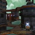
I totally agree with it. Coruscant has this cyberpunk style, kinda like Blade Runner, that isn't reflected in Jedi Academy at all, not even in the architecture. All you have there is just plain square rooftops and colorful buildings. And there are some snipers and the usual bad guys you've seen already throughout the entire game. As much as I like the map, I think it really is in need for a remake that looks and feels like Coruscant.
-
@@DT85 I'm trying to focus on the bigger details rather than the smaller ones. This is one of these "bigger details" (it's a new version of an existing part and needs some cleanups): It probably doesn't look like it, but I had a hard time modeling this part. This is how it should look like according to the reference pictures. The whole modeling process is sometimes a real pain in the ass, especially when I find something that doesn't look like it should. But on the other hand, I love the challange.
-
After making some adjustments, I tried to add more details by adding panels to some cones of the model. I also tried to reduce the tris count as much as I could. This is my result so far.
-
.thumb.jpeg.9a118f9ebe83e7f2b12f5b299a8a94af.jpeg)
A relatively simple request, if I may...
Lancelot replied to the_raven's topic in Mod Requests & Suggestions
Looking at the original models and the reskin by @@Omicron, I think it's time to give every appearance of Jaden a complete makeover. -
Blade Runner is the movie that inspired and still inspires EVERYTHING! (well, not really ). The whole cyberpunk genre was invented and defined by this movie. Blade Runner inspired Ghost in the Shell, and Ghost in the Shell was the inspiration for The Matrix. The impact Blade Runner has on movies is massive and still holds up to this day, considering that people didn't understand the story of it back in 1982, because it was ahead of its time. You wanna know more things inspired by Blade Runner? - Coruscant - Batman Begins - Cowboy Bebop (partially) - Snatcher (a game by Konami) - Cyberpunk 2077 (upcoming RPG) - Deus Ex Oh man, let's just focus on the request, were kinda off-topic now. I just love Blade Runner. I hope somebody picks up this request one day.
-
Okay, I removed many tris and adjusted some small things. It's not perfect yet, but looking at the tris, it's an improvement. If you have any advices, just let me know.
-
@@DT85 @@AshuraDX Thanks for the advises, guys. I'm trying my best to reduce what needs to be reduced while still preserving what's necessary. And I learned not to loose myself in many details, because much of it can be achieved with good texture work. That's what killed my previous model. I was losing myself in so many details that the of tris-counts and face-counts were exploding. As I said, there is still much work to do. The recent version of this model is pretty new, so it will take some time to get satisfying results.
-
Kept you waiting, huh? I had to redo the model from scratch. Still needs a lot of work, but this is my result so far.
-
Totally! I love Blade Runner! (A Blade Runner is a profession in the movie, just like a detective, who tracks down replicants to "retire" them. Deckard is one of those Blade Runners. Go watch the movie if you haven't yet, then you'll understand.) And no, the head of the Han Solo model that has been made many years ago is awful. Frankensteining it on another model wouldn't do Rick Deckard or even Harrison Ford justice. If we had a better Han Solo model that actually resembles him, that would be cool. The only model that comes close to Rick Deckard is the Mercenary Kyle model. All he needs is a trench coat and some decent textures.
-
.thumb.jpeg.9a118f9ebe83e7f2b12f5b299a8a94af.jpeg)
The Force Awakens Conversion Mod for SP
Lancelot replied to GPChannel's topic in WIPs, Teasers & Releases
That's exactly what most skyboxes need. When it comes to skyboxes, you need to think big. The original ones used in the game are lacking depth. Giving the impression that something interesting or menacing is outside right next to your location, something that you just want "to touch", is far more appealing than just flat landscapes. This skybox gives you the feeling that you could just jump into an X-Wing and fly right into the Starkiller Base. -
@@Scerendo Hapslash's Anakin model had the same problem. Circa made a tutorial how to fix that. Maybe that might be helpful: It's not much different from what @@Barricade24 said, but at least you've got a clue what might be the problem.
-
.thumb.jpeg.9a118f9ebe83e7f2b12f5b299a8a94af.jpeg)
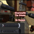
The Stinger (Reborn Lightsaber) - WeaponsHD
Lancelot commented on Rooxon's file in Lightsabers & Melee
- 6 comments
-
- Star Wars Related
- Lightsaber Based Weapon
-
(and 1 more)
Tagged with:
-
.thumb.jpeg.9a118f9ebe83e7f2b12f5b299a8a94af.jpeg)
The Force Awakens Conversion Mod for SP
Lancelot replied to GPChannel's topic in WIPs, Teasers & Releases
Oh, you mean that one? https://variety.com/2016/digital/news/star-wars-force-awakens-pirated-blu-ray-quality-1201737273/ I don't mean to be offensive, but seriously guys, you can be happy that JKHub isn't a Facebook sort of thing where you have to show your real name. Lucasfilm and Disney would force choke you if they knew that you "own" a pirated copy of the film. If you have these copies, you should keep that for yourself. The official DVDs and Blu-rays will be out within the next few weeks, so that bit of waiting isn't that hard to endure, isn't it? -
The Force Awakens has so many interesting locations to offer, it's hard for me to make a clear decision. But I would love to see Rey's home and the Starship Graveyard on Jakku, the bridge of the new Star Destroyer, the interior of the Starkiller Base and Ahch-To (for which Skellig Michael was used).
-
This is an interesting request actually. Nobody made a Sith version of Padme before (well, at least I don't know any). Just give it a try. The Padme model made by Toshi is the best one to start with.
-
It's an old map, probably made before Jedi Academy was out. The screenshots are the ones made by the original mapper. Back then, high quality screenshots were pretty rare. (And don't bash Polaroid cameras. They are not popular for no reason. If you use them correctly, you can make great photos with them.)
-
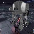
@@Archangel35757 Although many animations in Jedi Academy are decent, some of them are looking a little bit weird. Especially the gun animations (running, idle and shooting) are a little bit awkward. For example, when holding a gun in Jedi Academy, it looks like this: Instead, it should rather look like this: And when holding and shooting with a rifle, it should go into the direction of this: Not the best examples, but I hope you know what I mean.
-
.thumb.jpeg.9a118f9ebe83e7f2b12f5b299a8a94af.jpeg)
Real Life Models, Weapons and Maps
Lancelot replied to Finalizer's topic in Mod Requests & Suggestions
Counterquestion: Would you like to see something that you have created on your own being used by others without your permission? Porting models from other games without permission means copyright infringement. And depending on the company you lifted the content from, it might cause big trouble or a big-ass lawsuit. Let's say the admins of JKHub would have allowed ported models on this site (and I'm talking about fully ported models, not some parts of them), this site would be closed down by now. -
.thumb.jpeg.9a118f9ebe83e7f2b12f5b299a8a94af.jpeg)
Real Life Models, Weapons and Maps
Lancelot replied to Finalizer's topic in Mod Requests & Suggestions
Gunslinger's Academy http://www.moddb.com/mods/gunslingers-academy/downloads -
.thumb.jpeg.9a118f9ebe83e7f2b12f5b299a8a94af.jpeg)
Real Life Models, Weapons and Maps
Lancelot replied to Finalizer's topic in Mod Requests & Suggestions
Some of these weapons have been made and were available on JK3Files, but they are hard to find now. Even a Desert Eagle has been made. http://www.lonebullet.com/file/models/desert-eagle-50-cal/818 -
A good start would be to modify the Jetpack from Jedi Academy to make it work like a Jump Pack. And if it works, a Jump Pack model can be done afterwards. I would say that a Jump Pack would be great to see in Jedi Academy. It looks silly when players are running and flying around with Boba Fett's Jetpack.
-
- 5 comments
-
- New Effects or Textures
- JKHub Exclusive
-
(and 1 more)
Tagged with:
-
.thumb.jpeg.9a118f9ebe83e7f2b12f5b299a8a94af.jpeg)
Can anyone make a proper Sabine Wren?
Lancelot replied to the_raven's topic in Mod Requests & Suggestions
The model of Sabine Wren should look like in the second picture. To be honest, I think she looks even better in this picture than she does in Rebels.


