-
Posts
643 -
Joined
-
Last visited
Content Type
News Articles
Tutorials
Forums
Downloads
Everything posted by AngelModder
-

Kanan Jarrus (Very Early W.I.P) Jedi Academy Model
AngelModder replied to Liam's topic in WIPs, Teasers & Releases
I was actually just thinking the other day I'd love a model of this guy for jka! Was any one else a little disappointed by season 3? XD -

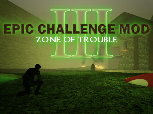
Jedi Home III - Temple Edition
AngelModder replied to AngelModder's topic in WIPs, Teasers & Releases
Maps really growing now... XD! Hmm see some thing familiar out that window there! -

Jedi Home III - Temple Edition
AngelModder replied to AngelModder's topic in WIPs, Teasers & Releases
-
- 30 comments
-
- Non Star Wars Related
- Contains Skins or Models
- (and 2 more)
-

Jedi Home III - Temple Edition
AngelModder replied to AngelModder's topic in WIPs, Teasers & Releases
Theirs a lot more to this then what I'm showing in these pictures, and still a lot to adjust in these area's. However these should make some of you feel a little more at home! -

Jedi Home III - Temple Edition
AngelModder replied to AngelModder's topic in WIPs, Teasers & Releases
Yep, they'll be in the courtyard. I always liked that my self. -

Jedi Home III - Temple Edition
AngelModder replied to AngelModder's topic in WIPs, Teasers & Releases
here is a few more shots, This is a re conception of the main entrance chamber. in the original you came in and it was all "Welcome home Jedi" and had the cantina up above. In this one as we're sticking a little more to an authentic jedi image it has a sweeping stair case that leads up to the student cafe you can also go through the cafe and go into the main lobby. The entrance beneath the sweeping stairs leads into like the original an antech chamber with elevators taking the students down to there classrooms etc. A quick note on the overall concept, this map is While tipping it's hat to JH3 as far as overall theme and name sake, does tip it's hat also to a more gounded realistic jedi academy as well as the original's location. to sum it up it's the rend2 to vanilla of JH... XD Lighting and such is not final etc etc you know the drill. LOL These hallways will contain doors on one side leading to a simple student bedroom section. Nothing fancy or fps/compile wasting just for a bit more Rp a tribute in a sense to the fantasy/roleplay of the original V1 Jh. -

Jedi Home III - Temple Edition
AngelModder replied to AngelModder's topic in WIPs, Teasers & Releases
Hmm those are all good point's however. This map has had many peoples input from day one, all of which were greatly in love with the original Jh's. From moment one we knew we had to go above and beyond the original two while at the same time NOT killing FPS. We do have to take into consideration lower and pc's but also the capabilities of most pc's these days. I can assure you I have finely balanced this map. We use a 2 gig gpu for most of the buld however it has been tested on a 256 mb gpu and all the way up to a 8 gig gpu all have reported through the map an average of 60-90+ fps on server with bots and players. So please rest assure this wont kill your fps. Most look at places like the walls and see multiple layers for the different texturing. I choose to combined these into one texture. This being practiced in multiple area's along with false shadowing and bloom effects has done wonders for controlling the fps. The new version is greatly different then the original 2 as far as aethetics go, however I'd point out the V2 was greatly different then V1. The same feeling's were felt about v2 over v1 during it's initial release and testing. Many felt v2 was too different in many ways and lacked the same imagination and creativity of the first and aimed more for realism. Most and the others overtime where won over by the V2 through immersion. I feel some opinion may be being a bit biased sdue to me NOT being Shadowstone. While I can respect this, SS admitted himself that he was only a novice at mapping and did so mostly as a hobby part time and it's lay out and area's were greatly for that of his clans needs. Not so much for the community at large. I would ask that you give it a chance. I can't see how even just on the premise of what it is that it will disappoint. There will be more photo's coming soon, possibly tonight; I've been taking everything all of you have said into consideration and have been working the texturing and architecture more towards the original's. However you must acknowledge that the overall idea had to grow. While some may argue that the facility was NOT on bespin, I argue it was due to the fact it not only used it's skybox, but it used about 50% Bespin texture's aside from SS's personnel textures. As well SS himself stated in server that the original concept was a hidden Bespin facility. Whether this was his original intent OR one he excepted and adapted to over time who will ever know. A few have also questioned the reasoning behind so many new area's in the map. V2 actually cut out a lot from v1 and had area's v1 didn't have, this is not only a combination of boths ideal's but and extension. Natural progression. Any who here is a pic of the nearly finished main lobby. I still want to replace the statue's but that will more then likely be a last minute addition before release. Thank you for your support! -
Ok so a few thing's I've elarned since posting this. 1 : NEVER include a .srf file in your pk3... Very bad stuff happens! 2 : Using the export import switches in the lighting stages yes you can import custom work and save the compiler a SHIT load of work and get a much better product. i believe theirs a tutorial I recently ran across on here covering this. 3 : Using this in conjunction with self made shadows and bloom ='s OMG beautiful. To sum it up, I HIGHLY recommend people learn these methods. using func groups to control what is casting shadows and not, what is receiving shadows and not, fake shadows and bloom effects, custom .Srf files beat's any thing q3map2 could produce no matter what level of GPU/CPU you have. As well you speed up your compiles 200% or more if you really just get down to brass tax and do a lot of the fore mentioned techniques your self.
-

STAR WARS: Movie Duels (Remaster of Movie Duels II)
AngelModder replied to General Howard's topic in WIPs, Teasers & Releases
So moving forward as we must. If theirs any thing else I can do for the project let me know! -

Jedi Home III - Temple Edition
AngelModder replied to AngelModder's topic in WIPs, Teasers & Releases
Interesting thoughts, this would be some thing I'd like to take a poll on. Yes, yes, and yes... XD -

Jedi Home III - Temple Edition
AngelModder replied to AngelModder's topic in WIPs, Teasers & Releases
O-o.... I didn't cancel the map... -

The path of the Apprentice
AngelModder replied to dark_apprentice's topic in WIPs, Teasers & Releases
Really? Some one tries to protect his work and that's how you treat them? And to do that you would have to go back to Dark Forces one.Theirs not many of us old school mappers around any more. Starting to wonder why I even stay... -

The path of the Apprentice
AngelModder replied to dark_apprentice's topic in WIPs, Teasers & Releases
Nah it's done before it even started. Injecting there thoughts on some thing that doesn't concern them trying to judge some one who has reasons for being protective and a right to be... They lost as soon as they posted. XD -

The path of the Apprentice
AngelModder replied to dark_apprentice's topic in WIPs, Teasers & Releases
And I just don't care... _,|,, I'm a jerk for a reason, know me before you judge... That's truly childish. -

The path of the Apprentice
AngelModder replied to dark_apprentice's topic in WIPs, Teasers & Releases
Good, then don't touch mine... -

The path of the Apprentice
AngelModder replied to dark_apprentice's topic in WIPs, Teasers & Releases
The body texture in HIS variation. All he did was alter the tone/color of it... Where as I when I made this completely started from scratch. Now The one I MADE! Now I want to be fair here and sya the only reason I never responded to your request bud was that I was inactive at that point. That doesn't mean since I don't answer you can just go ahead and use it... To be honest I like what you've done with the model. And since you DID at least attempt to request, I'll forgive this once. But I also had to make my point and case clear, ^^^^ THIS is exactly the kind of crap I'm talking about people! Stop using other peoples work without permission! Now, Apprentice, continue your work, you may use the texture, I would appreciate it if you came to ME for alterations to it in the future rather then doing them your self. -

The path of the Apprentice
AngelModder replied to dark_apprentice's topic in WIPs, Teasers & Releases
Not the face it's the body texture, the actual suite. Don't make me drop some comparison shots, this is the third person I've found today who has the exact same texture I made slapped on other variants of this model... -

The path of the Apprentice
AngelModder replied to dark_apprentice's topic in WIPs, Teasers & Releases
You really need to make sure you have some ones permission first before you use there stuff. I spent almost two months on the textures and the project overall. I see you did try to ask permission but read the post at the end... -
-

Luke Skywalker Dark Empire II (Legends)
AngelModder commented on The Punisher's file in Player Models
I want this removed... You did NOT have permission to use my texture and most definitely were not given permission to edit it! I am really getting sick of how many people are disobeying my wishes and using this texture, re-uploading Vader under different names on other sites... You can use toshi's vader withing his own wishes, my texture... NO!- 13 comments
-
- Star Wars Related
- Male
-
(and 2 more)
Tagged with:
-

Jedi Home III - Temple Edition
AngelModder replied to AngelModder's topic in WIPs, Teasers & Releases
Dont feel down folks work is being done on this. I'm just waiting until things are more finished before I show any thing more !!!!!!!!!!!!!!!! -
Yea I think a good video or set of video's would be nice going over what to do correctly and how all the new thing's work and should be used. The new shader's, entities etc. The best way to get people to use a product is to correctly show them how to use it. I hope they do some thing like this!
-
So I know this is sort of butting in. But I'm currently working on Jedi's Home III, I've been watching for some time your guy's progress. If you're willing I'd like to make a version of JH3 work/use rend2 in support of your guys's work. I'd need to know HOW to set up my end to build/compile but other then that you don't need to hold my hand. In other words, I want in on this XD!
-
Most curious myself. LOL I think theirs more former Jawa's here then not some time's. XD A trend perhaps?


