-
Posts
568 -
Joined
-
Last visited
Content Type
News Articles
Tutorials
Forums
Downloads
Everything posted by MoonDog
-
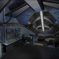
You can add these to your post if you want. First areas after I retouched them. I wish I had pictures of what it looked like before
-
My first reaction to your screenshots is that the interiors are way too dark.
-
Don't most of your threads start that way though?
-

JKO in Unreal Engine Porting Discussion
MoonDog replied to CaptainCrazy's topic in Art, Media & Technology
An epic decompile. Tis a fact my love. -
Maybe to demo the model, but I'd like to see something a little less confined and RP-y. Layout wise, less of a basin and more of a U-bend mountain range with dips for streams/frozen streams. Get some low poly fur and pine trees for medium distance vista, and some others with a bit higher definition for use in playable space. Architecture wise, I was thinking something like this: Broken platforms and vestiges of other floors could be added to make the space funner for saber combat. Also, stuff like that would be pretty easy to model in a 3D package like Blender Max or Maya.
-

JKO in Unreal Engine Porting Discussion
MoonDog replied to CaptainCrazy's topic in Art, Media & Technology
An epic decompile. -
I dont know why, but something in me is very excited to see a moose walking around JKA. Particularly if some one makes a cool wintery abandoned castle grounds type level with forests.
-
I knew we should of raised more funds for 4. It's not too late to bribe people though.
-
I don't know. It was actually a really good discussion for a while, then it sort of just spiraled out of control a few times, stalled and crashed into a mountain.
-

How to add a constuctions from gtkradiant to the skybox?
MoonDog replied to Langerd's topic in Modding Assistance
A box off some where in the void with geo in it. Place a misc_skyportal in that box. -

OMG The new serenity firefly map for JKA is...
MoonDog replied to Merek's topic in Jedi Knight General Discussions
You won't get an argument from me. it is. -

OMG The new serenity firefly map for JKA is...
MoonDog replied to Merek's topic in Jedi Knight General Discussions
Unless you didn't design with any sort of PVS scheme in mind. -
Why would we let you know? Are you the Emperor of Files? It may not be about being petty. Someone may have made a mod they wanted exclusively on a different site. Just like there are exclusive files on this site. I wouldn't want something I uploaded with the intent of being exclusive to JKHUB appearing on a different site.
-
Conversely, I've seen school taught modelers that suck really really hard. I think having the drive to dig through the internet to teach yourself yields more talented, albeit less technical modelers. Even then, that isn't always the case. Some people really dig into all facets of the process.
-
Oh yeah you can do that. Except you have to redo all the vis work. Detail/structural brushes. Lights, texture alignment and scale, misc_model placement.
-

Help D: Is it my mouse or my laptop?
MoonDog replied to Mysterious Stranger's topic in General Tech Support
Did you know it takes roughly half a million mice to equal 1 horse power? -

OMG The new serenity firefly map for JKA is...
MoonDog replied to Merek's topic in Jedi Knight General Discussions
Sigh... go back to the playground. -

OMG The new serenity firefly map for JKA is...
MoonDog replied to Merek's topic in Jedi Knight General Discussions
Its not a contest. -
Nope. It's just how I was taught. I like using a single trigger for that kind of thing.
-
This is a good point. He'd have a much greater chance at completion by starting with the MP side, gaining momentum and contribution, and then continuing to do an SP conversion.
-
Welcome. I like your album, cool work. You are currently in school for game design? Or are you working in game design?
-
-
Are you talking about the first Tribes? If so, I love you. If not, I don't love you. I will still sleep with you though.
-
Whoever told you there was? lol... Furthermore, how do you justify your aggressive and argumentative stance on the issue when they are obviously willing to listen to your suggestions and try to accommodate you? Perhaps stop behaving like an ape. Do explain why you need admin on an IP.Board in order to organize anything. Iterating that you are some sort of victim of prejudice or exclusion because you are a "competitive player" is literally one of the silliest things I've ever seen here. That's saying a lot considering that Ory'Hara slams his face on the keyboard and presses post all most all the time. Once again, they are clearly asking for your suggestions. I don't think you've listened to the other half of the conversation you are participating in. Also, you keep using the term "PR".
-
After 11 pages of discussion, a full compromise was made, and the most un-vague rule ever created was enacted into existence. Good job guys. So glad all the discussion didn't go to waste.


