-
Posts
2,319 -
Joined
-
Last visited
Content Type
News Articles
Tutorials
Forums
Downloads
Everything posted by AshuraDX
-
chalk likes to disappear for a few months from time to time but usually he returns some time later , he has been gone for allmost a year not too long ago and then he showed up here just from out of nowhere
-
that was done at the very beginning of my modding career , dont ask me why or when I made it I think it was just a test
-
which one of both ? or both ? I actually made a rainbow saber a few years ago... it basically utilised a couple of saberblades that had different lengths assigned to them to create this effect : https://imagizer.imageshack.us/v2/813x650q90/839/shot0153.jpg just remembered that I once did it like that which won't look odd in MP asweel but it's also horribly overpowered without changes to the damagescales
-
okay - jokes aside now I have an idea how to accomplish this in SP , it'll just look dumb in mp , or the effect will effect all sabers which would be an easy trick to perform
-
take out some of that blue and I'm happy with the textures as they are , the emtal just appears a bit too blue to me right now
-
much better !
-
I'd have alpha mapped the teeth also pull the center vertices in the lower jaw forward a bit , it'S a straight lnie atm and that's just not very organic
-
you just kept it a lil too blocky at the beginning otherwise it is indeed quite similiar to mine
-
I hope you mean the secondary blaster firemode , the full auto mode I dont think that overheating would make to much sense with the semi auto mode
-
I'd say I'll get started a a simple basemesh once I'M done with my exams for this yer (about 2.5 weeks)
-
so would you collaborate with me on this ? if so I'd say we look for a third one and get started then
-
Well a friend of mine ran across this with his first playermodel and we both spent ages looking for the issue, until I got the idea to rezip his archive and voila it worked , turned out he renamed a .rar to .pk3
-
say... are you using winrar to make your pk3's ? if so make sure that you set your winrar to output .zip and not .rar archives
-
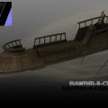
@@Xycaleth I'd like to offer my skiff model for testing purposes as it has fitting normal and spec maps I could also offer a version that doesn't utilise any smoothing groups if that'd be desired for testing purposes if you need to take a look at the mesh's vertex normals : modview can display them - just press ctrl+v here are the 2 normal maps if you're interested : http://i.imgur.com/Q1dbG1M.jpg http://i.imgur.com/DTyymIk.jpg edit : https://jkhub.org/files/file/1910-bantha-ii-cargo-skiff/
-
it is capable of using all plugins you feed it that where made for the version of max you're using the student license expires after 3 years though you can chose between 3 of the more recent versions of max to acquire it just gogle autodesk students
-
well a new clone model could probably be done in collaboration if a couple of modelers got together I'd say if we can build a team of 3 modelers or so I'd we go for it
-
@@Circa these models make great reference material
-
the use of guns is required in one of the missions , the mission in the imperial outpost during which you get captured and disarmed, depending on your force power choices you wont need weapons but it'S going to be a lot tougher than just grabbing a golan arms from one of the storm officers and the blast your way out
-
@@Rooxon why torrent it when there's a student version ? I use milkshape for my conversion processes but I guess noesis should do the trick aswell
-
doesn't really matter as far as I know , upon export it will be converted anyway - in 3ds max the editable poly just offers a few more neat tools and allows faces with more than 4 sides I'd say 18 is A LOT if you really want to go high stay with 12 it's more than enough
-
- 5 comments
-
- Star Wars Related
- JKHub Exclusive
- (and 2 more)
-
@Roxoon so far it looks pretty bland andm ore like a stone than a metal sword
-
https://jkhub.org/files/file/1910-bantha-ii-cargo-skiff/ Released
-
Version 1.0
486 downloads
I finally finished my skiff vehicle for Academy to spawn it open the cheat console , activate cheats and type : "npc spawn vehicle skiff" Please notice that using the skiff_anims.pk3 file will make swoops and other vehicles that use the swoop animation ridiculous while only this skiff profits from the aniamtion replacement - this makes it also incompatible with any other animation mods Have fun !- 5 comments
- 12 reviews
-
- Star Wars Related
- JKHub Exclusive
- (and 2 more)


