-
Posts
2,319 -
Joined
-
Last visited
Content Type
News Articles
Tutorials
Forums
Downloads
Everything posted by AshuraDX
-
[WIP] Jetstream Sam's Murasama HF Blade
AshuraDX replied to AshuraDX's topic in WIPs, Teasers & Releases
yup, I only have the regular HF, the wooden and the Fix Blade in MGR sofar so I can't take screenshots as reference material for the other high Frequency blades, like the armorbreaker or the stun blade but I plan to create those I have, except the wooden sword -

[WIP] Jetstream Sam's Murasama HF Blade
AshuraDX replied to AshuraDX's topic in WIPs, Teasers & Releases
phew, allmost done now, but it's time to get some sleep -

[WIP] Jetstream Sam's Murasama HF Blade
AshuraDX replied to AshuraDX's topic in WIPs, Teasers & Releases
Well okay , I spent over 12 hours at this today, the last 2 of them on some effects stuff which is not done yet and therefore not visible on these images I really like the way the textures turned out , even though thry could be higher res at the handle, sadly I noticed this too late and was to lazy to redo everything after adjusting the UV maps -

[WIP] Jetstream Sam's Murasama HF Blade
AshuraDX replied to AshuraDX's topic in WIPs, Teasers & Releases
6 Hours of work at the Highpoly model : The model still has a few bumps here and there around the screws/bolts which I'll probably fix in photoshop once I baked my normal map now, the same model with a bit more color : Time to work at the Highpoly Tsuba -
Started working at Jetstream "Minuano" Sam's High Frequency Blade, the Murasama, from Metal Gear Rising. The easy part is allready done : Still lacks UV maps, the fun part will be the creation of the highpoly mesh
-
we only have a helmet so far...
-

[WIP] Man at Arms - Reforged Lightsaber Katana
AshuraDX replied to AshuraDX's topic in WIPs, Teasers & Releases
Allright, feel free to reskin it if you wish though Currently thinking of modeling a few swords from Metal Gear Rising, if you want a red blade you'll probably like one of them http://www.enizr.com/media/52982/Metal%20Gear%20Rising%20Revengeance%20Samuel%20Concept%20Art%20(3).jpg -

[WIP] Man at Arms - Reforged Lightsaber Katana
AshuraDX replied to AshuraDX's topic in WIPs, Teasers & Releases
whoops, had a typo in there, thanks ! forgot to check the link before submitting it works now -

[WIP] Man at Arms - Reforged Lightsaber Katana
AshuraDX replied to AshuraDX's topic in WIPs, Teasers & Releases
Finished https://jkhub.org/files/file/2029-lightsaber-katana-man-at-arms-style/ and published, hope you guys like it @@therfiles I made the blade red temporarily and didn't like it that much , if you really want a version with a red blade let me know and I'll get crackin at it @@Omicron the blade length doesn't look so odd ingame, but if more requests for that come up I'll do it -
Version 1.0
2,296 downloads
Inspired by the Sword created in the recent Episode of Man at Arms : Reforged on the AWE me YT-channel (link to video) I've also included a version of the katana with a lightsaber blade in place of the steel blade Both Versions of the sword come with rend2 support if you wish to use this in Singleplayer enter the following cheatcode in the console: "saber MAARKatana" or for the lightsaberblade version : "saber MAARSaber" before you use this cheatcode, make sure that cheats are enabled, to enable cheats enter : "helpusobi 1" "devmap all" -

[WIP] Man at Arms - Reforged Lightsaber Katana
AshuraDX replied to AshuraDX's topic in WIPs, Teasers & Releases
finished texturing it EDIT : Imgur gallery with more pics also showing the highpoly model http://imgur.com/a/5M4At -

[WIP] Man at Arms - Reforged Lightsaber Katana
AshuraDX replied to AshuraDX's topic in WIPs, Teasers & Releases
it's usable, atleast all of the Man at arms weapons have been so far, but they are not for sale - sadly -

[WIP] Man at Arms - Reforged Lightsaber Katana
AshuraDX replied to AshuraDX's topic in WIPs, Teasers & Releases
hm... i'll try that red blade thing -

[WIP] Man at Arms - Reforged Lightsaber Katana
AshuraDX replied to AshuraDX's topic in WIPs, Teasers & Releases
blade might appear too long , but it should match the default lightsaberblade length from Jedi Academy (about 4 times the hilt) if it really is too long I'll shorten it later, as that's not too much work -
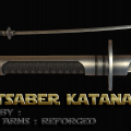
Hello everybody , you might have seen my recent status update allready but incase you didn't : I just stumbled across this : I really like that design and decided to start modeling it, quality wise I'm aiming for the same level of detail as with my ahsoka hilt while still trieing to stay as low as possible with the vertex count, the hardest piece to create, without wasting a shitload of vertices and tris on while maintaining a smooth, rounded look, is the tsuba , which I just finished I'll probably release 2 versions , one with the katana blade and the other with a regular lightsaber blade in place
-
Chibi Kyle Katarn ?
-
Silo certainly is not a bad program, i've just grown so used to 3ds max that I barely use it, even though I just noticed that my Silo2 (on Steam) was somehow upgraded to the professional version O.o
-
upload the model to sketchfab Anyway that model will need some proper smoothing groups or it will look very wierd, if people try to use it without rend2 the shaidng will end up looking like on that untextured model , which is something nobody wants
-
if you wish, I could pass you a .max file with the weighted head, I just need to know your max version
-
not bad for a first model ! while I own Silo 2 myself, I never actually used it to create a new model, only to make changes to models I made in max I'll keep an eye on your work here, If you need help anywhere let me know Edit : just had a look at my silo, to extrude simply select a face, then hit the extrude button on the top left, now a small yellow/orange ball should appear in the middle of your selected face/polygon click and drag that ball to extrude
-
Version 1.0
2,769 downloads
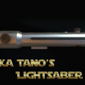
a recreation of m old Ahsoka Tano lightsaber hilt which was one of the first hilts I attempted to recreate for Jedi Academy And the second one I revamped until today I hope you enjoy it ! if you wish to use this in Singleplayer enter the following cheatcode in the console: "saber AhsokaADX" before you use this cheatcode, make sure that cheats are enabled to enable cheats enter : "helpusobi 1" "devmap all" -
I have a devaronian mercenary @@DT85 could easily carry that head over to a few other models if I didn't have to reweight the imported models, which is what kept me from putting that head on other models https://jkhub.org/files/file/1338-devaronian-mercenary/
-
woah , tone down those surface chips a lot , they look way to sparkly atm othwerwise that's not bad , I'd add a lil more dirt in those cavitys
-
http://handbrake.fr/ should do the job
