-
Posts
1,169 -
Joined
-
Last visited
Content Type
News Articles
Tutorials
Forums
Downloads
File Reviews posted by Noodle
-
-
This is such a clever map, I really enjoyed it and all the quirks it has. Performance was a bit lacking at some bits but still playable and I really like how it feels like an expansion to the Lannik Racto mission. We need more maps like this!
SpeedyJDFox95 and Droidy365 like this -
I really enjoyed spending time in this map. The general vibe and appearece of it is calm yet eerie and the clever use of ruins and abandoned hardware make it feel like it has a history of its own. It also works with rend2, which is really nice.
-
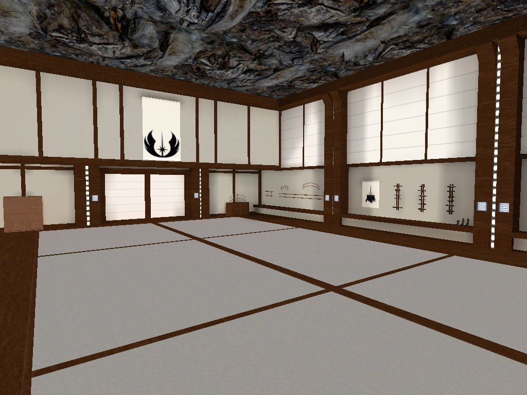
One of my favorite maps from the contest. The architecture work is great, same as the beautiful art piece made with brushes. I really liked the blend use of natural and artificial light to make the map so well lit.
-
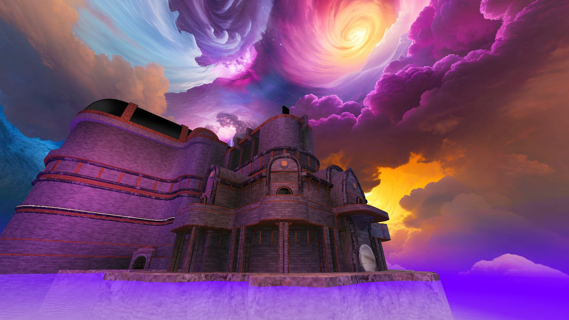
I'm a big fan of the complex architecture of this map, the horizon blending and the color use of it, though for a duel map I thought it was too maze like and I'm not a fan of travelling to different places with teleports. I appreciate that the map has its own music track, but it was not of my personal preference. Even though the sky texture looks impressive at first, the more I stare at it the flatter it seems, since the clouds are unmoving it just feels like someone painted a giant wallpaper instead of it actually being a distant space.
-
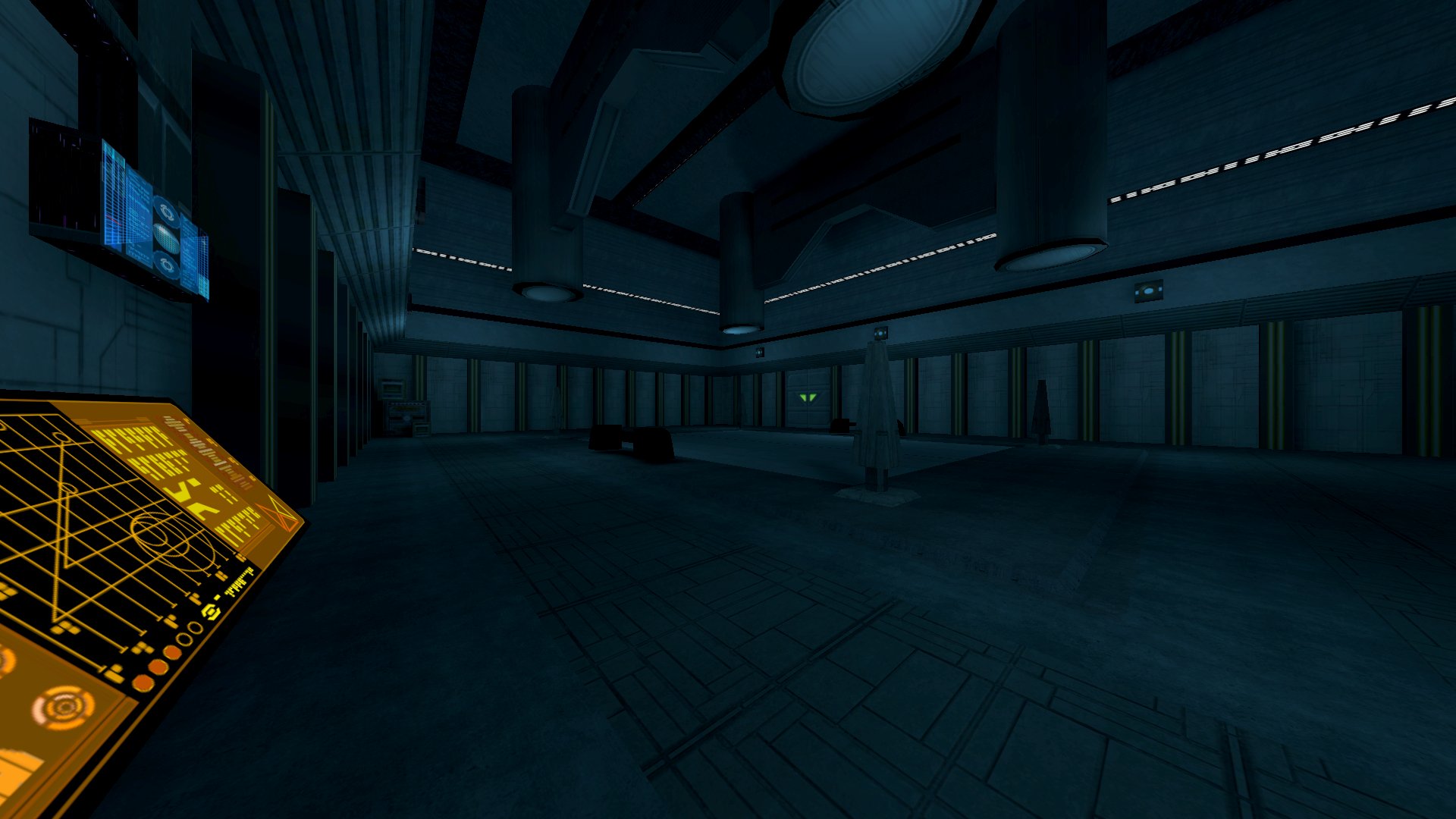
I really enjoyed the appearance of this map and how it resembles the telos academy from KOTOR II, I like the blue lighting and how dark it feels in general, although I wish the music choice wasn't so generic for a place like this. Also, the door's size seemed to be unnaturally big, but that's a minor gripe.
-
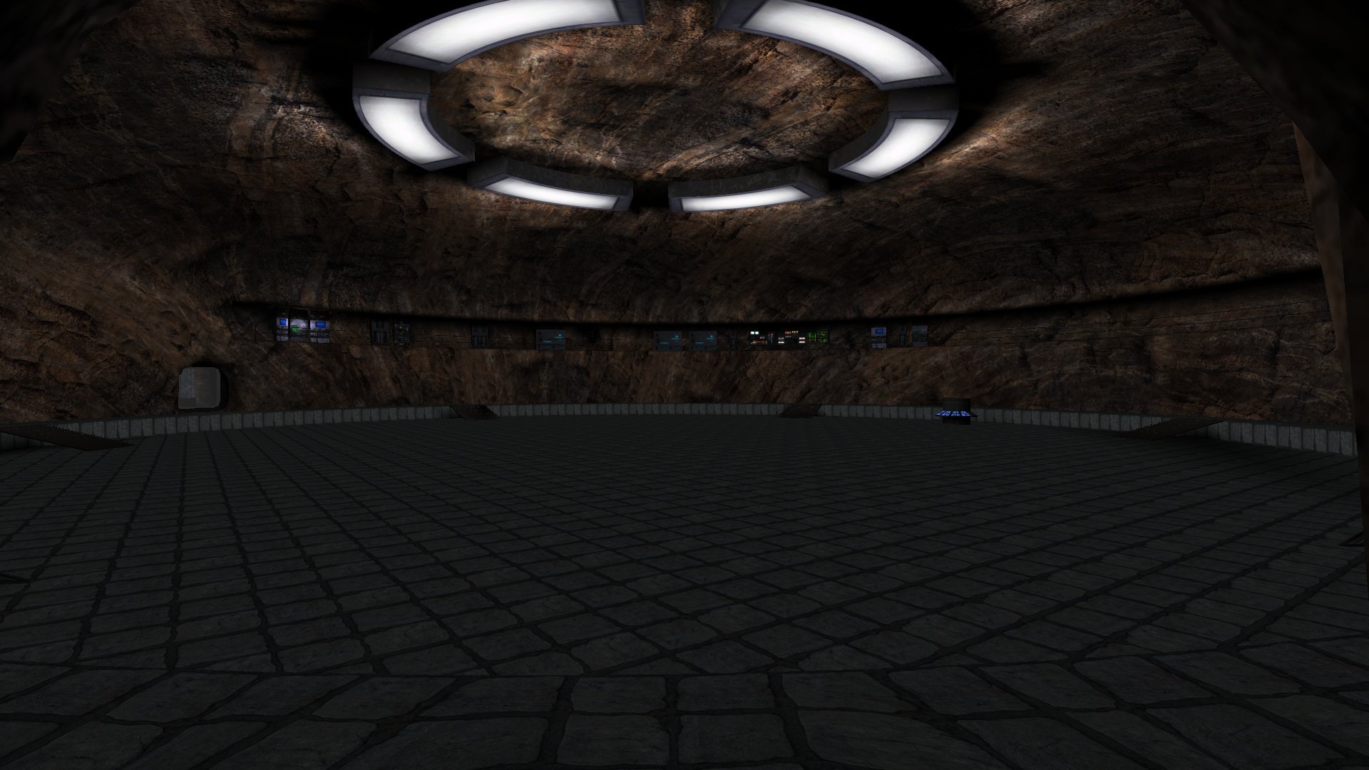
I enjoyed duelling in this map a lot. The round architecture makes it feel very distinctive from other maps and the fact that its inspired in a literary work makes it doubly special to me. I also really liked the easter eggs and the Spaarti cylinder, great brushwork!
-
I loved Star Wars Rebels so of course I was a fan of seeing this map here. I feel like its very close to the source and my gripes have to do generally with those annoying doors that open and close constantly and the pointless corridors behind them. Aside from that, the map is super good and you nailed the wood brushwork. Wish it had another music piece though.
-
This map is great, one of my top choices in the contest. I really like that its The Clone Wars inspired, it has custom textures for the control panels and its such a close adaptation to the original source. I can easily see this being used for TCW machinimas.
-
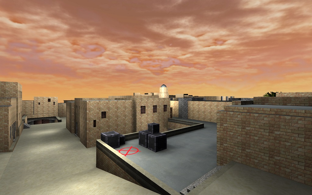
Its a great replica of the original, there was nothing that struck me as odd while playing on it. Had a bunch of fun in this map and its great if you're doing a no-saber match. Highly recommended if you're into CS nostalgia.
-
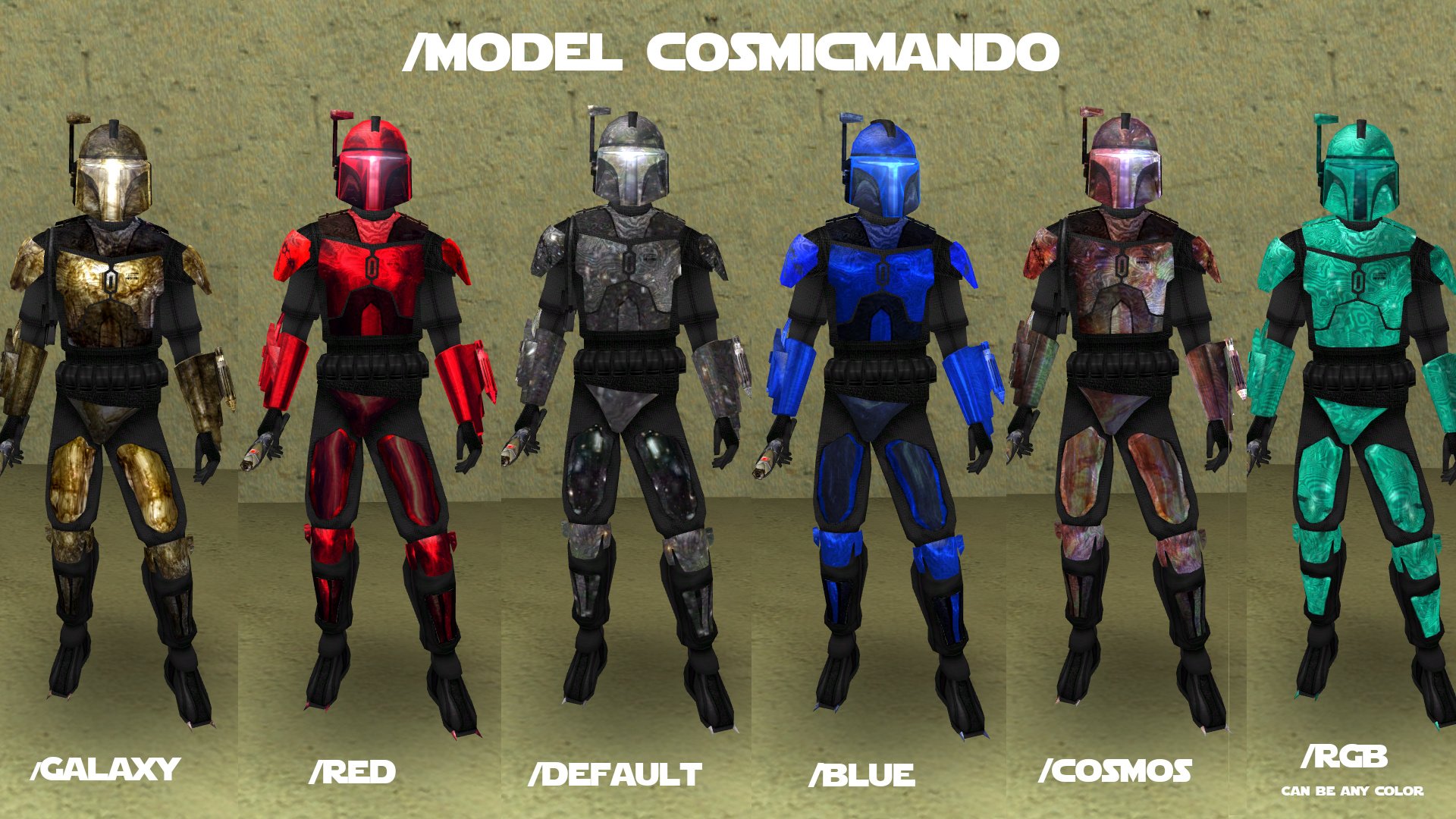
These are great skins if you're looking for some nice outfits for a team in a team-based competition. My favorite one was the red mandalorian.
-
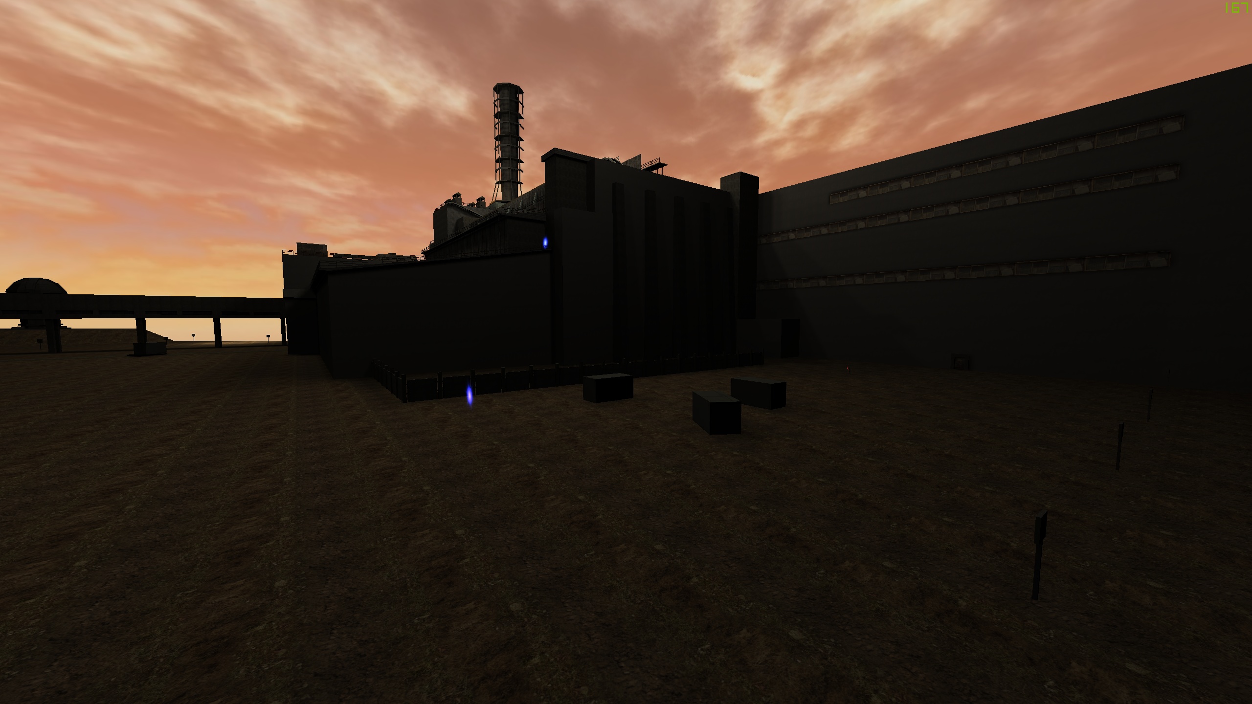
This is a good map, its very nice if you're playing with guns against another team. Lots of space for hiding and sniping and the radiation area is a nice touch. However, one of the issues I saw was that its so big that at a certain point the enemies dissappear because of the draw distance.
-
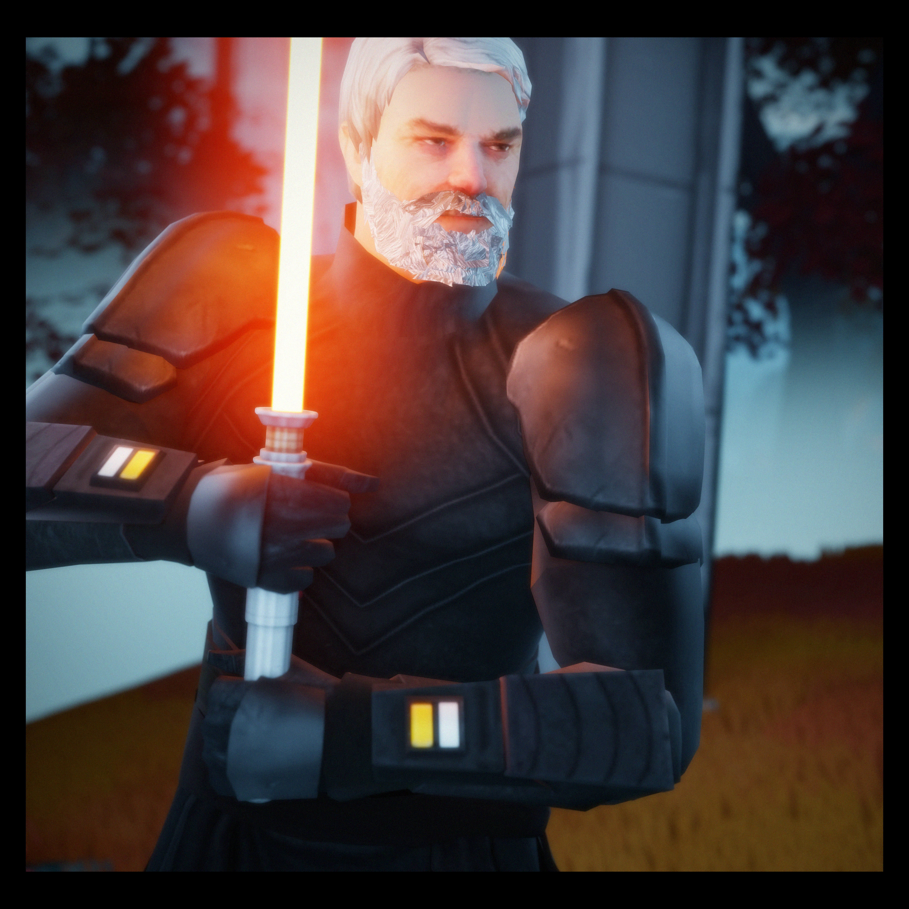
I've enjoyed playing with his model quite a lot. Its the closest thing we have to Baylan yet even if its not a 1:1 replica of the character from the show. The texture work is solid and its been made with a lot of care, and it shows. I hope to see a future version of the model with custom sounds, since it'd have made the battles with the NPC way more fun. Also, the NPC could be slightly taller than the player character, since Baylan is massive.
My main criticisms are that the head topology could be improved a bit. You can see around the ears pieces of the temple of some glasses (probably part of the base of the original model) and there's a gap in the belt area that isn't easily seen due to the dark textures, but it becomes noticeable when you use force powers on him. (pic related)

Overall, a great model and I can't wait to see your take on Shin!
-
Kyle with a jacket, need I say more? The singleplayer replacer is great, makes Kyle look more like a mentor than with his previous casual look. So far in my testing I haven't found any apparent issues, so its a 5/5 for me.

-
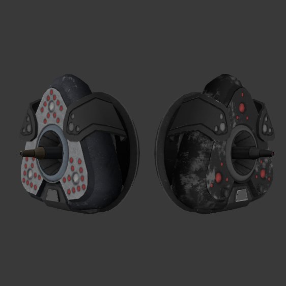
Tested it ingame for a while, killed a bunch of unsuspecting passerbys with them. They look great, much better than te original one. Thsi goes straight to my permanent collection of mods, a must have for anybody looking to improve the visual quality of their game.
Kitsu-NeshKaa likes this -
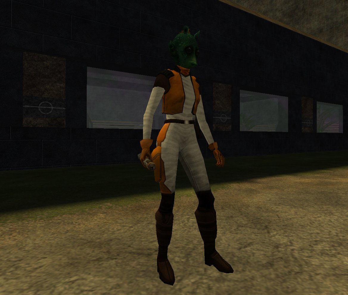
This is a very simple, yet effective, project. Texture wise it looks like it fits seamlessly with the base game and certain details like the choice of clothing and the hair texture make it seem both rodian-like and similar enough to the male counterpart fashion-wise. The couple things I could see changed to improve it is creating a new voice file so that it doesn't sound too maleish, maybe increase the pitch with audacity so that it sounds more feminine. Also, maybe use Jedi Rodian to create more skin variations, since that texture is way more polished.
Only garing issue I saw was some messed up normals around the mouth because of the blender export process, but overall its really good, I like it and hope it can be integrated into the game as more enemy variations.
-
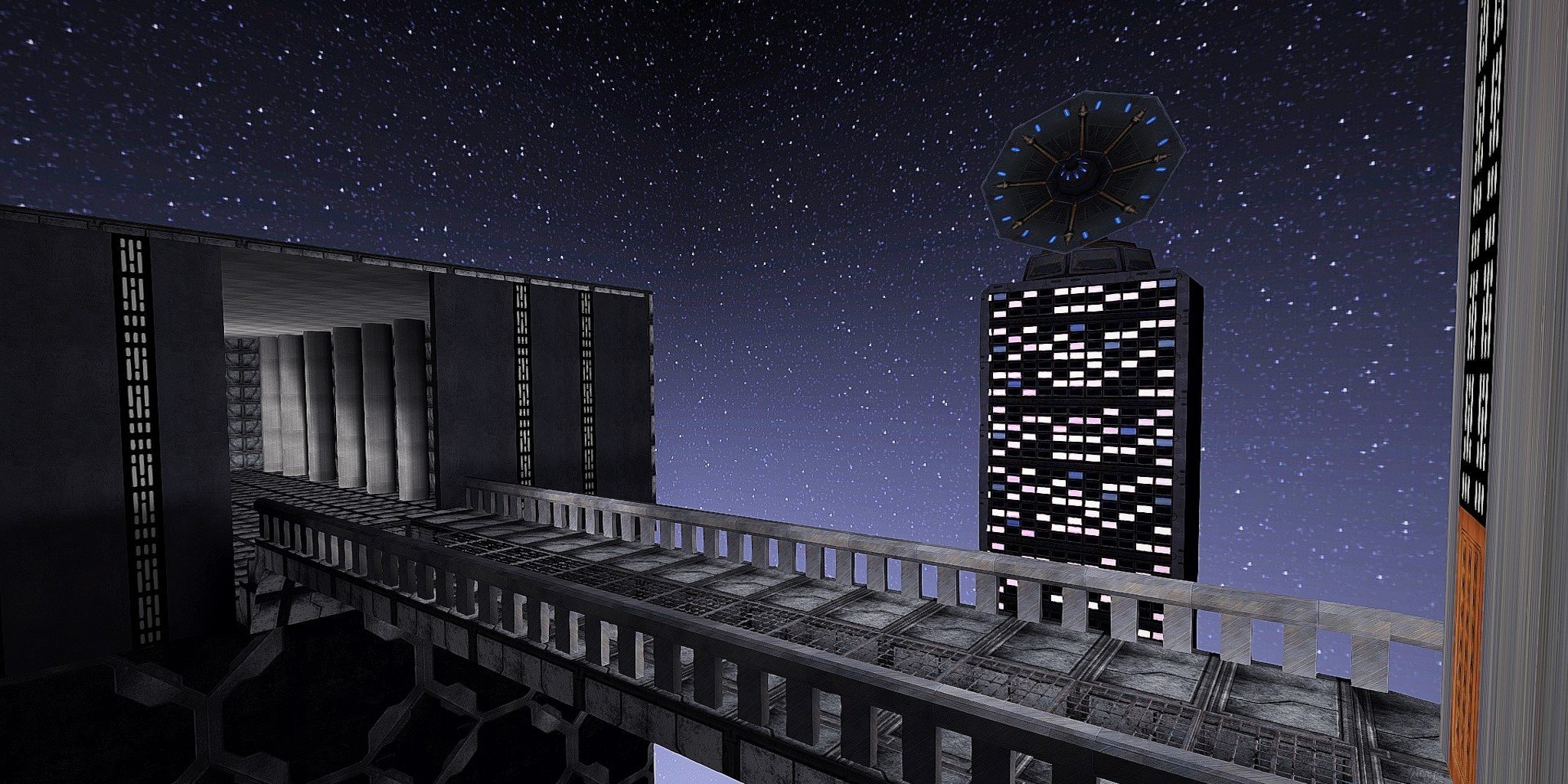
Congratulations on creating your first map, I really like the core concept behind its inspiration and I think the scale of it is pretty epic. The whole idea is super good, specially with stuff like the bridge it has, the size of everything and the fact that the tower in the middle isn't cubic, but has a more distinctive shape. All of this is great and could be further developed into something incredible.
Regarding the issue with the music, its not set to the proper path. You set it to music/imperial_hallway when it should be music/imperial_hallway_song/imperial_hallway
Here is m constructive criticism:
- Ther floor and wall textures are the same, which makes it look monotone and doesn't help give a distinctive presence to the map. Try to make it similar in style but different enough so we can easily differentiate between the walls and the floor.
- Concrete pillars lack detail, which makes them look like cylinders that have no proper structure. Try to add details at the base and top of it to make it look more distinctive.
- There are no visible light sources in the map, yet its somehow lit. Having objects as light sources make things feel more real.
- The doors are painted in the wall without having any distinctive shape and there's a missing texture in the tower's door. Add more brushes to make it look cooler.
- Everything that isn't visible to the player should be caulked instead of having a texture, this affects rendering time.
- The scale of the tower with the dish is off. People shouldn't be able to live there yet it has many windows.
- The base of the map looks like a black square which makes no sense, to fix this you can add a fog effect that makes it blend better with the edges.
- Minor thing, but annoying is that you used some light textures that don't have the proper shader on the outside so they aren't glowing.
Overall its a great project and I can't wait to see you create a new version of it, keep it up!
-
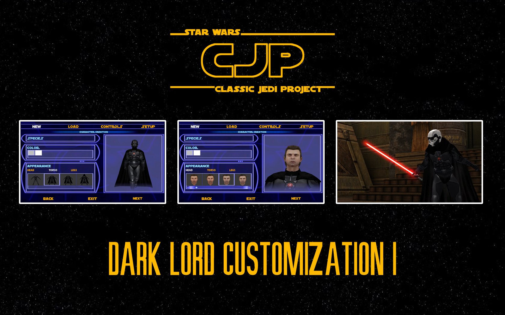
I like the use of the shadowtrooper as a basis for this model. Its a nice customization mod specially for the head pieces, though I wish as much variety could be seen in the torso and leg pieces. The hairstyles are nice, though they might be a bit too samey with just minor differences between each cut. Everything works pretty good, except the cape which has a very stiff rig that makes it look unnatural, this could be solved by rigging the lower part of the cape to the legs (as seen in Hapslash's Count Dooku model). Overall a great concept for sith players.
-
This map is a great way to showcase rend2 features, a 1:1 remake of one of the most memorable duel maps from the jedi knight franchise that brings new life with proper lighting, turning that orange afternoon from the original map into clear daylight. If you're going to check this map, I suggest using a model with PBR features, like Matt Gaunt's Boba Fett . So far in my playtesting I haven't found any apparent bugs, aside from an error popping out in console that says "Could not open file 'scripts/bespin_roff/cloudcar.IBI' once the map starts after a duel is over (the cloudcar is however bobbing ,so I have no clue what this is).
To any modders creating new assets, I highly recommend making sure your stuff has PBR materials because this stuff is amazing.
SomaZ likes this -
I really enjoyed this map and oh boy did the snowmen kick my ass. In case you're wondering, this map works better in MP since the snowman MD3 model doesn't load in singleplayer.
The fact that this map is located in Naboo was a really nice detail, since its a great planet that's often forgotten. The idea behind the map is also great and not something seen too often.
There are some suggestions I had in case this map ever gets an update. The snowmen fight was really funny, but it'd been interesting if the last snowman had a slightly different skin, he felt like a boss fight but didn't look like one. Also, the music can be quite repetitive after getting killed for the 10th time, maybe as you progress the tracks could change to match the intensity of the fight.
Overall, this is a great mod. Try it if you want a true challenge.
Circa likes this -
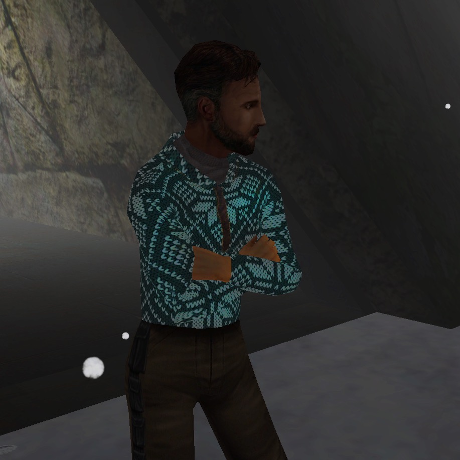
This mod is incredibly charming. The map is very well done, the music is quite nice, Kyle's shirt is a genious idea and the fight is pretty hard if you're a scrub like me (play it on Jedi Master though!). I noticed two small bugs, the first one was when Rosh jumped on top of me I got stuck on the snow and couldn't move until my foes turned me into kebab, the second one was that I managed to win by just beating Rosh. Overall, this is a great mod and I wouldn't be surprised if it wins the contest.
-
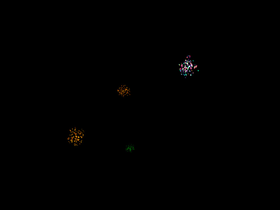
This is a great idea and it works flawlessly (in singleplayer). Beware though, if you spawn too many fireworks your computer won't be able to handle the intense power of new year celebration and will crash. The effect works great and I can see this being used for a map with a night skybox. The snowball addition is a cool one too, but given that it doens't really seem to interact with NPCs, I think the fireworks are what really elevates this mod.
Smoo likes this -
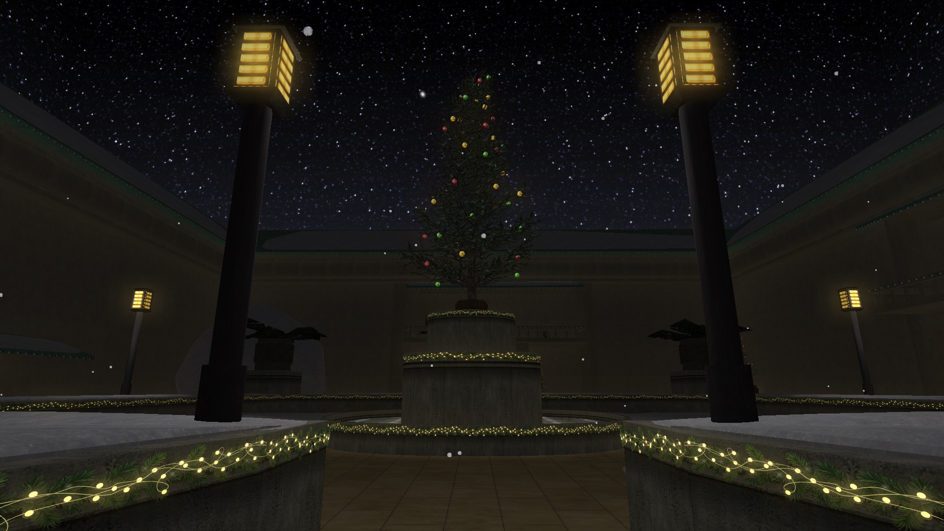
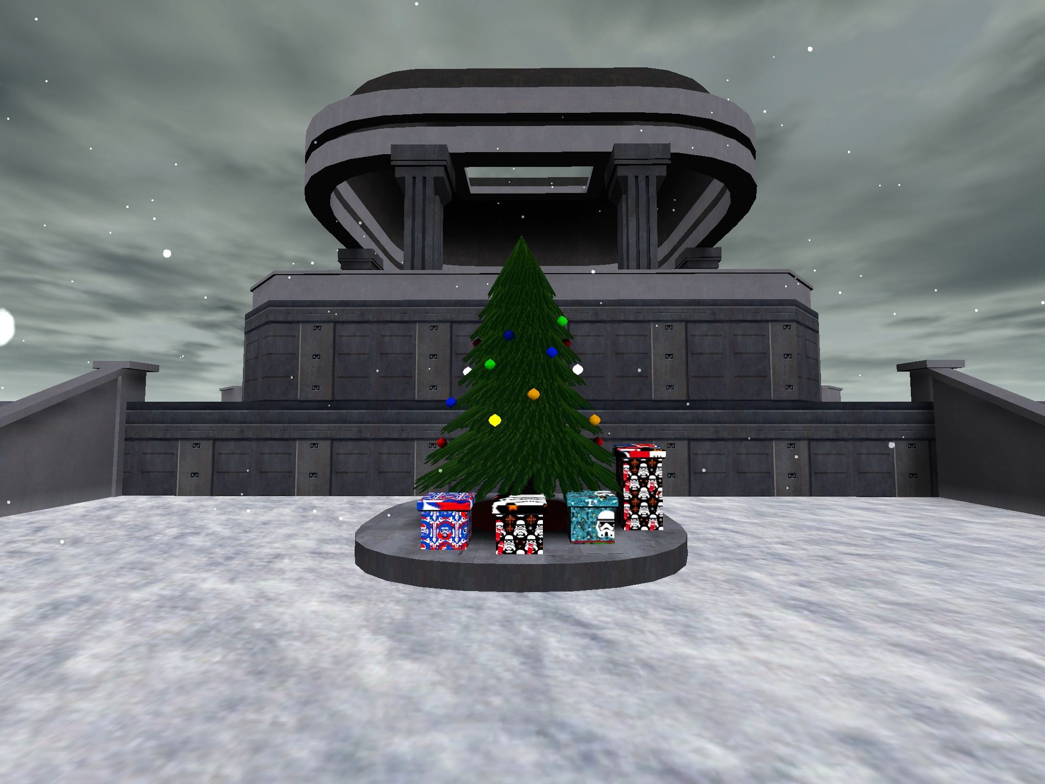
Even though the map is quite simple, I think its a solid idea that -properly developed- could be a great map. I like the tie-fighters on the outside because they help contextualize this base as a proper imperial outpost. The tree and christmas presents are a good idea, although the tree model isn't working properly to me. It seems there's a shader issue or something, because the textures aren't two-sided and its quite black, unlike what I saw in the screenshot. The presents are nice, but the texture on top of each one is quite blurry. Maybe making a model in blender and exporting it as an .md3 could make this a bit prettier.
One of the main issues with the map is the lighting. Its quite dull and there's not a single lightsource on the entire map. A proper imperial outpost would have lights everywhere I'd guess. You could add some to the landing pad, the dome-like structure and the main building. This could really add some flavor to the overall area. Also, there's no horizon blending in the map, so it feels like the edges are quite rough. Maybe adding some fog could make it seem less choppy on that regard.
The scale of the buildings is alright, though the doors seem to be quite small. On that regard, the map could benefit from some interior pieces. Aside from that, I like the structure of the buildings, it isn't very blocky and the use of textures make it look nice enough.
To me this is a 3/5, there's a lot of potential for improvement but its overall a useful map.
-
I love it! Nice composition and very original idea
SdeltroomT likes this -
This is a really good map for role playing and also if you just like looking at new sights. It had some things I really liked and others that I wasn't much of a fan.
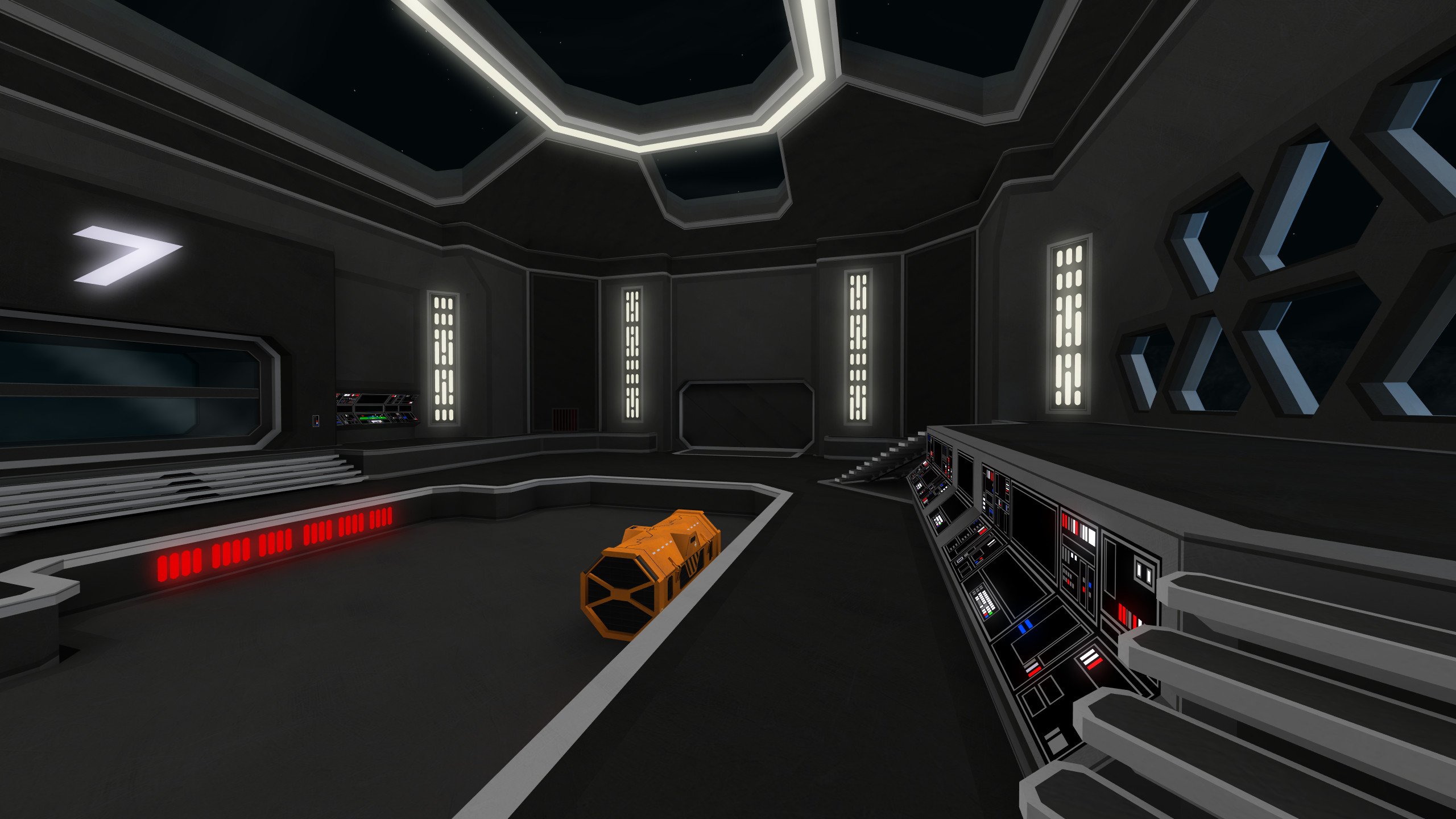
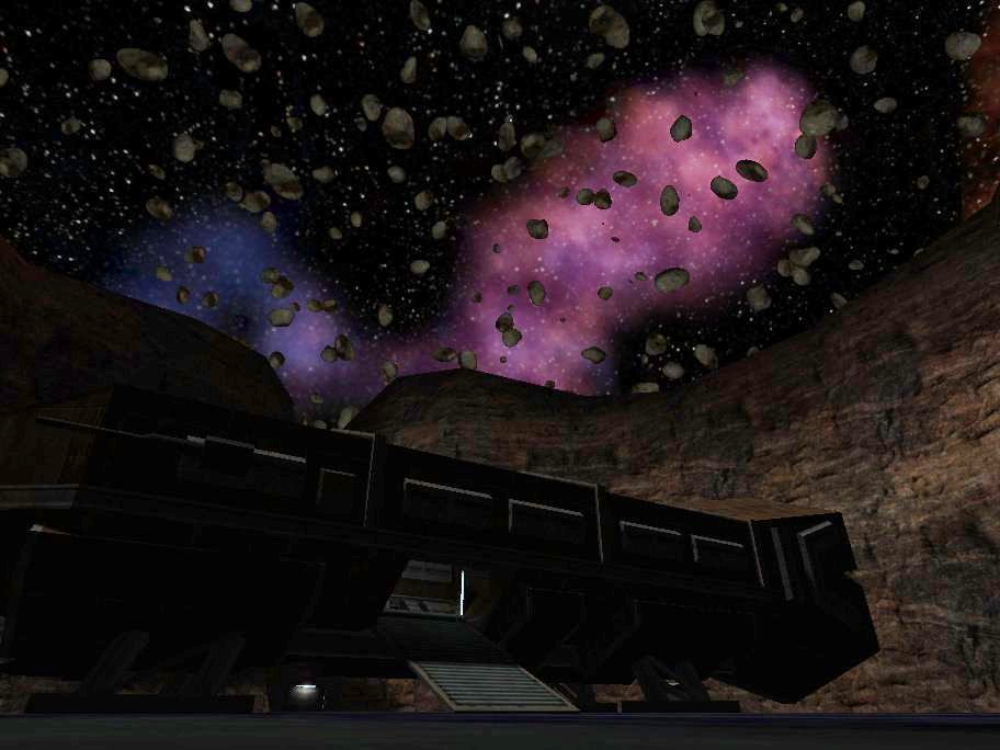
One of the things I really liked were the gigantic ships, including one you can visit its interior, though the cockpit is sadly locked. However, there's this huge hangar with some ships on it that there's no way to enter, because there are no doors on it. You can see it from a nice control room with a floating asteroid, which sadly had some bugged models that were pitch black (I think this can be fixed by changing the misc_model type of entity).
There's one criticism I have related to the doors, gameplay wise, and its that some doors open and close automatically, yet some only open if you use them. I'm not a fan of this because it seems arbitrary if there isn't a visual clue that tells you how a door operates. Also, I think its a missed opportunity because another thing that could be added is more interactivity to the map objects around the map. There are some control panels that don't do anything and they could work as interactive objects that close and open the doors near them. Also, sometimes its cool when you use something and have an audio or visual reaction to your interaction. It gives a reason to explore more of the map.
I liked most of the map's room with the exception of the room with the giant screen and chairs. I thought it was rather dull.
The trap room felt kind of unfair. Its a cool idea but there's no visual indication that its a trap room. You just start bouncing around when crossing it even though there was nothing to give you the idea that this space was much different than anything else. Maybe more details could indicate how this is supposed to operate, or some texture work can show that this is a room that has been used before effectively. That way you also make the player more aware of his surroundings.
Something that could improve the map a bit if you want to goof around with NPCs in singleplayer would be a bunch of waypoints. That way NPCs can navigate around it. Thankfully the map comes with a .map file, so you can add them on your own if you want.





Naboo Hills
in Mixed Gametypes
Posted
I spent so much time playing on this map when I was a teenager, its definetly one of the best maps of its time along sith council. If you like to play around with vehicles, this is a must play.