

Corto
-
Posts
341 -
Joined
-
Last visited
Content Type
Profiles
News Articles
Tutorials
Forums
Downloads
Posts posted by Corto
-
-
It's crazy watching videos on Autodesk's website about "new" Maya features for the 2015 version that have been features that Softimage has had since long before it was even bought by Autodesk.
This is exactly what I thought. In any case, it's good that they are including Softimage tools in Maya (since they are not doing it with Max) so, if the time comes, we can make the jump and still feel like at home.
-
I have been playing a lot with Maya lately and I'm happy to say that if they continue going the way they're going, jumping from SI to Maya is a safe bet. The controls can be mapped to feel almost like in SI and the modeling tools they got from Nex Tools make it almost similar to SI (I'm saying almost similar because SI modeling and animation tools are unmatched today, it just has bad press, it has always been like that). Maya's realtime preview options are amazing though. Anyway, I feel bad for Softimage but this was bound to happen since the day Autodesk bought it.
-
It's hard for a parent to admit that his bastard son is better looking, a better fighter and has a bigger dick than his marital son. Look what happened to Jon Snow...
-
Is this what I've been teaching both of you to do? This kind of crap??? I'm proud. Looks amazing. It finally got done!!!!
Tempust85 and minilogoguy18 like this -
What?!?!?!?! No screenshots? Gtfo...
PS: I'll try it later.
Circa likes this -
I think this one is going to look great. For the texture, there's not much room for personal interpretation, just do it exactly like it is on the pictures and you'll be fine. For the shapes though, that's a different story.
-
-
Much much better. Now it only needs small tweaks here and there, but I think it will be more easy if you tweak the face when it's textured. Sorry I haven't done any paintover, I've been very busy at work and when I get home I just feel too lazy.
Tempust85 likes this -
Nice. It's looking way better, I like it.You almost got it. The nostrils are just a tad narrower and the point of nose a little bit fatter. Also, check the upper eyelids, the bottom of the eyebrows, they are more saggier. Also, the cheekbones should be a little more narrower. Than cheek gaunts are ok, but the cheekbones are still bigger and rounder than they should be. Make the lips a little more bigger, but not too much. The rest is almost there, I would suggest you start painting the textures and do the final tweaks on the fly.
-
Getting closer. Keep working on the cheeks, they are flatter and they have the shape of a funnel towards the sides of the mouth. Yours still look too puffy. But it's much better all around.
-
It's clear that you don't lack modeling skills, but this head doesn't look like Sam Witwer at all. It can be fixed though since the mesh looks clean. Let's talk with a reference picture so it's easy to understand the main issues here:

Chin: Althoug the chin is wide and manly it's not wider than the mouth. The widest part is as wide as his mouth and it doesn't end so far on the jawline.
Cheeks and gaunt: The cheekbones kind of continues with the cheek gaunt, they don't stand out by themselves as a separate feature of the face. Here's a picture with a better angle to figure out what I mean.
Mouth: Just redo the mouth =P.
Eyes and brows: The eyes don't look so round, his lower eyelids look flatter than the upper eyelids. The lower part of the brows are bulgy, convex, not concave.
Ears: His ears are clearly bigger, tilted backwards (Psyko already pointed this out as a common mistake) and the lower part is more flappy (does that word even exists?).
Nose: The nose from the front looks ok, but when you see the side of it, it looks too perfect. The nostrils are a little taller (not wider) and the nose is more pointed.
The jawline looks quite alright and the rest could work if you figure out how to fix what I think are the main issues (which right now is your head doesn't look like Sam Witwer). I'll gladly start with the draw overs when we start talking about finer details.
Tempust85 likes this -
time for a change. give me GTA: Mos Eisley
With all the annoying stereotypes and all? Ghetto tuskens, gangsta jawas, twilek prostitutes...
Tempust85 likes this -
I saw it and I want it. GTA 4 was good, but they introduced a lot of annoying stuff which I think has been removed from this iteration. Looks like a Max Payne 3 meets GTA.
-
They actually adquired Lucasfilm to be able to do this once and for all.
-
I think the engine would need a complete overhaul, starting with realtime data streaming. I'm gonna let the actual experts talk about this, but I've read a few papers on this, and it sounds great, very few actual engines employed data streaming over the years (I remember the Gecko engine used for the Soul Reaver 1 and 2 games for example).
-
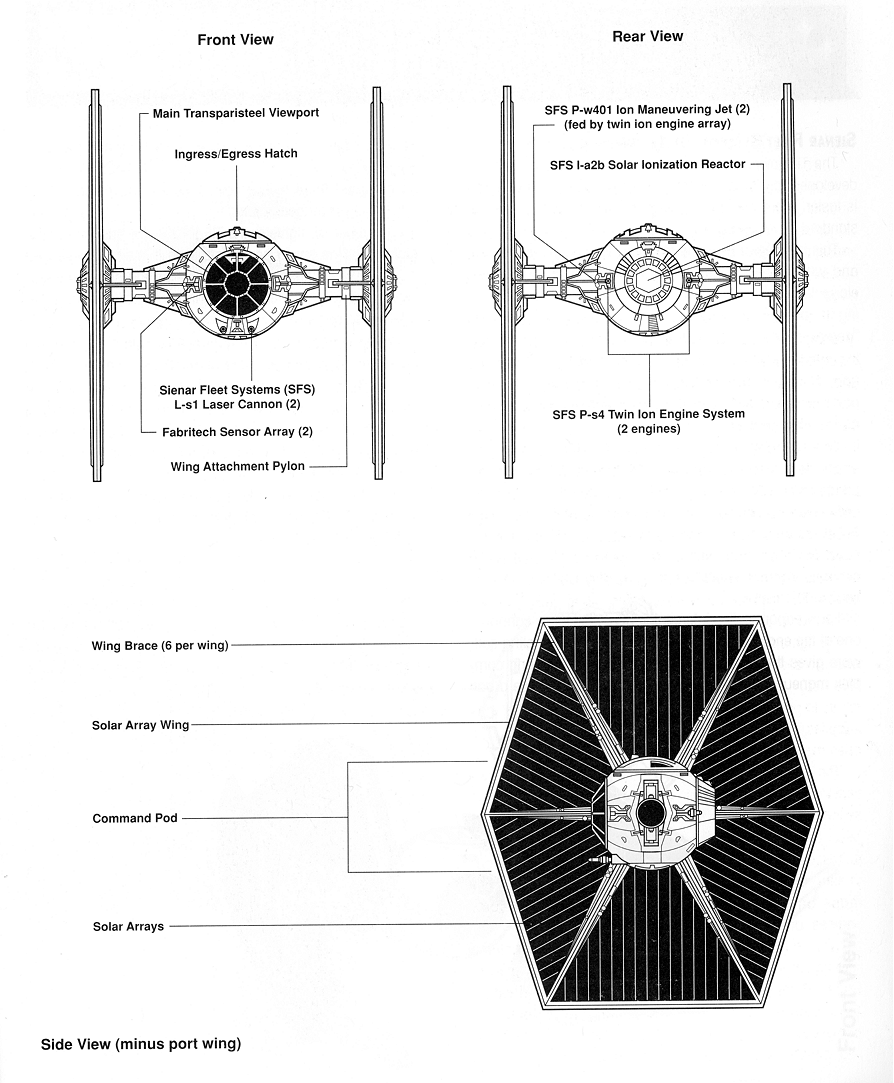
Never mind, I was looking at the tie fighter from the top. If you're not going by the blueprints then I don't see the point of doing this at all. If you want to re imagine stuff I would say you should do it with some characters (like Kyle Katarn, Dash Rendar or any EU characters that hasn't been portrayed in a movie already). Vehicles are very well documented and redesigning them will only created rejection in my opinion.
-
That hatch looks like a fez. Although fezzes are cool, they have no place on a tie fighter. Please, please, use the blueprints I posted as rotoscope images for the basic shapes. Don't talk about UV maps or other stuff when you don't have the geometry right. Have some order in your workflow. I've been following you since I signed up on this forum, and what you don't lack on skill, you lack in focus and patience.
-
Looking better. Good.
-
Here, use this blueprint, looks about right:
-
Chalk, don't focus so much in excessive geometry detail at first, focus more on proportions and accuracy. Once you have that right, you can start modeling some of the geometry that can't be faked with textures. For example, those wing pylons don't look right to me. They should look more robust, bigger all around, like this:
Also, the cockpit window frame is round.
-
Take my advice, and interpret it as "make an accurate TIE or don't at all".
I thought I made myself clear, but thanks Eez, that's exactly what I mean. I also meant that in the HD textures project but there were too many egos involved, so I stopped looking at the thread completely since my last post.
-
Chalk, Eez is right in his way, and you are right in yours. If you make an accurate Tie Fighter model I could use it in the near future. I wanna see this through.
-
Mein Got. Don't post the reference pictures in here man. And there're also a lot of movie prop reference pictures out there, not just game screeshots.
-
I really like how you take my opinion, If I didn't want you to improve I would give you a thumbs up all the time and let you think you're the best. Instead, I prefer to tell my side of the truth and push you to improve. Start by searching proper blueprints, then create a folder and get as many reference pictures as you can. Once you're saturated with pictures start the modeling.


Kain - Legacy of Kain series
in WIPs, Teasers & Releases
Posted
That, my friend, happened the moment Autodesk bought Softimage from Avid. In a way, it has also been killing 3dsmax and Maya ever since.