-
Posts
67 -
Joined
-
Last visited
Content Type
News Articles
Tutorials
Forums
Downloads
Everything posted by zicmak
-
Version V.2
888 downloads
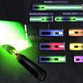
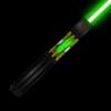
This is released as a separate file to the first because it changes a few cosmetic things (such as the grips being changed, and the chrome shader added, and the textures lightened) And I want more files under my name Please Note: Make sure you remove resolute(crystalchamber).pk3, other wise you may have problems with duplicating backhand saber and I don't know what else Like the last one, I shall quote myself from the readme DESCRIPTION: *V1* This is a reasonably simple saber with a piece removed to show the crystal chamber (which is based somewhat off the SWTOR design) ... It may have too many vertices... maybe *V2* Mostly the same as v1, except I have removed the modeled (anikin styled) grips and done a texturd one on the hilt itself (more Obi-Wan(y)). Also canged the shader to the chrome, which I think looks better since you can see it shine. Change the button into a triangle shape to bring down the vert count a little since it is so snall (and it just looks cooler). Added another tag_blade at the crystal to make it extra glowy. Also made a Resolute_Staff, once again 'cause I could. Readme (This is mostly copied from my version 1 readme ) TITLE: Resolute (Crystal Chamber Saber) V2 AUTHOR: Zicmak FILENAME: resolute(crystalchamber)_v2.pk3 FILESIZE: 112kb DATE RELEASED: 13 February 2013 CREDITS: Me (mostly) Raven (or Lucas arts... or disney... who ever owns the game assets:P) for some shaders and textures (to do with the shaders) INSTALLATION INSTRUCTIONS: Remove resolute(crystalchamber).pk3 from your base first if you have it, Unzip the file and place resolute(crystalchamber)_v2.pk3 into your base folder. DESCRIPTION: *V1* This is a reasonably simple saber with a piece removed to show the crystal chamber (which is based somewhat off the SWTOR design) ... It may have too many vertices... maybe *V2* Mostly the same as v1, except I have removed the modeled (anikin styled) grips and done a texturd one on the hilt itself (more Obi-Wan(y)). Also canged the shader to the chrome, which I think looks better since you can see it shine. Change the button into a triangle shape to bring down the vert count a little since it is so snall (and it just looks cooler). Added another tag_blade at the crystal to make it extra glowy. Also made a Resolute_Staff, once again 'cause I could. BUGS: Nada COMMENTS: *V1*This is my first lightsaber hilt that is actually a lightsaber... my first (and second) was a Tron Light Disk *V2* This saber thing is full of new stuff for me... This is the first that I made that is mostly on one .jpg, making it my best uv map yet, and bringing the file size down THIS MODIFICATION IS NOT MADE, DISTRIBUTED, OR SUPPORTED BY ACTIVISION, RAVEN, OR LUCASARTS ENTERTAINMENT COMPANY LLC. ELEMENTS TM & LUCASARTS ENTERTAINMENT COMPANY LLC AND/OR ITS LICENSORS.- 1 comment
- 4 reviews
-
- Star Wars
- JKHub Exclusive
- (and 3 more)
-
167 downloads
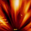
This is a menu mod that is based somewhat of the 10th doctors opening sequence including the Red and blue parts. It also has the 10th doctors theme. Sadly, there is no Tardis flying through the vortex. Readme Jedi Knight: Jedi Academy TITLE: Doctor Who Menu AUTHOR: Zicmak FILENAME: doctorwhomenu.pk3 FILESIZE: 18.8 MB MB DATE RELEASED: 11 February 2013 CREDITS: Me: Parts of The Menu Ravensoft etc. The other parts of the menu INSTALLATION INSTRUCTIONS: Unzip the file and place doctorwhomenu.pk3 into your base folder. DESCRIPTION: This is a menu mod that is based somewhat of the 10th doctors opening sequence. It also has the 10th dctors theme. Sadly, there is no Tardis flying through the vortex. BUGS: None that I know of COMMENTS: It is almost to the finished state, but I can't be bothered making it super fancy, so here it is. -
Not really... except basic modeling, but out of on the list, no. Mapping almost scares me, and I don't act
-
Well, I am not the best skinner around, and due to school my schedule is all over the place, but if you want I can help a bit
-
274 downloads
Just a skin based of the 10th doctors cloths (sorry- no trenchcoat), nothing fancy added, so no bot support or Npc. Just a skin Readme Jedi Knight: Jedi Academy TITLE: Doctor Who 10th Doctor Skin AUTHOR: Zicmak FILENAME: doctorwhodr.pk3 FILESIZE: 2.44 MB DATE RELEASED: 26 January 2013 CREDITS: Me: The Skin INSTALLATION INSTRUCTIONS: Unzip the file and place doctorwhodr.pk3 into your base folder. DESCRIPTION: This is a skin based loosly on the 10th doctors outfit (white and brown one) BUGS: None that I know of COMMENTS: This skin stinks... but someone might like it.- 3 comments
- 1 review
-
- Male
- Celebrity Skin or Model
- (and 3 more)
-
122 downloads
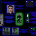
This is my Personal skin, so I am either this or Kyle Katarn, depending on whether this is downloaded Readme Jedi Knight: Jedi Academy TITLE: Zicmak's Personal skin AUTHOR: Zicmak FILENAME: zicmak_skin.pk3 FILESIZE: 1.44 MB DATE RELEASED: 25 January 2013 CREDITS: Me: The skin People Here for 'random ideas-and critique', and being encouraging People Here for help on the shiney shader INSTALLATION INSTRUCTIONS: Unzip the file and place zicmak_skin.pk3 into your base folder. DESCRIPTION: This is my Personal skin - It has black cloth for most of it, and Armour gloves and boots with green plates, and chest Armour. BUGS: None that I know of COMMENTS: Thanks to all that have helped me with this Oh, and if anyone thinks it needs more contrast or whatever, just tell me... -
My Personal Skin (need random ideas-and critique )
zicmak replied to zicmak's topic in WIPs, Teasers & Releases
Okay, I now believe it to be finished (apart from the need to maybe make the skin brighter) Only things changed are the hair and gloves, but I liked how the last picture turned out so I just made another one for the fun of it... with readable text this time The image's brightness has been increased, hence the possible need to brighten the textures. So now My skin is more or less finished, unless someone has a random idea I like -

My Personal Skin (need random ideas-and critique )
zicmak replied to zicmak's topic in WIPs, Teasers & Releases
Just a quick update post, nothing done on the hair of skin, but the torso part is finished (more or less), and I have done the shiny shaders now thanks to some helpful people (well two anyway) on this thread... so methinks almost done Update -

Shader Help? (Shiny-HUD on a Skin- Glowing RGB)
zicmak replied to zicmak's topic in Modding Assistance
Okay, thank you both -
Just need some help with shaders- 1. How (assuming possible here) do I make only certain areas of a texture shiny in game? 2. Is it (even remotely) possible to have a shader that has a (working) HUD and apply it to a skin? As in goes down with health, force, etc.? 3. Last question (for now), how do you have a glowing rgb choice for the species menu skins? (least important question, but I'm interested nonetheless) Any answers are helpful (pertaining to the topic that is )
-

My Personal Skin (need random ideas-and critique )
zicmak replied to zicmak's topic in WIPs, Teasers & Releases
Just a bump that includes an update- Think I am going to redo the torso Armour at least... and can anyone point me to a skin and/or hair Photoshop tutorial? I think I'll try my hand at that too... Update Although, any idea on where to put some glow on the boots would be nice... It feels like it needs to glow but I can't find a place to put some :unsure: . -

My Personal Skin (need random ideas-and critique )
zicmak replied to zicmak's topic in WIPs, Teasers & Releases
As promised... Saber Up (to show the arm) Saber down Back This I liked very much... will keep in base to save me those priceless minutes of fiddling. No I didn't- had you asked the green to shut up? The bolts is a good Idea... and I'll have a look at costumes... that might just help. -

My Personal Skin (need random ideas-and critique )
zicmak replied to zicmak's topic in WIPs, Teasers & Releases
Tomorrow- Too late for me tonight Now this looks helpful though ... -

My Personal Skin (need random ideas-and critique )
zicmak replied to zicmak's topic in WIPs, Teasers & Releases
I think it the brightness... to me they look like it is too ...um... sharp? contrasted (whatever it is :/ ) ? Got to start somewhere Looking at them arms and legs, I gotta agree with you, I'll work on that. Eh, I am very fond of green... Already does (or should anyway) Tried, keep getting the cloth to shine too... So I am missing something regarding shiny shaders. Yea, that what I would like suggestions for, something to throw on the empty bits ( and where to slap a glow shader on ) Anyway, been working on the boots for a (little) while, and these from (filter) scratch (as in not modified base texture) In your opinions- Is this better or worse? Front Back Although I do need Ideas for the back of the boots... they just don't seem right Recap- ideas for back o'the boots are good, things to make glow are good, and ideas to make use of empty space are good -

My Personal Skin (need random ideas-and critique )
zicmak posted a topic in WIPs, Teasers & Releases
Although, I hope less of the Second is needed . What I am doing is (trying out) making a personal skin, and I just need some ideas- ideas that preferably revolve about glowy things Most of the torso is from scratch (at least, Photoshop filter scratch, with the Armour on the arms and legs being used from base and the belt (so far) Front Back I am kinda at stalemate with myself over whether to add more stuff...So yeah, any ideas would be helpful EDIT: Is now released, thanks all -
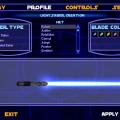
Just been working on making my own controls config thingy, and I was wondering, is it possible to set the saber model in the config file (heck, a list of anything that works in a config file would be nice) Anyways, help here would be nice
-
-
Version V.1
151 downloads
My first light saber hilt that is actually... a lightsaber... Yay! Quoting myself from the readme: DESCRIPTION: This is a reasonably simple saber with a piece removed to show the crystal chamber (which is based somewhat off the SWTOR design) ... It may have too many vertices... maybe Also made a back hand saber ('cause I can) Readme: Jedi Knight: Jedi Academy TITLE: Resolute (Crystal Chamber Saber) AUTHOR: Zicmak FILENAME: resolute(crystalchamber).pk3 FILESIZE: 212kb DATE RELEASED: 26 December 2012 CREDITS: Me (mostly) Raven (or Lucas arts... or disney... who ever owns the game assets:P) for some shaders and textures (to do with the shaders) INSTALLATION INSTRUCTIONS: Unzip the file and place resolute(crystalchamber).pk3 into your base folder. DESCRIPTION: This is a reasonably simple saber with a piece removed to show the crystal chamber (which is based somewhat off the SWTOR design) ... It may have too many vertices... maybe BUGS: Nada COMMENTS: This is my first lightsaber hilt that is actually a lightsaber... my first (and second) was a Tron Light Disk THIS MODIFICATION IS NOT MADE, DISTRIBUTED, OR SUPPORTED BY ACTIVISION, RAVEN, OR LUCASARTS ENTERTAINMENT COMPANY LLC. ELEMENTS TM & LUCASARTS ENTERTAINMENT COMPANY LLC AND/OR ITS LICENSORS.- 2 comments
- 1 review
-
- Star Wars Related
- JKHub Exclusive
-
(and 2 more)
Tagged with:
-
Got it down to V:1192 ... This any better? @@Kualan Already decided on a Name (and to lazy to change it)... But that is a pretty good name
