
Omicron
-
Posts
1,195 -
Joined
Content Type
News Articles
Tutorials
Forums
Downloads
Posts posted by Omicron
-
-
Dayum, it's been ages since I last saw you Resuru, are these for JKG?
-
Modellers nowadays here are busy, so your best bet would probably be to learn how to model yourself, and as you get better, then try and make it.
AshuraDX likes this -
Instead of having one background with the picture that wins, why not have multiple themes which the user can switch to whichever they feel like?
Onysfx likes this -
The desert one is my least favourite, dat sand texture just looks so grainy. 7 or 4 are favs out of this pic, but my top 3 didn't make it to the final vote D:
-
With the source code release, it might be possible to get the actual menu and port it to PC, since they both use .menu and the same formats. The XBOX version used .gob files instead of .pk3s, and I think Gamecube did too. Only problem lies in actually making a .gob extractor. I think I started on one but never completed it.
To open gob files, I found these 2 forums topics which may help.
http://www.planetcricket.net/forums/cricket-2005-forum/how-open-gob-files-13961.html
-
-
Sweet work, awesome!
Boothand likes this -
 JAWSFreelao likes this
 -
I'm assuming that these could be toggled on/off by the client player?
-
4 fits with the colours of the site, imo.
But clashes horribly with the logo D:
-
I'll have a look at this this weekend, sounds like a great idea!
ChalklYne likes this -
Sweet vid
-
Having the main menu as it looked on the gamecube version in this would be cool
Grab and TheWhitePhoenix like this -
IMO these days it should just be made in widescreen and ditch 4:3 altogether, who the F is still using a square monitor these days anyway?
That's like saying cassette tapes are still relevant.
I use a square monitor
-
The green stuff looks like someone put some paint on him/her, and it's dripping off. Is that the desired effect?
-
Go back to Oh, Hello.
Dai likes this -
*bumps*
any updates on this DT?
-
nice looking map! welcome to the hub!
-
That first pic eez is just fanart, and I agree the logo does look nice, I'm glad they haven't changed it too much, but enough to make it a nice refreshing new look.
-
i cant find that ported mastercheif thats why it would be great if somebody made one (not ported) thats all
do you have a link to it?
-
Definitly looks much better than the current Kain model, awesome work!
-
Welcome to the Hub!
-
Good to see it is still in development.
-
I based the saber stuff off of numerous playtests with other people, and what we mutually decided "felt right" in terms of game play. Ultimately it produced a system which was easy to pick up, but difficult to truly master, and battles which are as slow or fast as the players dictate, not dictated by any timers (like in MB2).
I believe we got a random person to play it, and he was able to understand it in three or so battles, no explanation required.
I'd like to get JK2:HD done at some point. It'll contain my saber system. Buuut other stuff in the way.
I was wondering what happened to your JK2:HD mod, was going to ask you on IRC sometime


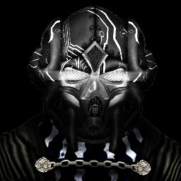
Heavy Rodian
in WIPs, Teasers & Releases
Posted
Lovin' the mohawk on your model