About This File
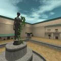
This is small duel map set in a courtyard in the Naboo capital city of Theed. There is a button on the middle balcony to reveal a duel platform, surrounded by a pit, to keep the duels interesting. There is room on the sides to use this map in FFA mode as well.
Bug: There is a timer on the button, which means you can't push it over and over, to avoid people spamming while other are dueling on the platform. So if the button doesn't work right after you use it, wait about 10 seconds.
This was a map made for a specific king of the hill type of event in my clan. The premise is everyone lines up by the main door in a single file line and the two people in the front of the line duel on the platform. First person to get cut by a saber must go back to the line, and the next person enters to challenge the survivor. Last person standing wins. Feel free to use this idea on your own servers.
Check out the Christmas version here!
This file is not developed, distributed, or endorsed by Activision Publishing, Inc., Raven Software, Lucasfilm Ltd., Disney, Inc., or any of their affiliated entities. All trademarks, copyrights, and intellectual property rights belong to their respective owners. Star Wars®, Jedi®, and Jedi Knight® are registered trademarks of Lucasfilm Ltd.™ and Disney, Inc.™. This file is intended for educational, non-commercial, or fan-based use under the principles of fair use. No copyright infringement is intended. Any claims of ownership or DMCA takedown requests can be submitted here.


Recommended Comments
Create an account or sign in to comment
You need to be a member in order to leave a comment
Create an account
Sign up for a new account in our community. It's easy!
Register a new accountSign in
Already have an account? Sign in here.
Sign In Now