-
Posts
628 -
Joined
-
Last visited
Content Type
Profiles
News Articles
Tutorials
Forums
Downloads
Everything posted by AngelModder
-
You know you seem allot more intelligent when you don't speak. If you had read the posts above and or knew any real technical skill involving maps you would not have even posted this "attempt to belittle my technical skill". So instead I will simply use my vernacular skills and express that obviously you pay attention to nothing and that is why in my opinion this has got to be the most ignorant post I have seen to date. And I've seen plenty in my days among map-craft.
-
Let me clarify this is not a perfect map.. if you have a old school low end machine don't even try it... If you have less then me again dont try this map... My computer sux, It's state are garbage were talking I3 3 gigs of ram and a POS graphics chip. Now 30 fps ='s most peoples 90 for me... 10-15 ='s about 40-60 for most folks. Ive had some mid and high end machines test this. The mid level was a i5 4 gigs of ram and a 1 half 1 gig graphics card. and the high end was a 17 with 8 gigs ram and a 2 gig graphics card... nei9ther one of them experienced any low frame rates, the lowest reported was around in the 70's with 10 people in the server during the sinking variety which is the most fps demanding since the exterior/interior can not vis from each other due to them being entities. Comparatively this map is as demanding as Blueice twilight v2. The day time versions are better as the exterior/interior area vis'd off from one another. Also another note, I was using JA++ post processing and Qeffects pro during that interior shot...
-
If I may give some suggestions, it would be to adjust the overall skin color, as well use a less harsh opacity when doing the shadows... I would recommend doing subtle shadowing on the skin texture and use a spec map for the high points of the skins lighting...
-
The smudge too does alright but I dont like how low res it leaves the texture more often then not. I generally try to avoid doing skins where I will have to mess with hair (aside from recolors etc) but if I could find a PS CS3 brush that could help, I may take on different varieties of skins.
-

Arrevanous VII V2 - AngelModder
AngelModder replied to AngelModder's topic in WIPs, Teasers & Releases
Those trees are actually brush built, and they will being altered before the final release. I have 12 different varieties of branches to add variety to each tree once I get around to it. Arrevanous 7 can be found on jk2files... it was often mistook as another "Arevass" location however, the resemblance came strongly from working and learning some tricks back in the day from Darth Norman. In this version I sought to give it its own identity. -
Hey sorry to bug you and all, but you mentioned in the starkiller post that you have a short hair brush? is this for photoshop? If so is it compatible with CS3? And if it is to both of those questions do you think I could get it from you? I struggle at hair on my skins. Thank you for your time. AngelModder
-

Released AngelModder - Darth Vader
AngelModder replied to AngelModder's topic in WIPs, Teasers & Releases
Noted XD! -
I will keep this teaser short and simple as the pictures say it all... The R.M.S. Titanic will include 6 varieties. At sea Titanic High end - This will have interior (most of this is finished just needs some finishing touches.) At seat Titanic Low end - No interior At sea Olympic High end - This will have interior (most of this is finished just needs some finishing touches.) At sea Olympic Low end - No interior. Sinking - This is a accurate depiction of the sinking, it breaks, its light go out (using a shader change to make all the glow maps shut off just before she breaks) The funnels fall accurately, and this does include an interior. She also strikes the iceberg and from there takes the full time to sink. I felt keeping the sinking time realistic allows people to experiance what such a horrific event in maritime history would have been like. The lifeboats disapear after she strikes the iceberg and re-appear out in the water in the proper order and at the proper times they were launched. Sinking low end - same as the above but the only interior is as the junction where she breaks just directly forward of the third funnel and is purely for an asthetic touch At this point and time I am not revealing how much of the interior is going to be shown, but let me just say its almost as much as the virtual sailor model. the ship is built exactly to scale and according to the ships line plans, meaning theirs only a 70 foot spot (where the engines set between funnel 3 and 4 thats acctualy perfectly level design wise, the rest of the ship curves high to the bow and to the stern accurately. This map was said by many to be impossible to build... After 7 years of trial and error here it is. To be released on April 10th 2014.... Are you ready to go back to Titanic? AngelModder
-
As I mentioned in the Darth Vader post I am an old school mapper, so later this month if all goes well I will be releasing this. Arrevanous 7 V2! Please note the last pic was of the waterfall before I changed the terrain textures. Here is a link to a video of the caves within my map - VIDEO
-

Released AngelModder - Darth Vader
AngelModder replied to AngelModder's topic in WIPs, Teasers & Releases
Well to address some concerns about the clean thing. Honestl most vader models and or re-skins have always shown him clean.. So I will try to amend that with a few varieties of him scratched and dinged up. However remember there will be the Force unleashed beat up version so that's gonna be him in pretty rough shape. XD -

Released AngelModder - Darth Vader
AngelModder replied to AngelModder's topic in WIPs, Teasers & Releases
Your absolutely right! Please note the specular is only this intense under the right lighting and animations. This also is not the finished product merely a test to see if it was gonna be a working idea. Updates - 1 : I currently added some muscle tone to his arms using a specular map and some light shadowing, I am currently working on giving the mesh suite that wrinkled feel to the arms and legs. I will probably get a bit more detailed with the specular maps for the legs and arms. But even thus far today in game it looked really good. 2 : I also will be replacing the helmet texture tonight as well as his chest plate. 3 : Tested the new caps for his arms and legs, they turned out pretty good. Definitely adds a new level of detail when you are in a duel and lose. 4 : I am currently going to see if the animsounds.cfg will allow me to replace the footsteps sound with a footsteps + him breathing sound. I dont know if this will work as I've never really messed with this file in the past. 5 : Going to be creating a template soon of what the team skins will look like, as well as what I call the guilded Vader (Vader with some fancy touches gold and silver) that will be mostly for myself when having clan ceremonies but others may like it as well. So on that note I wont refuse putting it in the pack. 6 : Did some research last night and started grabbing texture sources for the mechanical left arm and left that will be damaged for the force unleashed variant. I ran across some pictures of pretty much a similar idea of what I want to do on hapslashes website, however I don't think the reskin was ever released, so no hopes in getting it and improving on it. I will have just have to do it myself. But that's alright seeing how they did it gave me some ideas on how I will do mine Any ways that's the update for now... Ill have more at the end of the day for me ! -

Released AngelModder - Darth Vader
AngelModder replied to AngelModder's topic in WIPs, Teasers & Releases
Yes thank you all ^^... I am working on adding muscle definition atm as well as the chest plate, the chest box, and helmet... so next update should show vast improvement over the original. In fact I'll make point and do a side by side of before and after lol. I love before and after peaces. -

Released AngelModder - Darth Vader
AngelModder replied to AngelModder's topic in WIPs, Teasers & Releases
There will be, theirs just not any pictures of it yet... I will be working on that face tonight. -
Hey guys this is my first post on here so I figured I would make a splash. I'm a mapper and skinner. I've been around since the days of JKO and I've been modding since I cant remember. Well now that I've got the introductory out of the way. Here is is Darth Vader WIP. The model is Toshi's, and I recently came by the model. after looking it over and seeing how well ti was made and the many options is had available I felt it was time to give it a skin worth the model. Now this is not finished yet, for starters I still need to redo the chest plate and shoulder pads, as well as some other details. On the note of things, I have fixed many problems that the original skin had (aside from resolution and overall detail) I even went so far as to texture the back of the legs and calves, there no longer black. While most were not bothered by this, I find such lack of detail and work completely unacceptable. There will be more changes so if you note any thing that's constructive pleas let me know. To clarify on this the first thing many will notice is the darkness of the robes and armor, this came out quiet well in game with a correct specular map. Allot of people for the wrong reasons make there specular maps black and white, this is a false trick. In real life lighting/specular effects contrast and push the colors of the items the light is hitting. I also am atm working on the mask a bit more and will be redoing the helmet texture. I also have added new caps in certain area's. Now when you cut off his hands arms or legs, theirs different caps for each area. Looking more like wires and mech then w/e Raven gave us in base... :/ There will be several versions for this reskin so here's the list before we get to showing you the pictures. 1 : Vader Full - This is just normal Basic Darth Vader 2 : Vader No Helmet 1 - Basic Darth Vader without the Helmet, still wearing the mask 3 : Vader No Helmet 2 - Basic Darth Vader without the helmet, Still wearing mask but the lenses are similar to episode 4 (slight reddish tent) I have also made them slightly transparent allowing you to see his eyes glowing behind the mask. 4 : Vader Full 2 - This is normal Basic Vader but with the semi transparent lenses. 5 : Vader Battle Ready 1 - This is the same as Vader Full 2 but he is not wearing his cape. (Thankfully Toshi modeled out the front and back of the chest plate so it looks awesome.) 6 : Vader Battle Ready 2 - This is the same as Vader battle ready one but the lenses on the mask are not transparent. 7 : Immolated Vader - This is Darth Vader as seen in episode 3 without the mask and helmet 9 : Immolated Vader battle ready - This is the same as Immolated Vader but without the cape. (Personally my favorite thus far). 10 : ESB Vader - This is Darth Vader as seen in episode 6 (pale face and only the mask on) 11 : Dark Father - This is Darth Vader as seen at the end of episode 6 without the mask and helmet (WIP - Screenies will come of this soon) 12 Darth Father battle ready - This is the same as Dark Father but without the cape as well (Wip - Screenies will come of this soon) 12 TFU Vader - Darth Vader as seen in the force unleashed beaten up and half dead. (WIP - Screenies will come of this soon) Also note one of these pictures is from yesterday before I added the details on the back and sides of the breather. The last pic is from yesterday... Theirs been some changes to the body and head since then... But this gets the point across Any ways I hope you all like it... Leave your comments below and thank you for your opinions and time. Thank you for your time. AngelModder
-
Version 1.01
380 downloads
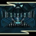
A simple duel/small ffa map based in an underwater observatory. Featuring a nice reflective floor and some new underwater effects. This is version one later I will add onto this visually and game play wise for a version 2. It is not necessarily based on an movies or games, just a bit of fun. This took about 2 days of spare time so its not exactly pushing my limits of skill. Any ways People liked it so here it is. Titas Observatory. Enjoy AngelModder -
Hey guys, alright this is gonna be a bit touch and go... But atm I am working on a Sith pure blood race re-skinning project for myself and for the JAWA clan. I have been trying to find a particular model that I think would do well for the males/Sith warrior variants of the project. The concepts are of course based on TOR. What i am looking for is a model I have not seen in a long time I dont even know the name so I will do my best to describe it and hopefully some one will have it?!?! Name : unknown it was demon or scropio some thing or other then Version 7 I believe... Descriptiong : It was a rather bulky (but well done model) it had serveral variants of wings/no wings/horns hairs/armor/colors... Bassically it looked like a demon. I know this is a vague description but if you think you know what it was please post a pic and let me know if you have it. I have searched all over google and JK2files (as well as here). The model was not canon but potentially could be awesome to skin into the sith purebloods male variant. Again thank you for your time. AngelModder


