Jump to content

5 Screenshots

About This File

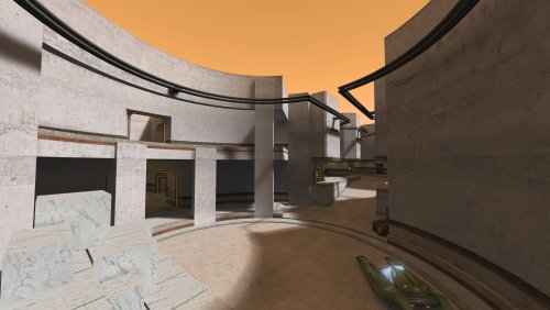
Designed for TFFA with varied fighting areas.

Inspired by the planet Abafar from the series Star Wars: The Clone Wars. It does not represent any specific location seen on the series.

SUPPORTED GAME MODES:

  •  FFA, TFFA, Duel.

NOTES:

  • The map's lighting was done while using "r_gamma 1.2". Screenshots were also taken while using "r_gamma 1.2".

THIS FILE IS NOT MADE, DISTRIBUTED, OR SUPPORTED BY ACTIVISION PUBLISHING, INC., RAVEN SOFTWARE, OR LUCASARTS ENTERTAINMENT COMPANY, LLC. ELEMENTS™ & © LUCASFILM LTD.™ & DISNEY, INC.™ AND/OR ITS LICENSORS. STAR WARS®, JEDI®, & JEDI KNIGHT® ARE REGISTERED TRADEMARKS OF LUCASFILM LTD™ AND WALT DISNEY, INC.™ STAR WARS®, JEDI®, & JEDI KNIGHT® ARE REGISTERED TRADEMARKS OF LUCASFILM LTD™ & DISNEY, INC.™


What's New in Version 11-11-2024

Released

Visual changes:

  • Added more texture details and gribbles.
  • Replaced some textures.
  • Player model lighting fixed.
  • Overall map lighting somewhat improved.

Gameplay changes:

  • Moved and reshaped main elevator.
  • Speeder taken out of glass frame. No longer just a box with a speeder inside it.
  • Improved clipping to ease player movement and prevent getting stuck.
  • Bot routes improved.


Goosto, biggs, bigphil2695 and 4 others like this

User Feedback

Create an account or sign in to leave a review

You need to be a member in order to leave a review

Create an account

Sign up for a new account in our community. It's easy!

Register a new account

Sign in

Already have an account? Sign in here.

Sign In Now

Jeff


Just a very solid map that captures the theme from the Clone Wars, upper and lower levels is a nice touch and the textures are outstanding, The size is perfect for FFA or TFFA games I highly recommend. 

Reepray likes this
Qira


Oooooo... I absolutely love the architecture of this map! 

Response from the author:

Thank you! It means a lot coming from you specially, your maps are awesome!

Reepray likes this
ZanderNao


I can't begin to overstate how wonderful the texture work and lighting is for this map. It's got a great feel to it. It isn't boxy (despite the boxes, lol) and the atmosphere is fantastic. Absolutely no downside. I really love this map.

The one opportunity for growth in a future version might be to incorporate more greebles or details. It's a bit open and empty, but it is still a perfect, beautiful map.

Response from the author:

Thank you!

I've got a planned update for hopefully the end of next month that will add some more details and fix a few things.

Edit: the update mentioned above has been published.

Reepray likes this
×
×
  • Create New...