

Milamber
-
Posts
261 -
Joined
-
Last visited
Content Type
News Articles
Tutorials
Forums
Downloads
Everything posted by Milamber
-
he looks kinda malnourished. And kinda more like anakin than starkiller. At least in the last picture Only my own opinion ofc. Ears are still bothering me though, they look like discs attached to the head.
-
I like this one better than the previous one you showed me, gj ^^
-
looks better now imo I think what's throwing me off is the shadow under his cheek bones, and the lines from his nose down around his mouth. I think they're too prominent maybe the lines on the nose by the eyes too.
-
I think in general the head is too tall compared to how wide it is, kinda looks more like Sheldon Cooper than Starkiller right now I'd say. ( well not quite but you get what I mean ) also @@Psyk0Sith thanks a lot for posting that tutorial link. You have no idea how annoyed I've been at losing that one ^^
-
I suggest a more neutral background color for the screenshots, especially when the textures are in the focus, so you don't get any funky contrast illusion stuff going on.
-
better yes, although you have a tiny pinching going on right between the chest/stomach where you have those / and \'s under his arms, causing him to still look kinda V shaped even though the shape is a lot better. Remove the pinching going on and make his overall body shape less like this: \ / ( ) and more like this: \ / | | Not as extreme as these /'s ('s and |'s but you get the point i hope And the diameter of of the arms right up at the connecting point to the shoulders is still kinda big.
-
I don't really see any changes to the proportions, so I repeat my previous post
-
shoulders/chest in general.
-
Hey Chalk, after my last exam would you be interested in letting me have a go at the low poly model? As in, sending me the head and letting me move the points around so I can give you suggestion on what to do that way? Morph-able! xD That is if you're comfortable with it ofcourse. I might not do a great job at it, but I wouldn't mind giving it a try.
-
Serenity and Scooper, try to keep your arguments clean. You guys aren't agreeing, and you're welcome to discuss it freely here, but if you start throwing insults at eachother we'd much prefer you to take it into a private conversation. Fairly be warned. And yes I consider your last comments to eachother insulting, so any more of that will be removed
-
Chalk, can you start doing screenshots like this: 1 straight from the front view 1 straight from the side view (left or right) 1 3/4 view (google it) which can be high or low angle as you please. This gives us the best screenshots to give you feedback on. All the random camera angles are just making it harder to tell what's going on sometimes, or hides mistakes. Make it easy and post the "boring" screenshot views, they're the best for feedback, do beauty shots when you're done xD or as an extra.
-
Hey thund @@Scooper - take a look at this topic.
-
Cousin! lets go bowling
-
The overall feel the head gives me right now is that it's too much of a V shape. Probably a result of the eyes being too far apart again, and the chin being too sharp and more defined than it should be.
-
-
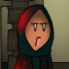
The issue with the eyes right now is that you got this going on: 0_0 instead of a normal o_o, really shocked expression on the eyes. In addition you're not adding enough shading to the actual eyeballs, they're still really white compared to how far into the shadow area they really are. Not too much though, it might be that it's just the shocked expression doing it, and the color is fine. And why is he purple in the corner of the eye? Here's a gif and some notes: Might be people see issues with my edit as well, didn't spend a lot of time on it, but these are my thoughts at least
-
Not gonna be super picky, but I got 2 tweaks to suggest still. 1. the eyes are kinda big still 2. Please look up an ear tutorial or something, because a persistent problem with ALL your heads has been messed up ears. They've improved but you're not quite there yet. It's one of the most noticeable features from the side. (remember people notice/are bothered by what's wrong a lot faster than what's correct, so the ear really stands out from the side now)
-
you added borders to the walkway, it's just supposed to be a surface that goes down. Right now it's got a big step on the top, so wouldn't be all that good to walk on
-
The best mod request of all.
Milamber replied to Rosh is my favorite's topic in Mod Requests & Suggestions
I remember dueling Rosh, got in a saber lock with him, he had 1 reborn twin left healing him. I cut his saber hand off. He kept fighting with the stumb of his hand, it was just sad, and really really funny. -
It's mainly something for image editors I'd say or for spicing up a scene in a movie you're making real quick, with objects you're not gonna be taking a closer look at. Really cool though xD
-
He got a French name. He's Scandinavian yes, but he's half French
-
Fixed it for you.
-
Alright xD just didn't really agree with the topic title, didn't mean to step on you mate
-
Tbh I don't feel that's very watchable. Quality isn't very good, and in general all the odd camera crossovers and weird camera angles just makes it a "no" for me. I feel a lot of people who make machinima should read up on some basic theory before they start. http://www.youtube.com/watch?v=QPDNnCLj-qk this series was fun, and with the limitations of filming in spectator, did a really good job.
-
As far as I know the majority of servers are saber focused, so not quite sure where you been playing Captain
