Jump to content

[JKA] Stormtrooper Mess (test map)

   (4 reviews)

1 Screenshot

About This File

Hello to all!


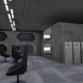
Here I am releasing my very first map to have a feedback of different members (and mappers). This is how I imagined a dorm for stormtroopers in a little Imperial base. It is small, very small. In fact, this room is a part of a bigger creation but to train myself with lights etc., I just took this work apart.
I'm open to all critics as long they are useful (especially with the lights). Just don't be too hard, I'm a rookie with this stuff.


This file will probably be updated then deleted later, it has no vocation to be a playing map (or for duel, maybe?)


I want to thanks NumberWan who helped me a lot with some issues with Radiant, and the JKHub member MUG for his video tutorials.

THIS FILE IS NOT MADE, DISTRIBUTED, OR SUPPORTED BY ACTIVISION PUBLISHING, INC., RAVEN SOFTWARE, OR LUCASARTS ENTERTAINMENT COMPANY, LLC. ELEMENTS™ & © LUCASFILM LTD.™ & DISNEY, INC.™ AND/OR ITS LICENSORS. STAR WARS®, JEDI®, & JEDI KNIGHT® ARE REGISTERED TRADEMARKS OF LUCASFILM LTD™ AND WALT DISNEY, INC.™ STAR WARS®, JEDI®, & JEDI KNIGHT® ARE REGISTERED TRADEMARKS OF LUCASFILM LTD™ & DISNEY, INC.™


User Feedback

Recommended Comments

Noodle

Posted

I've just downloaded and tested the map and I've a couple of criticisms and suggestions:


First of all, I recommend you download and study this map, since it's a great example of imperial architecture with the game's base assets. 


https://jkhub.org/files/file/3189-imperial-research-facility/


One of the main things that I'd criticize is the scale of things in your map. The chairs are way too big in comparison with the tables that are next to them. The corridor at the entrance is small and tight, which doesn't look aesthetically pleasing. It also lacks any sort of light source, even though the place is lit. 


I'd try in general to add more light sources to the map that look coherent with the style you've chosen. The ones on the roof seem lacking, given the amount of light in that room. 


Finally, I'd advise you to fix some of the textures that are too stretched. Specifically those at the sides of the lockers. 


Overall it's a very cool concept! I hope you can improve it!

lang_french

Posted

Thank you for that advice!

The thing of this room (and by extension the map) is that it's a part of a small base, and the mess as other rooms are underground: built quickly, no time to make style or something, a little bit like a bunker. That is for this reason I wanted to make it very "square", condensed, and not really tall.

Well, I'm not use with re-scaling, because it doesn't work as brushes: impossible to make it manually. And I'm afraid that chairs will be too small for characters (I had the idea to sit a stormtrooper, even if I don't know how to make yet). But I will have a look on it.

The corridor was intentionally tight because it was made only in purpose to try the door effect. It is removed on the next version, where there is a quite big room.


The lights are my main enemy right now. I know how it works but not used with them. For instance, as you say it, the roof: I am afraid that lights are too bright. And how to make them: a few which are big and large, or a lot little?


Right now I added more areas to try some new effects, but this is not fixed yet (sounds repeating in a trigger when I want them to make it once, and other things with key doors or forcefields)


Thank you again!

AngelModder

Posted

A suggestion involving lighting. Stick to shader lighting, not only does it compile faster, look better, and have a lot more versitility but it also makes you think about your lighting and lightsources as the surface emmision becomes true value. In other words you wont just be placing and orb and even the light fixture it's self end up lit, rather the said surfaces that SHOULD be casting light will correctly do so. 
Try to avoid the ambient key and value in world spawn, maybe for a little color blending use like ambient 15-25 and then your said color you want the shadow lighting to have, but honestly if your maps coming out too dark, that means you need more lightsources, and try using a bounce of 3 or 5 in your map during light compile. Honestly past 5 it's just not worth the extra time it takes.
If you have any further questions etc you can always PM me on here and I'll see what I can do to help you! 


Another thing to really study is your texturing. Base textures can still be very usefull to this day, but only if used correctly. It comes down to application. Scaling for one, most base textures are a bit blurry by our common standards today so scaling them down a bit hides this.

Cor

Posted

Nice overall concept. This does look like what a dorm room for Imperials would look like!


I thought you mixed the textures quite well, even though more modern custom textures would probably make it look more high-quality. 

My own little (and perhaps stupid) question is how do the stormtroopers get to the upper beds? Perhaps small ladders could add a little something. Or I could be trying to base this too much in reality, who knows, up to you!


Good work, keep going.

Psyk0Sith

Posted

My own little (and perhaps stupid) question is how do the stormtroopers get to the upper beds?

Jetpacks of course!

lang_french

Posted

I thought you mixed the textures quite well, even though more modern custom textures would probably make it look more high-quality.

Well, I don't think I could make a new texture from scratch. I can use Gimp but not for this. So, it would be complicated, especially because I probably don't have enough imagination for this kind of stuff.


how do the stormtroopers get to the upper beds? Perhaps small ladders could add a little something. Or I could be trying to base this too much in reality, who knows, up to you!

First I had the idea to make little ladders. But I thought that stormtroopers just had to climb from the lower bed. Maybe this is not obvious, but in fact, it will not be a question in the game.

Create an account or sign in to comment

You need to be a member in order to leave a comment

Create an account

Sign up for a new account in our community. It's easy!

Register a new account

Sign in

Already have an account? Sign in here.

Sign In Now
×
×
  • Create New...