-
Posts
1,052 -
Joined
-
Last visited
Content Type
News Articles
Tutorials
Forums
Downloads
Everything posted by Barricade24
-
- 11 comments
-
- Star Wars Related
- Male
-
(and 3 more)
Tagged with:
-
Barricade24's WIPs & Projects
Barricade24 replied to Barricade24's topic in WIPs, Teasers & Releases
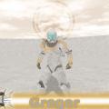
Gregor is up! http://jkhub.org/files/file/2046-clone-commando-gregor/ -
Version 1.5
903 downloads
This is a skin based off of Star Wars the Clone Wars's Clone Commando Gregor. From the episode "Missing in Action" I believe. This one has been in the works for awhile but is finally seeing his long awaited release date. In this file new sounds are included, which are property of LucasArts, they were acquired from their game Republic Heroes. Shaders are based off of the Vode An: Delta Squad's work. Team skins are also included and NPCs are included for all skins. Those are: Gregor Gregor_red Gregor_blue- 11 comments
- 9 reviews
-
- Star Wars Related
- Male
-
(and 3 more)
Tagged with:
-

Barricade24's WIPs & Projects
Barricade24 replied to Barricade24's topic in WIPs, Teasers & Releases
@@AshuraDX Works great, now! Many thanks! @@Sithani You might be right I'll take another look at the tally marks and see what I can do to enhance the quality or at least make it appear more real. -

Barricade24's WIPs & Projects
Barricade24 replied to Barricade24's topic in WIPs, Teasers & Releases
Having some problems with the Dropbox so I had to copy and paste here. models/players/Gregor/visor{ { map models/players/Gregor/visor blendFunc GL_DST_COLOR GL_ZERO } { map models/players/Gregor/visor-spec blendFunc GL_ONE GL_ONE glow }} Also here is an image of what it looks like in game. -
Would it be all right if we used that?
-

Barricade24's WIPs & Projects
Barricade24 replied to Barricade24's topic in WIPs, Teasers & Releases
Getting closer but still some shader issues I am having. The default shader for the Commando makes the visor transparent, which enables you to see inside the helmet. Is there any way I can fix this? It is more likely this will be released tomorrow. -

Barricade24's WIPs & Projects
Barricade24 replied to Barricade24's topic in WIPs, Teasers & Releases
Well those are supposed to be tally marks. Not so much scratches. They really come out as a flat black sort of appearance. Or are you actually referring to the scratches used on the yellow portion of his armor to blend with the camo/default armor? -
Okay then. Any takers will to get this head on the Reborn model?
-

Barricade24's WIPs & Projects
Barricade24 replied to Barricade24's topic in WIPs, Teasers & Releases
Better? -

Barricade24's WIPs & Projects
Barricade24 replied to Barricade24's topic in WIPs, Teasers & Releases
All right all the tally marks I done. But before I release (which will likely be tomorrow by the way) I need some shader feedback and @@AshuraDX since you supplied feedback for the 212 I figured you'd be the one to ask. Also @@Sithani you wanted to see the final product as I recall so here are some shots of the finished skin job. Shaders are still awaiting feedback. So Ashura, are we too bright on the specs? -

Barricade24's WIPs & Projects
Barricade24 replied to Barricade24's topic in WIPs, Teasers & Releases
Gregor should be released sometime early this week. -
Then I may seek an alternative for the skull.
-
Yep that is the model. So would using this be a violation of our port rules @@Circa? Or is it acceptable?
-
I think for the majority of things I have pretty much finished up. However, I am need of someone to model on a skull I have. I don't know the author of the skeleton model but if someone could get this skull onto this body I would really appreciate it.
-
DT's new Stormtrooper does make the old one look like a pile of junk.
-

Barricade24's WIPs & Projects
Barricade24 replied to Barricade24's topic in WIPs, Teasers & Releases
Forgot to add the vibro-axe. File has been updated. -

Barricade24's WIPs & Projects
Barricade24 replied to Barricade24's topic in WIPs, Teasers & Releases
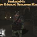
Gamorrean is up! -
Version 1.5
746 downloads
This is a skin based off of Haps Gamorrean Model. It is updated to a more movie accurate appearance. Also included in this pack is a vibro-axe created by Jolt_JK2. It has been modified to be a single saber-based weapon. You may see the staff animations at times, this is intended to stay so he will be a bit more unpredictable It is the exact same features from Haps' original release just the appearance and icons have been changed. Enjoy!- 7 comments
- 10 reviews
-
- Bot Support
- Star Wars Related
-
(and 4 more)
Tagged with:
-
I think snipers are kind of needed on the streets. There are so many distant areas where they would fit in. But I'm all for adding the Trandoshans in. I actually wouldn't mind the Trandoshans to have Concussion rifles again. Like they did in DFII and Dark Forces. I'd really like Outcast and Academy to reflect back to the prior ones.
-

Barricade24's WIPs & Projects
Barricade24 replied to Barricade24's topic in WIPs, Teasers & Releases
Due to certain reasons, the Gamorrean and other files may be delayed awhile. Certain matters have come up that I must take care of before continuing work. -

Barricade24's WIPs & Projects
Barricade24 replied to Barricade24's topic in WIPs, Teasers & Releases
Is there even such a thing? -

Barricade24's WIPs & Projects
Barricade24 replied to Barricade24's topic in WIPs, Teasers & Releases
You can expect the Gamorrean to be released tomorrow sometime. -

Barricade24's WIPs & Projects
Barricade24 replied to Barricade24's topic in WIPs, Teasers & Releases
Sure thing. I was also playing around a bit in game with a few things. -

Barricade24's WIPs & Projects
Barricade24 replied to Barricade24's topic in WIPs, Teasers & Releases
Something else I just decided to take up. There was always something about the skin of this model that looked off but now it looks much better. The only thing I'm not sure about is the pink/red. I'm not sure if I got the color totally right. Anyway, let me know what you think.


