About This File
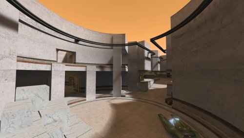
Designed for TFFA with varied fighting areas.
Inspired by the planet Abafar from the series Star Wars: The Clone Wars. It does not represent any specific location seen on the series.
SUPPORTED GAME MODES: FFA, TFFA, Duel.
MAP NAME: ffa_abafar
NOTES:
- The map's lighting was done while using "r_gamma 1.2". Screenshots were also taken while using "r_gamma 1.2". If you find it is too dark, up the gamma. Might update lighting in the future.
This file is not developed, distributed, or endorsed by Activision Publishing, Inc., Raven Software, Lucasfilm Ltd., Disney, Inc., or any of their affiliated entities. All trademarks, copyrights, and intellectual property rights belong to their respective owners. Star Wars®, Jedi®, and Jedi Knight® are registered trademarks of Lucasfilm Ltd.™ and Disney, Inc.™. This file is intended for educational, non-commercial, or fan-based use under the principles of fair use. No copyright infringement is intended. Any claims of ownership or DMCA takedown requests can be submitted here.
What's New in Version 11-11-2024
Released
Visual changes:
- Added more texture details and gribbles.
- Replaced some textures.
- Player model lighting fixed.
- Overall map lighting somewhat improved.
Gameplay changes:
- Moved and reshaped main elevator.
- Speeder taken out of glass frame. No longer just a box with a speeder inside it.
- Improved clipping to ease player movement and prevent getting stuck.
- Bot routes improved.


