Jump to content

TFU-2 *HUD* for JKA by Dark Apprentice Release Version

   (9 reviews)

6 Screenshots

About This File

Info:

------------------------------------------------------------------------------

This is my very first try to make something little, but maybe not so "little"

for the Jedi Academy game.


I present you my own version and design idea, based on the original -

Star Wars: The Force Unleashed-2 game "TFU-2".


Comments:

-------------------------------------------------------------------------------------------------

* I always loved the TFU-2 HUD and I decided to try creating my own version.

The HUD is a little bit "transparent", because as I saw during my research

over the original TFU-2, the real HUD there really is a bit of a transparent-ish,

or at least it gives the feeling.


As I saw on the original game, the original HUD actually does NOT show to the player,

when changeing saber positions and since most palyers in JKA use this option, I have

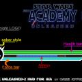
just hide it in the JediKnight LOGO (for more info, please take a look at the "HUD History.JPG")


Installation:

----------------------------------------------------------------------

the PK3 file, goes into your GameData/Base folder.


Uninstallation:

----------------------------------------------------------------------


just remove/delete the PK3 file


Bugs:

----------------------------------------------------------------------

none to my knowlage, please tell me if you find some.


Credits:

----------------------------------------------------------------------

LucasArts: for the original game - Staw Wars: The Force Unleashed 2

and for the lovely: SW Jedi Knight: Jedi Academy


JkHub: for the great supporting and help by the nice guys there as they follow:


* therfiles


* ensiform


* AshuraDX


* mrwonko


* Rogueboy (for the inspiration from his HUD based on the First "SW Force Unleashed" (TFU-1)


Legal stuff:

----------------------------------------------------------------------

THIS MODIFICATION IS NOT MADE, DISTRIBUTED, OR SUPPORTED BY ACTIVISION, RAVEN, OR

LUCASARTS ENTERTAINMENT COMPANY LLC. ELEMENTS TM & © LUCASARTS

ENTERTAINMENT COMPANY LLC AND/OR ITS LICENSORS.

THIS FILE IS NOT MADE, DISTRIBUTED, OR SUPPORTED BY ACTIVISION PUBLISHING, INC., RAVEN SOFTWARE, OR LUCASARTS ENTERTAINMENT COMPANY, LLC. ELEMENTS™ & © LUCASFILM LTD.™ & DISNEY, INC.™ AND/OR ITS LICENSORS. STAR WARS®, JEDI®, & JEDI KNIGHT® ARE REGISTERED TRADEMARKS OF LUCASFILM LTD™ AND WALT DISNEY, INC.™ STAR WARS®, JEDI®, & JEDI KNIGHT® ARE REGISTERED TRADEMARKS OF LUCASFILM LTD™ & DISNEY, INC.™


What's New in Version Release Version

Released

  • The Force Unleashed HUD for Jedi Academy (by Dark Apprentice)

leon82 likes this

User Feedback

Recommended Comments

ensiform

Posted

Ammo text colors seem weird... Black for default, yellow for pickup, grey for busy/firing.  Hmm not sure what else to try.  May also want something behind the text so that its consistent with that background instead of whatever might be behind it otherwise.


The ammo bar doesn't seem to work right now? (MP)  That middle bar is in fact the armor bar not ammo bar.

dark_apprentice likes this
McGroose

Posted

This is a great hud, I think, with just a few flaws. The ammo text needs to be either properly representedinto the hud itself instead of just being left off towards the side, or the text needs to be changed to a color that pops out more.

Also, does the saber style work? Nothing changes from the default image when I switch saber styles.

z3filus

Posted

I think if the health/armor/force indicators are in the lower corners of the screen, they are just in the way of gaming.


So I like this very much, especially that JK logo


dark_apprentice

Posted

This is a great hud, I think, with just a few flaws. The ammo text needs to be either properly representedinto the hud itself instead of just being left off towards the side, or the text needs to be changed to a color that pops out more.

Also, does the saber style work? Nothing changes from the default image when I switch saber styles.

About the image with the HUD's History I just wanted to make sure, that people will not miss it :D for the HUD itself, yes it works with all of the 3 saber styles.


At first my idea was the JK Logo to change colors or move, but that perhaps will be made in later version if I'm able to make one in the free time. As I wrote on the description section, in the original game SW: TFU-2 as longer as I remember and searched all over the internet and YouTube vidoes it is simple and it has nothing like this, so I have decided to make it a little bit "invisible" for the player's eye (you will have to look up closer to it and you will see it, it's hidden in the JK Logo). After all you see the changes of saber style in your character when you play ;) Thanks for the kind words to all of you

Dumah 11523

Posted

* The Hud looks good, but you should add the colors for the saber styles. The little saber is white so you can change to blue with the first style,  to yellow for the second (and for the dual/staff style), and to red for the third style: http://imgbox.com/g/YmU8AId3Vd

Or just a little color and not the change the whole saber: http://imgbox.com/NhVuwYgO


* I give this 4/5.

Merek

Posted

I love it. Not too shabby for a first attempt! 9/10.

dark_apprentice likes this
dark_apprentice

Posted

@Dumah 11523  - as I said in the comment and also INSIDE the READ ME FILE:

" in the original game SW: TFU-2 as longer as I remember and searched all over the internet and YouTube videos it is,

simple and it has nothing like this, I have DECIDED   to make it a little bit  "invisible"  for the player's eye

(you will have to look up closer to it and you will see it, it's hidden in the JK Logo). After all you see the changes of saber style in your character when you play "


P.S.  The ORIGINAL IDEA, was to make the JediKnight-Logo to be, as follows: Blue (saber fast), Green (saber medium), Red (saber strong)  B-U-T this could appear in a later version if I have free time to make it (and it will NOT be soon, because I have much work outside of the JKA World, sadly....), and I wanted to keep the main idea, from the original HUD by the "STAR WARS: THE FORCE UNLEASED-2".

ensiform

Posted

Just FYI, the notification box for regular prints (non-chat) is being blocked when using this HUD too.


Could use some text indications of the values somewhere too tbh.

dark_apprentice

Posted

Just FYI, the notification box for regular prints (non-chat) is being blocked when using this HUD too.


Could use some text indications of the values somewhere too tbh.

erm, what you mean with the non-chat is blocked, in MP?! I admit, I have not test it at all for MP game, just started one solo game to see if it works  and if it's there, but not in server

ensiform

Posted

Anything that prints from Com_Printf etc :P


The Red box area is what I'm referring to.  (Not using your HUD atm)  It is not specific to MP either.
 

shot2014-08-27_20-58-08.jpg


z3filus

Posted

Anything that prints from Com_Printf etc :P


The Red box area is what I'm referring to.  (Not using your HUD atm)  It is not specific to MP either.


shot2014-08-27_20-58-08.jpg


I may be wrong but there should be a command to disable/hide that line of text. or just move it to the lower corner of the screen.

No.. im certain:  I have the chat located up there and that kilfeed isn't showing on the background.


So I think it's safe to say that there's nothing wrong with the HUD, you just have to make some adjustments in your config file.

dark_apprentice likes this
ensiform

Posted

You can HIDE it but, you cannot move it lower (only move it horizontally with cl_conXOffset or w/e).  Its part of the engine, not a HUD so can't adjust it that way either.  Regardless, nobody wants the wall of text that will more than likely be in the way.

GojiraGamer

Posted

What's the skin in those screenshots?

dark_apprentice

Posted

@GojiraGamer those two skins are simply the Lord Stalker (Lord Sith Stalker) from SW Force Unleashed: Ultimate Sith Edition bonus gameplay on the Hoth map and the other one is the Starkiller's costume from the SW Force Unleased-2 DarkSide ending, after the original Starkiller kills the main clone and is sent to destroy Leia and Han Solo on the Ewok's homeland. Costume that for my personal opinion reminds a lot of the good old Reborns in Jedi Outcast, but a bit improved you know.

It's a Trap

Posted

Where did you find the Dark Starkiller skin from TFU 2 Endor DLC ?

Dark_Reaper

Posted

can u add link for this skin ??

The Punisher

Posted

The "TFU" best looking HUD so far. But I've would preferred a shield level instead of ammo level.

Vanguardian

Posted

Wow this HUD looks so clean! Thanks i've been looking all over for this!

BlindDaThief

Posted

I love this HUD. Terrific job!

Question tho, whenever I start up the game with it, it gives me an error message in the cmd console that says something to the effect of:

error ui/hud_menu unknown command number on line 205- 360, 180

I looked at line 205 of the hud_menu but I have no idea what the numbers of 360 and 180 are even for, so I didn't want to mess it up. Let me know what they should be? or what else to do if anything ... thanks!

Create an account or sign in to comment

You need to be a member in order to leave a comment

Create an account

Sign up for a new account in our community. It's easy!

Register a new account

Sign in

Already have an account? Sign in here.

Sign In Now
×
×
  • Create New...