Jump to content

WeaponsHD - Lightsaber Blades 1.0 Final + Update

   (14 reviews)

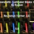
1 Screenshot

About This File

The latest update brings you a vanilla blade recreations, but much much much more beautiful and on a higher resolution, so even looking up close won't hurt the quality!

Don't worry, for those of you who've liked the previous versions more, I've included them!


INSTALLATION INSTRUCTIONS:

Choose >>ONLY ONE<< of the pk3 files:

- r_whd_sb.pk3 (final 1.0)

- r_whd_hd_saber_f.pk3 (former 1.0)

- r_whd_hd_saber_08.pk3 (0.8 version)


Copy it over to your base folder,

the default path is "C:/Program Files/Lucas Arts/Star Wars Jedi Knight Jedi Academy/Game data/Base"


DESCRIPTION:

HD Lightsaber blades, greatly improved resolution and quality! Sooner versions 0.8 and Recreation version included :)


BUGS:

None that I noticed, if you did, message in the comment section!


COMMENTS:

May the Force be with you!


WeaponsHD:


https://jkhub.org/files/file/2792-%7B%3F%7D/

https://jkhub.org/files/file/2802-%7B%3F%7D/

https://jkhub.org/files/file/2796-%7B%3F%7D/

https://jkhub.org/files/file/1900-%7B%3F%7D/

https://jkhub.org/files/file/2167-%7B%3F%7D/

https://jkhub.org/files/file/1921-%7B%3F%7D/

https://jkhub.org/files/file/2808-%7B%3F%7D/

THIS FILE IS NOT MADE, DISTRIBUTED, OR SUPPORTED BY ACTIVISION PUBLISHING, INC., RAVEN SOFTWARE, OR LUCASARTS ENTERTAINMENT COMPANY, LLC. ELEMENTS™ & © LUCASFILM LTD.™ & DISNEY, INC.™ AND/OR ITS LICENSORS. STAR WARS®, JEDI®, & JEDI KNIGHT® ARE REGISTERED TRADEMARKS OF LUCASFILM LTD™ AND WALT DISNEY, INC.™ STAR WARS®, JEDI®, & JEDI KNIGHT® ARE REGISTERED TRADEMARKS OF LUCASFILM LTD™ & DISNEY, INC.™


What's New in Version 1.0 Final + Update

Released

  • 0.7 - a slight look change and fixes
  • 0.8 - further look changes and color fixes
  • 1.0 - HD recreations of vanilla blades!
  • 1.0 Final + Update - All versions from before + a completely new version of the HD blades, the best so far!

User Feedback

Recommended Comments

Bek

Posted

Not bad, this will be in my base for some time...

Rooxon likes this
Circa

Posted

Hmm. I may have to try these out. Not sure I like the shape of them, but I love the quality.

Rooxon likes this
Rooxon

Posted

Thanks, maybe the top is really a bit TOO pointy, but I got the effect I wanted to get and to me, they look much better than the originals. Any suggestions what I could try to get the trail the same "a bit" desaturated colors as the blades?

Circa

Posted

Now they're a bit too round for my taste. :P Though I'm a bit picky when it comes to that stuff.

Rooxon

Posted

Now they're a bit too round for my taste. :P Though I'm a bit picky when it comes to that stuff.

I bet noone's ever said that to you @Circa, but I actually like your pickiness and the fact that you always find something that's off. Because of that it's a lot easier for me to find a way to make mods good for a wider population, you know... make sure that it's not TOO ROUND for those who like them spiky and not too spiky for those who like 'em round :P Ok maybe this sounds wierd, but we all know I'm talking about the saber blades here. :P

Mr.Zz likes this
Mr.Zz

Posted

AWESOME!

Angel Soul

Posted

I have the previous version and I found it so amazing. In the screenshot of version 0.8, the blade seems detached from the saber? If that is the case, could you make a small add-on that comes with this pack, where the saber core is attached to the saber like they were in the previous version?

Rooxon

Posted

It's only a bug in my released weapons pack. Next update of it will fix this, otherwise try it out yourself. It doesn't seem detached with other hilts..

Angel Soul likes this
Angel Soul

Posted

It's only a bug in my released weapons pack. Next update of it will fix this, otherwise try it out yourself. It doesn't seem detached with other hilts..


Just tried them out. They look much sharper and color transitions are *PERFECT*. I just find the core too thin though. :D Maybe a little bit thicker? :)

Rooxon

Posted

Just tried them out. They look much sharper and color transitions are *PERFECT*. I just find the core too thin though. :D Maybe a little bit thicker? :)

All in due time, I'd like to see more faults in it before I go and make an update. As you can see, I've made quite the list going from 0.7 to 0.8

Angel Soul likes this
Angel Soul

Posted

All in due time, I'd like to see more faults in it before I go and make an update. As you can see, I've made quite the list going from 0.7 to 0.8

Allright man. :) Good point. Anticipating your next release, that's for sure. Your saber blades are the best IMO.

Rooxon likes this
Rooxon

Posted

A 1000 downloads!! Aww that's helluva great treat! :D Thank you everybody!!

General Howard likes this
Kahzmat

Posted

When I think that I just discovered this... Nice job *o*, I fell on my ass!

Astrol

Posted

It is very good, but as Angel Soul mentioned back then, I would like to do the same. The blades still seems detached from the hilt on the picture. Or its not like that in the game? Btw I know its a bit big request, but could you made a HD quality for the game itself to match your mods?

Rooxon

Posted

It is very good, but as Angel Soul mentioned back then, I would like to do the same. The blades still seems detached from the hilt on the picture. Or its not like that in the game? Btw I know its a bit big request, but could you made a HD quality for the game itself to match your mods?

Well I dont have much time anymore to do any mods at all. Or motivation, mostly. I'll resume and first finish what i started then i'll see if i continue to continue doing mods.


EDIT: I'm back. Kinda. ;)


Now what I'm wondering about is if you people from the community still find this problem about the blades being detached, because for this last update I worked with the original files. This means the blades SHOULD be practically on the same position as the ones in the original game. Please comment here about this!

TheFlashCW

Posted

Why it doesnt work for me :( im on SP and i pit zzzzzzz but it change nothing please help

General Howard

Posted

Personally.. I love version 0.8, the most. And I think it's the closest (as far as colour tone goes) that we have, to the current TFA lightsabers. So I'll definitely be using those colours in my JK: Enhanced version. Great job, Rooxon!

Rooxon likes this

Create an account or sign in to comment

You need to be a member in order to leave a comment

Create an account

Sign up for a new account in our community. It's easy!

Register a new account

Sign in

Already have an account? Sign in here.

Sign In Now
×
×
  • Create New...