Jump to content

3 Screenshots

About This File

Here it is, ladies and gentlemen! We finally have it, my first-ever map for Jedi Academy. Ever since I was a wee lad, I've dreamed of creating my own maps for Jedi Academy. Now, for the first time since I got the game in 2009, I've turned that dream into a reality.

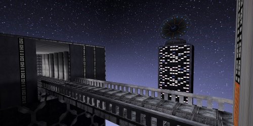
I present to you: the Imperial Hallway. It is meant to be based on Coruscant as a part of the Imperial Palace. My main source of inspiration for this map was, in fact, the old Star Wars: Infinities - A New Hope comics. This map is loosely based on them, but with my own creative twist.

Installation:
Simply place the pk3 file into your gamedata base folder. I've already tested it for multiplayer, so it should run smoothly.

Issues:
There's only one known issue at the moment - the music I selected doesn't seem to work in multiplayer. Rest assured, I plan to fix it eventually.

Final Notes:
This map was created to honor Jedi Academy on its 20th Anniversary. As such, I'd like to express my gratitude to the following:

Colonel Cornelius CornJulio, for teaching me the art of mapping -  The MD team, for fueling my imagination - Linken, for helping me to get the music to run

Enjoy, and may the Force be with you always.

This file is not developed, distributed, or endorsed by Activision Publishing, Inc., Raven Software, Lucasfilm Ltd., Disney, Inc., or any of their affiliated entities. All trademarks, copyrights, and intellectual property rights belong to their respective owners. Star Wars®, Jedi®, and Jedi Knight® are registered trademarks of Lucasfilm Ltd.™ and Disney, Inc.™. This file is intended for educational, non-commercial, or fan-based use under the principles of fair use. No copyright infringement is intended. Any claims of ownership or DMCA takedown requests can be submitted here.


What's New in Version 1.2

Released

cleaned up some of the more questionable textures, got the music to run in multiplayer and I fixed the missing door texture, which was from Jedi outcast, for this i profusely appologize


GamerRedNeck, OCD2, Lwkill and 2 others like this

User Feedback

Create an account or sign in to leave a review

You need to be a member in order to leave a review

Create an account

Sign up for a new account in our community. It's easy!

Register a new account

Sign in

Already have an account? Sign in here.

Sign In Now

Noodle

   3 of 3 members found this review helpful 3 / 3 members

Congratulations on creating your first map, I really like the core concept behind its inspiration and I think the scale of it is pretty epic. The whole idea is super good, specially with stuff like the bridge it has, the size of everything and the fact that the tower in the middle isn't cubic, but has a more distinctive shape. All of this is great and could be further developed into something incredible. 

Regarding the issue with the music, its not set to the proper path. You set it to music/imperial_hallway when it should be music/imperial_hallway_song/imperial_hallway

Here is m constructive criticism: 


- Ther floor and wall textures are the same, which makes it look monotone and doesn't help give a distinctive presence to the map. Try to make it similar in style but different enough so we can easily differentiate between the walls and the floor. 

- Concrete pillars lack detail, which makes them look like cylinders  that have no proper structure. Try to add details at the base and top of it to make it look more distinctive. 

- There are no visible light sources in the map, yet its somehow lit. Having objects as light sources make things feel more real. 

- The doors are painted in the wall without having any distinctive shape and there's a missing texture in the tower's door. Add more brushes to make it look cooler. 

- Everything that isn't visible to the player should be caulked instead of having a texture, this affects rendering time. 

- The scale of the tower with the dish is off. People shouldn't be able to live there yet it has many windows. 

- The base of the map looks like a black square which makes no sense, to fix this you can add a fog effect that makes it blend better with the edges. 

- Minor thing, but annoying is that you used some light textures that don't have the proper shader on the outside so they aren't glowing. 

Overall its a great project and I can't wait to see you create a new version of it, keep it up! 

×
×
  • Create New...