Jump to content

5 Screenshots

About This File

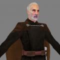
Count Dooku, this model is based on the HapSlash's dooku and is different from original about head and costume color.
Visibility of cape and hilt can be changed by specifying on Skin file.


-Support-
Bot support: yes (Count Dooku)
Npc support: yes (dookuNk)
Team skins: yes
SP support: no


-Installation-
Extract zip and put pk3 into your base folder in gamedata/base folder.


-External Content (Credits)-
Hapslash (Original model)
Cape texture (TFU)


-License-
Other players may not share or modify this work without permission from the original author.

THIS FILE IS NOT MADE, DISTRIBUTED, OR SUPPORTED BY ACTIVISION PUBLISHING, INC., RAVEN SOFTWARE, OR LUCASARTS ENTERTAINMENT COMPANY, LLC. ELEMENTS™ & © LUCASFILM LTD.™ & DISNEY, INC.™ AND/OR ITS LICENSORS. STAR WARS®, JEDI®, & JEDI KNIGHT® ARE REGISTERED TRADEMARKS OF LUCASFILM LTD™ AND WALT DISNEY, INC.™ STAR WARS®, JEDI®, & JEDI KNIGHT® ARE REGISTERED TRADEMARKS OF LUCASFILM LTD™ & DISNEY, INC.™


User Feedback

Recommended Comments

Lancelot

Posted

This is a good one. Looks more like Christopher Lee than HapSlash's original version.


Also, you improved yourself very well. This one is probably the best reskin you did so far.

Langerd, yasuakiNk and axanik like this
Encritary

Posted

Good one, but I like Dooku with TFU head more. Also it needs color correction.

RJA

Posted

OMG it's fantastic ! Look at his head ! With your permission I'll take him to my Saga Npc Pack :o

yasuakiNk likes this
yasuakiNk

Posted

Good one, but I like Dooku with TFU head more. Also it needs color correction.

If it needs color correction as you mentioned, I will revise the costume color. There is a topic on the Forum about this model. https://jkhub.org/topic/9081-yasuakinks-wip/ Canyou check this out and leave your comment more concretely?

Jolly

Posted

Again, sorry guys. My retarded brother just got access to the internet the other day. 

The Punisher

Posted

Looks really nice. I agree with Lancelot, your best one so far. However, the neck area could use some "re-texturing" to match the face. Apart from that, looks really good.

yasuakiNk likes this
yasuakiNk

Posted

Looks really nice. I agree with Lancelot, your best one so far. However, the neck area could use some "re-texturing" to match the face. Apart from that, looks really good.

Thank you for comment. I received the same pointed out from Noodle. I will add more texture work to neck.

krkarr

Posted

will you add lip movement in the next version?

DanilReal2018

Posted

I have question what abt his pose because on default he looks bad i want his pose like in star wars episode 3 attack of the clones06f2ec50ad9a62e24ebf024cd60a0908-image4.jpg

Create an account or sign in to comment

You need to be a member in order to leave a comment

Create an account

Sign up for a new account in our community. It's easy!

Register a new account

Sign in

Already have an account? Sign in here.

Sign In Now
×
×
  • Create New...