Jump to content

9 Screenshots

About This File

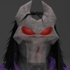
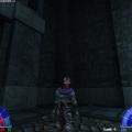
Death based off Darksiders II.


Contains:
- Team Support
- Menu Support
- Custom Sounds
- Custom Shader
- New Model
- Custom Textures


Known bugs:
- A small amount of unavoidable clipping on a few poses.


If you would like to see some additional screenshots & renders of Death, check out my Artstation here: www.artstation.com/artwork/1kYZX


ooeJack

THIS FILE IS NOT MADE, DISTRIBUTED, OR SUPPORTED BY ACTIVISION PUBLISHING, INC., RAVEN SOFTWARE, OR LUCASARTS ENTERTAINMENT COMPANY, LLC. ELEMENTS™ & © LUCASFILM LTD.™ & DISNEY, INC.™ AND/OR ITS LICENSORS. STAR WARS®, JEDI®, & JEDI KNIGHT® ARE REGISTERED TRADEMARKS OF LUCASFILM LTD™ AND WALT DISNEY, INC.™ STAR WARS®, JEDI®, & JEDI KNIGHT® ARE REGISTERED TRADEMARKS OF LUCASFILM LTD™ & DISNEY, INC.™


User Feedback

Recommended Comments

Penekowski

Posted

That's definitely very decent for a first version. I'm looking forward to seeing more from you, maybe flesh out the mask a bit more, but I really like it!

Langerd, ooeJack and swegmaster like this
Arth

Posted

Whoa man, I love it!

Well there is some room for improvement, but this looks REALLY good.


Awesome job, cheers mate!

ooeJack likes this
the_raven

Posted

No idea who this character is supposed to be (or what Darksiders II is at that matter), but I salute your good work! (and the fact that we got to have a non-Star Wars character for a change :rolleyes: )

ooeJack and Smoo like this
Rooxon

Posted

Darksiders games are two of the most enjoyable games i have ever played. It pulls you into their lore, which fyi resembles the real lore by quite a vast amount. The three realms, human, angel and demon fighting a war and four horsemen coming to save the day. It's incredible.


This model, though, it is very nice except for one huge general mistake. The mask is way too big and i mean WAY too big. It actually fits on death's head originally. Had you taken note of that, it would appear fantastic, worth of all praise. Not that it's not now, don't get me wrong; just a good advice from me for future projects. Gather several references, study them - BEFORE - you start creating whatever you create. If you find different concepts on every step, go for the middle ground - gather up your favorites and create your original one from there. Some bits of this model almost seem like it was ported - which is, in my opinion, wrong. I stand hard ground to create whatever i create from nothing; a new 3ds max file and a white, new file in Photoshop/Substance Painter 2. That's how all mods should be done - i'm not even too fond about frankensteining characters. But taking into account that AshuraDX has provided the base mesh, i'm not even too stunned that it looks great - i'd expect it. Nothing comes from that dude that isn't awesome. There's some other flaws i'd point out but i don't wanna appear too criticizing or, for most people, like the "one who knows it all, he just wants to show how clever he is but he's an idiot". We all know what jealousy speaks to us so i won't elaborate on this.


Nevertheless i left you a 5 star rate and a download. :) But you got talent, maybe more than i ever had. Work on it!

Langerd and ooeJack like this
Langerd

Posted

He rly take me back to my older models.. I am talking about First Morin model for example (my own guy made for the modification)  .

When You are making a character from book or game It is very important to feel this original character .  As the Rooxon said His mask is defenitly too big and i think his Eyes were yellow/orange.

Also the body build is more like that - arms are set wide and his body is more slim.. Even if someone is muscular it doesnt mean he is bulky and seems like that person is fat or something. 

2b55842ad491cead5bc69f9ba057a95f.jpg

But anyway very good start and i hope too see more stuff soon :) 

Of course We all should take on note that this character is kinda cartoonish looking so his proportions are changed.


Rooxon and ooeJack like this
ooeJack

Posted

I had to do his proportions to the limitations of the JKA rig. If I make it look exactly like the image here, either he would look really skinny in the stomach region and good near his torso, or, like I found out while working on him, his shoulders, arms etc would not align with the skeleton rig because of his wide shoulder/torso build.


It's hard to see in the in-game screenshots above, but I did try to do his proportions as close as the skeleton would let me. So much so that his shoulders and the skeletons shoulder bones actually do not line up, if you check that out the artstation link in the main post.


https://cdnb.artstation.com/p/assets/images/images/005/958/017/large/jack-dabrowny-4-sculpt.jpg?1494990615

https://cdnb.artstation.com/p/assets/images/images/005/958/019/large/jack-dabrowny-5-sculpt.jpg?1494990617


In the above 2 links, you can see I've tried to recreate his stomach to torso proportions. Granted, I can see that I could have made his stomach a bit more slimmer in width, but I definitely could not have made his torso any wider. I intend to keep working on him, and will fix what I can while adding more content to him. :)


Also, none of the stuff here is ported.

I appreciate the comments from you guys. :)


ooeJack

Langerd likes this

Create an account or sign in to comment

You need to be a member in order to leave a comment

Create an account

Sign up for a new account in our community. It's easy!

Register a new account

Sign in

Already have an account? Sign in here.

Sign In Now
×
×
  • Create New...