Jump to content

5 Screenshots

About This File

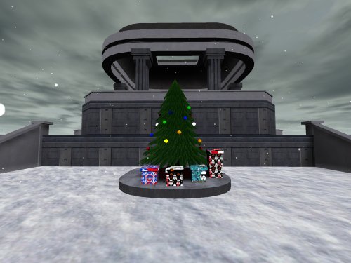
Description: An Imperial Bastion located high in the mountains, inspired by an unnamed location in Fortnite, Chapter 4 Season 1. This was created for the JKHub Holiday Mod Contest 2022 and was built in two days.

Installation Instructions: Unzip the file and place the .pk3 file in your GameData/base directory.

Notes: I would like to revisit the map after the holiday contest to improve it and add additional details. It was more difficult than I anticipated to find a Christmas tree model and I ended up improvising one. The exterior terrain is a lot shallower than I would have liked, so it doesn't quite feel like a proper mountain base.

THIS FILE IS NOT MADE, DISTRIBUTED, OR SUPPORTED BY ACTIVISION PUBLISHING, INC., RAVEN SOFTWARE, OR LUCASARTS ENTERTAINMENT COMPANY, LLC. ELEMENTS™ & © LUCASFILM LTD.™ & DISNEY, INC.™ AND/OR ITS LICENSORS. STAR WARS®, JEDI®, & JEDI KNIGHT® ARE REGISTERED TRADEMARKS OF LUCASFILM LTD™ AND WALT DISNEY, INC.™ STAR WARS®, JEDI®, & JEDI KNIGHT® ARE REGISTERED TRADEMARKS OF LUCASFILM LTD™ & DISNEY, INC.™

Ramikad, Smoo, DarthValeria and 2 others like this

User Feedback

Create an account or sign in to leave a review

You need to be a member in order to leave a review

Create an account

Sign up for a new account in our community. It's easy!

Register a new account

Sign in

Already have an account? Sign in here.

Sign In Now

Noodle


Even though the map is quite simple, I think its a solid idea that -properly developed- could be a great map.  I like the tie-fighters on the outside because they help contextualize this base as a proper imperial outpost. The tree and christmas presents are a good idea, although the tree model isn't working properly to me. It seems there's a shader issue or something, because the textures aren't two-sided and its quite black, unlike what I saw in the screenshot. The presents are nice, but the texture on top of each one is quite blurry.  Maybe making a model in blender and exporting it as an .md3 could make this a bit prettier. 

One of the main issues with the map is the lighting. Its quite dull and there's not a single lightsource on the entire map. A proper imperial outpost would have lights everywhere I'd guess. You could add some to the landing pad, the dome-like structure and the main building. This could really add some flavor to the overall area. Also, there's no horizon blending in the map, so it feels like the edges are quite rough. Maybe adding some fog could make it seem less choppy on that regard. 

The scale of the buildings is alright, though the doors seem to be quite small.  On that regard, the map could benefit from some interior pieces. Aside from that, I like the structure of the buildings, it isn't very blocky and the use of textures make it look nice enough. 

To me this is a 3/5, there's a lot of potential for improvement but its overall a useful map. 


×
×
  • Create New...