About This File
Description:
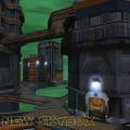
This version is somewhat different to version 1 of the Kril'Dor skybox. Looking at version 1, while it was updated and different, I felt it seemed too much like a green version of Bespin and didn't really resemble a green, gas Planet, as such. So I had a re-think and thought about what this planet could actually be like in the STAR WARS universe. So overall, I thought this would be a more accurate representation of the planet, judging from the information featured in the Wookieepedia link, here;
http://starwars.wikia.com/wiki/Kril%27Dor.
The image quality of the Sky is nowhere near HD, but unfortunately there wasn't really any other way to improve it, without awful pixelation.
Known Bugs:
None
Comments:
If you wish to modify and can find a way to increase the image quality, then by all means.. Have a go and I wish you the best of luck. Hopefully more than I've had.
Credits:
Wookieepedia (http://starwars.wikia.com/wiki/Main_Page)
This file is not developed, distributed, or endorsed by Activision Publishing, Inc., Raven Software, Lucasfilm Ltd., Disney, Inc., or any of their affiliated entities. All trademarks, copyrights, and intellectual property rights belong to their respective owners. Star Wars®, Jedi®, and Jedi Knight® are registered trademarks of Lucasfilm Ltd.™ and Disney, Inc.™. This file is intended for educational, non-commercial, or fan-based use under the principles of fair use. No copyright infringement is intended. Any claims of ownership or DMCA takedown requests can be submitted here.


Recommended Comments
Create an account or sign in to comment
You need to be a member in order to leave a comment
Create an account
Sign up for a new account in our community. It's easy!
Register a new accountSign in
Already have an account? Sign in here.
Sign In Now