Tools
You will require:
- A graphics program, such as Photoshop or GIMP
- A text editor program, such as NotePad or TextEdit
- Jedi Academy (Obviously!)
Premise
Jedi Academy's HUD is divided into 3 main sections: The code which tells the game which elements to draw and when to draw them, the .menu files which determine the appearance of each element, and the images themselves. This tutorial will show you how to edit the .menu files and images in order to change the HUD's appearance without changing its functionality.
ui/hud.menu (contained within "assets1.pk3") defines the size, shape, colour and image used for each element of the HUD.
gfx/hud (also within "assets1.pk3") contains all the images used, in .tga format.
Graphics
Jedi Academy displays in a 4:3 aspect ratio. When designing your HUD, your first step should be to create a new document of the same ratio (For example, 1600 x 1200 pixels). Fill the background layer with a single colour (Black is usually preferable). Each element of your HUD should have its own layer. A list of graphics elements follows:
Background 1
Background 2 (Optional)
Health (In 4 sections)
Armour (In 4 sections)
Ammo (In 4 sections)
Force (In 4 sections)
Sabre Stance Indicators (3 of them)
Refer to gfx/hud in "assets1.pk3" for the names of each element. Background 1 is "hudleft", and for the purpose of this tutorial, Background 2 will be named "hudright". Not every element has to be drawn, but no new ones can be added. Text is handled completely by the .menu file and does not require any images. By default, the same background image is used for the left and right sides of the HUD. Later on in this tutorial you will see how to change that if you so wish.
Once you have designed your HUD, save each element as a separate image file, but keep the complete design as a reference. Each element should be saved as a .tga file, have an alpha channel and an appropriate size. JKA requires that all image dimensions be powers of 2, for example: 256, 512, 1024 pixels etc. The height and width may be different, but each must conform to this rule. In order to avoid your image being stretched, you should copy the HUD element into a blank, appropriately sized document, rather than resizing the element itself. Line the HUD element up with the top-left corner of the document - the reason for this will be apparent when positioning elements on screen.
Menu File
Now that you've created the graphics for you new HUD, it's time to position them on screen.
All menus in JKA conform to a size of 640 x 480 (4:3 ratio). [0, 0] is the top-left corner, and [640, 480] is the bottom-right. Every entry in hud.menu is headed with either "menuDef" or "itemDef" and is contained within parentheses: { } Lines beginning with two forward slashes // are comments, and do not have any effect on the HUD.
Scroll down to "// LEFT SIDE HUD - contains the armor and health". "menuDef" defines the initial menu section, named "lefthud". This is invisible, but defines a origin point for the left hand side of the HUD. The line "rect 0 368 112 112" is the position and size of the menu section. If you changed this to say "rect 0 0 112 112" the left side of the HUD would draw from the top-left of the screen, and be 112 x 112 units large. Since this section is invisible, the size is not important, however the position is. Every following entry which begins with "itemDef" is placed relative to the 'menuDef" entry. For example, "health_tic1" is positioned at [20, 24] relative to "lefthud", so its position on screen is actually [20, 24] + [0, 368] = [20, 392]. Bear in mind that "righthud" and all its constituent parts have a negative horizontal scale by default, so they draw back-to-front.
Alter the positions and sizes of all your modified elements as you wish. You may find it beneficial to resize your original HUD design (The image with all elements shown) to 640 x 480 pixels, and use that as a reference for positions. Remember that the sizes may be different, since the graphics had to conform to the sizing rule.
The numerical counters for health, armour, ammo and force power are positioned and sized in the same way, but you may also want to alter their colour. "forecolour" is the line which controls this, followed by 4 values: Red component, green component, blue component, alpha component. These combine to give the colour and opacity, for example" "1 1 0 0.5" would be yellow and slightly see-through. If you change the ammo counter, remember to also change "ammoinfinte", as this has a separate entry.
By default, JKA splits the HUD into two sides: Health and armour on the left, ammo and force on the right. You can move elements from on side to the other if you wish to do so. For example, if you wanted to place the ammo counter (originally under "righthud") on the same side as the health bar, select the entry ("itemDef" and parentheses included), cut it from its original position and paste it somewhere under "lefthud".
Different Background Images
Earlier in this tutorial we mentioned using different background graphics for either side of the HUD. In hud.menu we can see that the backgrounds (called "frame" in each case) both use "gfx/hud/hudleft" as their image. If you created a separate background image for the right side you can change this to "gfx/hud/hudright" to display this image instead. You will also need to create a shader for this image:
gfx/hud/hudright
{
nopicmip
{
map gfx/hud/hudright
blendFunc GL_SRC_ALPHA GL_ONE_MINUS_SRC_ALPHA
}
}
This will display the image with its alpha channel as a source of transparency, rather than making it fully opaque. Place the shader in a folder directory "shaders" and save it with a name of your choice and the file extension ".shader".
Conclusion
You new HUD should now be complete. Compress all your folder directories into a .pk3 file and place it in JKA's base folder. Although this tutorial specifically covers creating a new HUD, all menus are laid out in a similar way and the skills learned here are applicable to those as well.


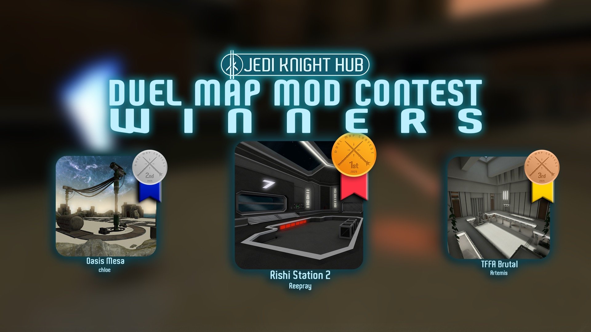
 1st Place Winner Reepray with Rishi Station 2,
  2nd Place Winner chloe with Oasis Mesa, and
  3rd Place Winner Artemis with TFFA Brutal! Amazing submissions by everyone!


Recommended Comments
There are no comments to display.
Create an account or sign in to comment
You need to be a member in order to leave a comment
Create an account
Sign up for a new account in our community. It's easy!
Register a new accountSign in
Already have an account? Sign in here.
Sign In Now