-
Posts
7 -
Joined
-
Last visited
Profile Information
-
Pronouns
Not Telling
-
Gaming Specialty
Singleplayer
-
Operating System
Windows, Mac OS X
Merscil's Achievements
-
- 9 comments
-
- Contains Cosmetic Changes
- Star Wars Related
- (and 2 more)
-
- 39 comments
-
- Menu Support
- Team Support
-
(and 5 more)
Tagged with:
-
GaryTheStormtrooper liked a comment on a file: Less Annoying Rosh
-
AnonMC liked a comment on a file: Less Annoying Rosh
-
Thanks. I recently released a mod that changes the dark skin of the Rosh model. It works in the cutscene before the battle and during the battle sequence of Vjun. But for some reason Raven decided to use the standard npc again in the cutscenes after the battle is over (when Tavion makes her appearance). To change that I would have to edit the map as well?
-
Merscil liked a comment on a file: Less Annoying Rosh
-
- 9 comments
-
- Contains Cosmetic Changes
- Star Wars Related
- (and 2 more)
-
Hi, I'm looking for the files that determine what player models/skins are used in the cutscenes of the game.
-
1,040 downloads
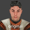
Hello, I have been away from this game for years but recently got struck by nostalgia and it wasn't before long I felt like making a mod. Rosh Penin, the character everyone hates. This mod attempts to make him a bit less of a nuisance. I know there are a lot of mods out there that attempt to do the same thing but this one is meant to be a bit more subtle. This was originally planned to be just a mod for me but it turned out quite well so I thought I might as well share it. There are three pk3 files included in this mod: ----------------------------------------------------------------------------------- LessAnnoyingRosh.pk3 ----------------------------------------------------------------------------------- - Visual Changes: the eyesbrows have been made thicker and are now closer together and the shading below the eyebrows has been reduced/changed. the lips were made less red and the contrast with the rest of the skin has been toned down. the irises were redone and I made them a bit larger, which reduces the stupid look on his face. Also the pupils have been made smaller. This helps in giving him a more neutral, less infatuated look. the subtle hint of a mustache he has going on has been widened a bit, to reduce the prepubescent look he has. These changes are subtle - he is still Rosh - but they help out a great deal. - Multiplayer icons have been updated with the new face (and the default jka backgrounds). - A dark skin has been added, which is now used in the appropriate single player sections. the eye pupils were made even smaller and he now has bloodshot eyes. you can now see veins through his skin and the skin has been made paler. the robes have been recolored to represent his fall to the dark side. ----------------------------------------------------------------------------------- LessAnnoyingRosh_deeper_voice.pk3 (optional) ----------------------------------------------------------------------------------- - All Rosh sound have been lowered in pitch. Don't worry, I didn't overdo it, he's still Rosh. This to me helped out a lot but if you don't like it, you can leave out the pk3. Conversely, if you would just like to have the sounds and prefer another Rosh modification, you can do that too. ----------------------------------------------------------------------------------- LessAnnoyingRosh_mp_playable_dark_skin.pk3 (optional) ----------------------------------------------------------------------------------- - This pk3 contains a multi player version of the dark skin. I put this in a seperate pk3 because with all the awesome models being around nowadays, I fully understand it if you don't want Rosh to take up another spot in the menu. So that's basically it, I hope this is going to be useful for some of you.- 9 comments
- 10 reviews
-
- Contains Cosmetic Changes
- Star Wars Related
- (and 2 more)
-
I can't seem to find the jk2 version of that mod. Also I'm not exactly familiar with it. What does it do and how do I know which build to select?
-
I have now. Thank you for the suggestion, I hadn't thought of that. The closest I came to having the height of my entire display filled was at a resolution of 1332x999 (4:3). Yet it is immersion breaking, with all the crap at my desktop showing. Interestingly enought though, when I try the corresponding widescreen resolution 1776x999 (16:9), I get the same zoomed in top left view as , same goes for 1920x1080. The 1332x999 resultion in fullscreen mode also gives the top left view, so it's really confusing. But I guess for now, until a better suggestion comes along the 1332x999 windowed mode is probably my best bet. The top part of the game gets cut of by the window though. Is there anyway to make it borderless?
-
Hi there, this is my first post here. I made this account because jk3files shut down and this seems to be the main site to go to for jk related issues. I recently decided I wanted to play Jedi Outcast again for nostalgia's sake. So I installed it but can't seem to get it running correctly (I'm trying to run it under Windows 8). The problem is the following: the highest resolution I'm able to select is 1152x864, which looks like this on my monitor: This is with full screen enabled. Whenever I go higher then this, let's say 1280x1024, I get a zoomed in view, with only the top left part of the game visible: I've googled for a solution but everywhere people seem to recommend the same thing. I've tried this with 1920x1080 and 1280x720 resolutions (widescreen) as well as 1440x1080 resolution (3:4 aspect ratio, because I don't mind black bars on the side), but still it only shows the top left part of the game, extremely zoomed in. I even found someone who had the same problem with 'Return to Castle Wolfenstein' and was able to fix it by altering one of the existing lines in the config file: to "1" So I tried adding that line to the jk outcast config file, but without result. I am out of ideas on how to solve this but would still really like the game to at least fill the entire height of my laptop display. One thing's for certain though, it seems to be a common problem on newers systems (relatively speaking). Any help would be much appreciated.


