-
Posts
8 -
Joined
-
Last visited
Recent Profile Visitors
The recent visitors block is disabled and is not being shown to other users.
STOIK's Achievements
-
Srethem liked a post in a topic: STOIK's Menu Design
-
Srethem liked a post in a topic: STOIK's Menu Design
-
Smoo liked a post in a topic: STOIK's Menu Design
-
Circa liked a post in a topic: STOIK's Menu Design
-
Yeah, it was mostly just a fun challenge for myself to see how far I could push the UI/engine within its (mostly) original guard rails, I'm not really looking to do any sort of modifications to the engine myself, unless it was something built into a popular fork of OpenJK or something. If the means existed I would use it otherwise it's just more fun to work within the limitations. I didn't even think to digg through MB and look at what you all did just within the context of the menu files, I'll have to take a look. So far in my testing it's been great in every 16:9 resolution from 1080 up to 4k, I'm not really concerned with any legacy 4:3 situations and just running with the assumption that if you download a mod like this you're not using vanilla JA given the remaining player base is a bunch of legacy 30+ year olds. For sure, I understand, but if not to change then there's really no reason at all. That being said the OG UI was made in a time before any sort of established user experience practices and wrought with accessibility nightmares so while it endearing for people that have grown up with it, it is a genuine nightmare from many perspectives.
-
STOIK liked a post in a topic: STOIK's Menu Design
-
STOIK liked a post in a topic: STOIK's Menu Design
-
Srethem liked a post in a topic: STOIK's Menu Design
-
DarthValeria liked a post in a topic: STOIK's Menu Design
-
DarthValeria liked a post in a topic: STOIK's Menu Design
-
DarthValeria liked a post in a topic: STOIK's Menu Design
-
DarthValeria liked a post in a topic: STOIK's Menu Design
-
DarthValeria liked a post in a topic: STOIK's Menu Design
-
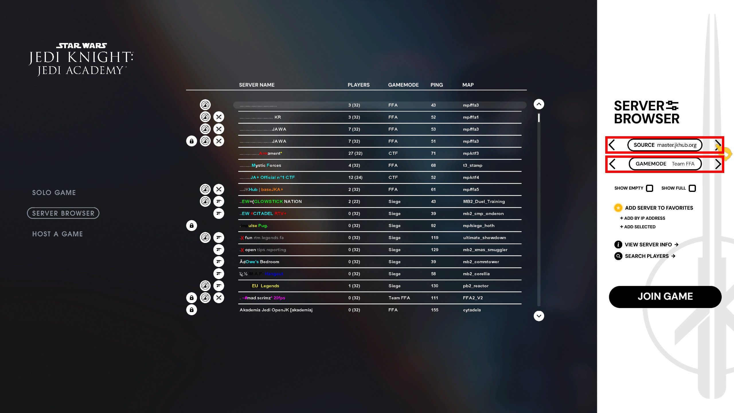
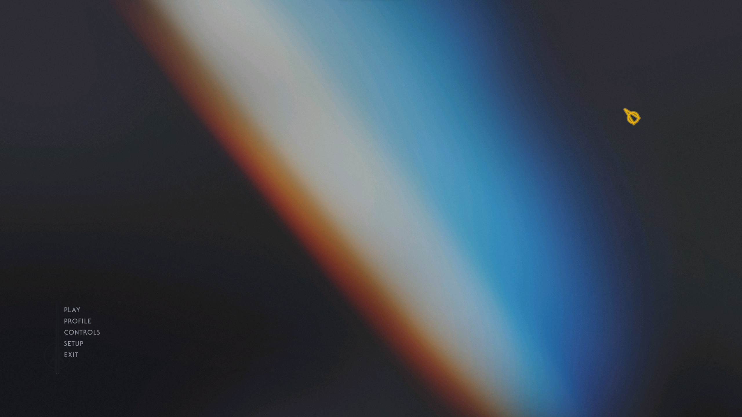
Figured I would share another shot of what I've been messing with. Unfortunately I have hit some walls that I may not be able to overcome and have to go back to the drawing board a bit and/or take a dive into learning how to replace the various fonts. I was attempting to use a different .menu file for each of the menu selection states (image attached for reference) and just scaling/placing them accordingly. I was doing this so I wouldn't be restricted to using 1 of the few in-engine fonts and allow me to do more with the appearance and design vs just throwing text on the screen but it doesn't seem like .menu files can layer each other with those below it still being accessible. So atm its feeling like things might have to simplify quite a lot but I'm going to give a few other ideas a try.
-
STOIK liked a post in a topic: STOIK's Menu Design
-
STOIK liked a post in a topic: STOIK's Menu Design
-
STOIK liked a post in a topic: STOIK's Menu Design
-
Sounds good! Works for me Now I'm curious if anyone here has any insight on something: Am I able to add new .menu files or are they hardcoded somewhere and require some deeper modification & compiling of the source? EDIT: ignore, I found the jampmenus text file
-
STOIK liked a post in a topic: STOIK's Menu Design
-
STOIK liked a post in a topic: STOIK's Menu Design
-
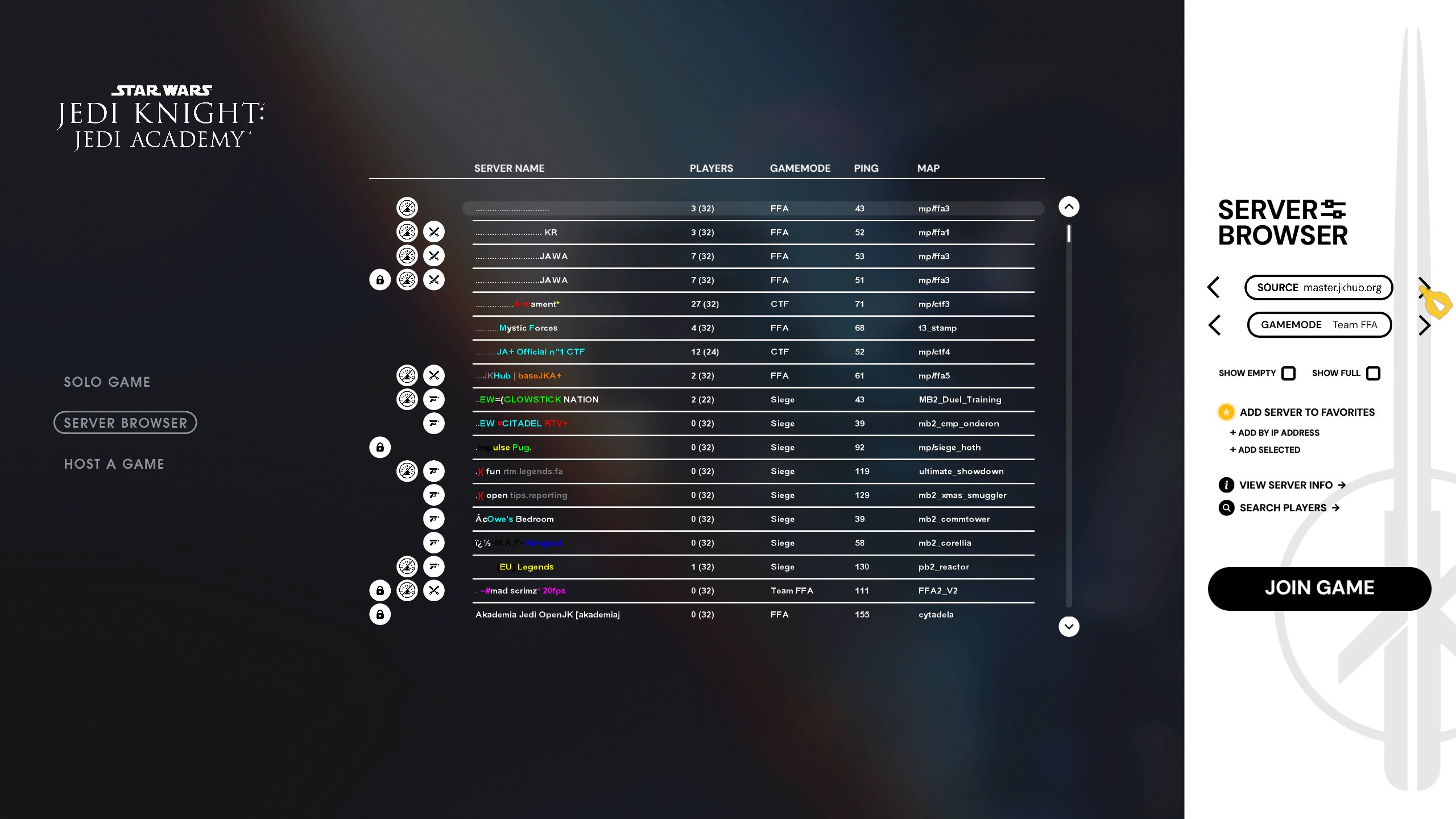
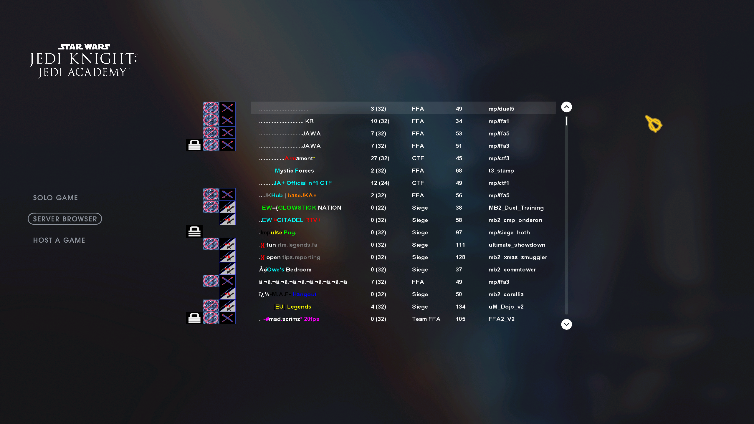
Oh trust, I'm trying lol. The icons are a bit interesting because the menuDef that contains the itemDef for the server feed columns element is kind of broken. Adjusting the position of the parent menuDef moves the child column element as it should.... except for those icons. The icons themselves are part of the 2nd column which is actually the map name column. So I had to do some rearranging of the column order in order to get everything to kind of still be positioned near eachother if I wanted to move the whole menuDef for the server list. Otherwise the icons would either be across the screen, overlapping the server names or some variation of another awful situation. As for the icon visuals I'm just making more very liberal use of an alpha channel of the background visual that sits over top of everything so I can make most things more visually appealing... the icons, the scroll bar, the pill shape of the highlight for the actively selected server, etc.
-
That's good to know, hopefully I can get to the point of exploring that before my mind collapses in on itself from trying to brainstorm solutions for things. The amount of jank I feel like I am employing just to for instance have the scrollbar appear as anything other than a rectangle is kind of funny. Alpha channels putting in some work here.
-
STOIK liked a post in a topic: STOIK's Menu Design
-
Thank you! I'll definitely poke around in these. I'd like to keep pushing it and see how far the entire UI experience can be pushed to just feel better and not like something out of a time capsule despite finding it endearing at this point. It was always 1 of the largest detractors for me when it came to large scale mods for the game; the UI never changed outside of some color shifting for the most part so things never felt quite their own to me.
-
STOIK liked a post in a topic: STOIK's Menu Design
-
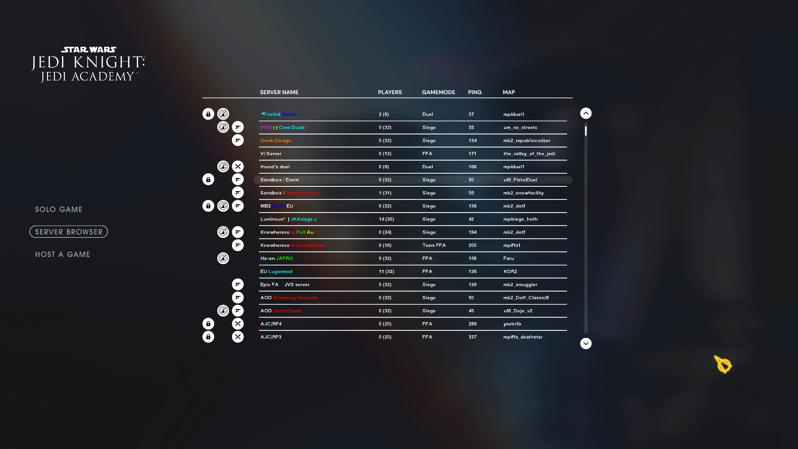
Appreciate the clarity, and yes you're right about using the .menu to handle the squishing vs doing it in the texture, I ended up realizing that last night. I wasn't sure where the ceiling exists for texture resolution so arbitrarily chose 4096x4096 for the background and 4096x2048 for the games logo lockup which hasn't given me any issues. It seems like there me be some rudimentary ways of providing motion to some texture elements as well based on what I see in the .menu of the original menu for the scrolling Aurebesh text? An editor would be great but it does feel like once you get a grip on the .menu files things start to come together fairly quickly. Anyway this is where I ended up after messing around. I'll keep toying with this as I have time, was fun to figure out.
-
STOIK liked a post in a topic: STOIK's Menu Design
-
STOIK changed their profile photo
-
It's been about 15-16 years since I have done any sort of modding on this game/engine but I've been hopping back onto the game more and more over the last year or 2 and last night my masochism got the better of me. I'm a visual and UX designer these days and I guess I decided now would be a good time to give myself a headache while I mess around with seeing how far I could push the idea of making the UI in this game feel more modern. So I have a few questions for anyone here that has knowledge on the q3 menu tech. It seems like the engine wants you to design for the minimum viable resolution and work out from there? At least that was the case with Doom and it seems to be 640x480? At least when it comes to utilizing "fonts". However if I use images instead it seems to position them relative to the resolution so I can get around that issue. The problem using images creates seems to be despite OpenJK having widescreen support any images used in menus will still be stretched so my solution there has just been to preemptively squish the images beforehand so when the menu is rendered they appear correct, does this feel accurate? Is there a better way to do this? I'm assuming not but you never know lol. This is mostly just me giving myself a fun exercise to see what I can or can't do but who knows, maybe I'd end up finishing something and releasing it to share. Mostly just wanting to see if there is anything I am overlooking or if I should continue approaching this the way I am currently.
