zicmak Posted February 26, 2013 Share Posted February 26, 2013 Just throwing out here a small design change for my Resolute saber... And asking for design ideas The black with smudgy grey is the glass part... which I have finally gotten around to putting in it. But anyway, what do you think, and any ideas for something to add? Link to comment
zicmak Posted February 26, 2013 Author Share Posted February 26, 2013 At the risk of (possibly) sounding like an idiot, how do you mean? Link to comment
Milamber Posted February 26, 2013 Share Posted February 26, 2013 Pretty much means "detail level" in common terms He's asking if you're being careful with the amount of unnecessary detail. Like having 20 sided cylinder for a jka saber would be overkill. Link to comment
zicmak Posted February 27, 2013 Author Share Posted February 27, 2013 Oh, right... Well, I am doing my best to keep the poly count as low as possible without looking like it is made out of a square. Compared to version 2, it has more vertices, but that is due to the glass and sides being added...Compared to Version 1, I think It would have less... maybe, have't check in a while. By the way, how do the base glass shaders work? (And more ideas for something to add would be good ) Link to comment
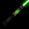
Ryojin Posted February 27, 2013 Share Posted February 27, 2013 To be completely honest, it looks very plain to me, texture-wise. It could use some more details like a button or something. Also, what is that black triangle thing near the top? Link to comment
zicmak Posted February 27, 2013 Author Share Posted February 27, 2013 The triangle thing is the button, it really has a (very) shiny shader and a few glowing things, including the buttons... I'll try to put an in game picture up later Link to comment
Ryojin Posted February 27, 2013 Share Posted February 27, 2013 Perhaps the button shouldn't be a solid color, especially a solid black... Doesn't really make it look like it belongs there, ya know? Link to comment
zicmak Posted February 28, 2013 Author Share Posted February 28, 2013 Perhaps the button shouldn't be a solid color, especially a solid black... Doesn't really make it look like it belongs there, ya know?It isn't black (The Stripes are caused by the shiny shader) The button is black on the others because it is in modview (although, if there is a way to have shaders in modview, can some please tell me ), it actually glows in game... (yeah, I could of probably explained it better before) Link to comment
Ryojin Posted February 28, 2013 Share Posted February 28, 2013 Ah. That looks much better. Link to comment
MagSul Posted February 28, 2013 Share Posted February 28, 2013 That there is a pretty swish looking hilt upgrade, though. Link to comment
zicmak Posted March 3, 2013 Author Share Posted March 3, 2013 Switch to blendFunc GL_SRC_ALPHA GL_ONE and experiment with lower alphaGen const values like 0.1 or .15. The shine stage of your shader is making that look funky.Tried it, and I reckon it makes it look boring, since the textures are kinda dull on its own... anymore Ideas? Link to comment
zicmak Posted March 5, 2013 Author Share Posted March 5, 2013 Okay, no, what is a specular texture? Link to comment
Recommended Posts
Create an account or sign in to comment
You need to be a member in order to leave a comment
Create an account
Sign up for a new account in our community. It's easy!
Register a new accountSign in
Already have an account? Sign in here.
Sign In Now